Another week has past and it’s time for new charts. I’ve been tracking the daily positivity rate for Washington State. The “positivity rate” is the percentage of positive test results for each 24 hour period. Dividing by the number of tests each day adjusts for variations in daily testing throughput, i.e., the number of tests performed each day is different.
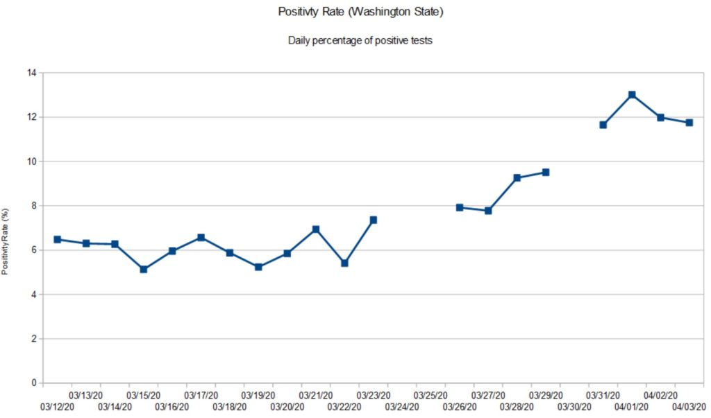
First, here is the chart using test results from the Washington State Department of Health (DOH). [Click to enlarge.]

The gaps in the data are due to database issues at DOH. DOH receives and integrates test reports from around the state. Their database has been stressed and has not been tallying negative test results from which one can compute the number of tests per day (i.e., the sum of positive and negative results). Thus, I wasn’t able to compute a daily positivity rate for certain days.
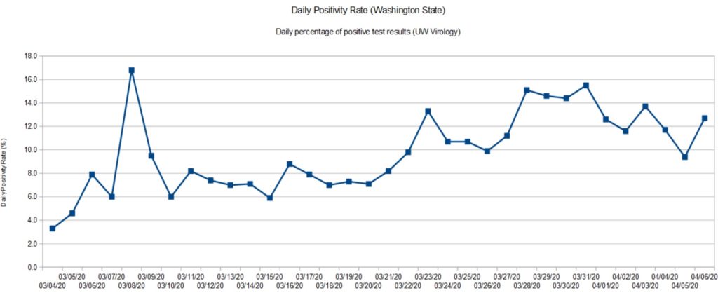
Fortunately, I have the University of Washington Virology Laboratory as back-up. The UW Virology Lab is performing a large portion of tests in Washington. The Lab maintains a dashboard showing the number of tests they performed, the positives, negatives and inconclusives. Inconclusive tests are presumed positive. So, the daily positivity rate is the sum of the positive and inconclusive tests divided by the number of tests performed that day.

Both graphs have a similar shape which shouldn’t be surprising as the UW Virology Lab is a major component in the DOH results. The positivity rate has more than doubled since early March. As of today (April 6), the positivity rate appears to be at a plateau and may show the beginning of a downturn. That’s good news and we need to remain committed to social distancing and other community mitigation measures.
Washington State recommended home-stay on March 16 and closed some businesses (e.g., hair salons, gyms, churches, etc.) I regard these measures as “social distancing lite.” On March 24, the State imposed a stay-at-home order. Given the time lag (10 to 14 days), the turn in the positivity rate is most likely due to the full stay-at-home order.
Fortunately, Governor Inslee has not declared victory. Instead, social distancing measures have been extended to May 4. Further, school has been cancelled through the end of the Spring term.
From my own observations, people in our part of Snohomish County (near Bothell and Everett) are treating COVID-19 seriously and are complying with the stay-at-home order. If a state, county or city is waiting for signs of an outbreak, don’t wait to issue a stay-at-home order. Response now will keep the size of your problem manageable. An ounce of prevention is worth a pound of cure.
Cleveland, OH
I keep an eye on the old hometown for no other reason than the Cavs and Browns. Cleveland.com published a few useful looking charts and graphs.
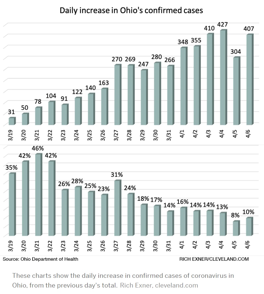
As we all go forward, we need to know when our communities have turned the corner and, importantly, when we can restart some business activities. The Ohio Department Health tracks the percentage increase in confirmed cases day-over-day.

Like Washington, Ohio has not hesitated to issue a stay-at-home order and to implement other forms of community mitigation. Gov. Mike DeWine, like Gov. Inslee, may not be the most dynamic individual, but he, too, is leading his state effectively in this crisis. I’m pulling for the folks at home!

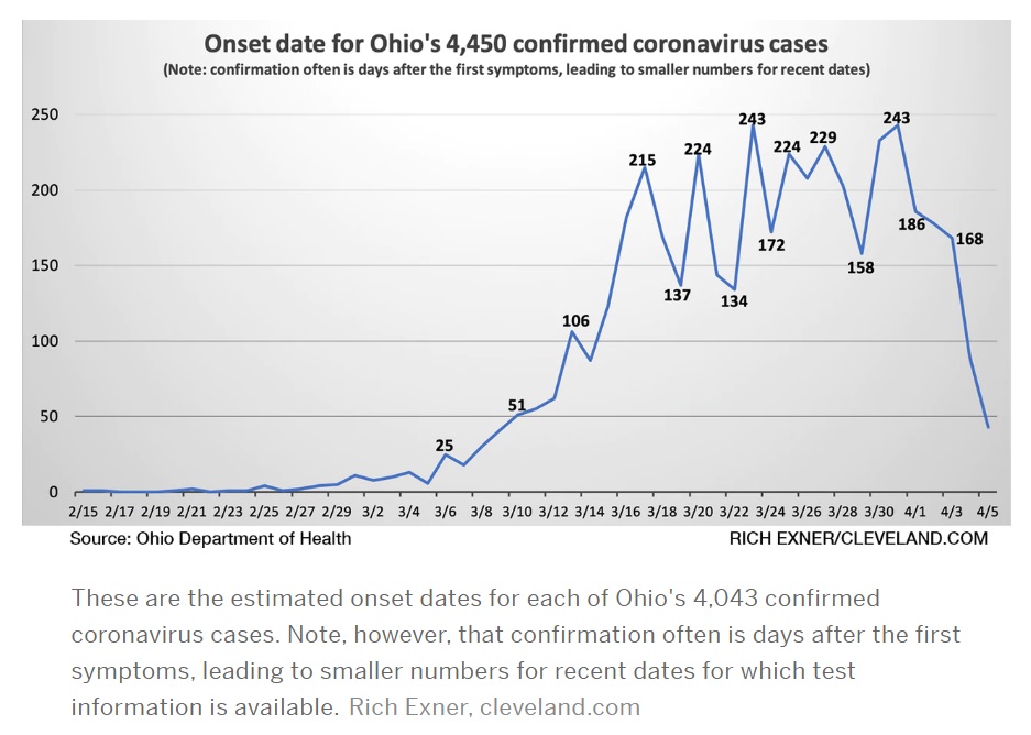
This is another Ohio DOH chart which caught my eye. It plots confirmed cases by the onset of symptoms. This chart better aligns case count with the actual time frame in which a patient was infected.
NYT: What’s next?
The New York Times published two good articles on community mitigation and the next phase in our battle against SAR-CoV-2 (COVID-19) — cycles of “suppress and lift” as restrictions are applied and relaxed, so-called waves.
- Lockdown Can’t Last Forever. Here’s How to Lift It.
- How Will We Know When It’s Time to Reopen the Nation?
These articles are flying by so fast and so thick that you’ll miss them if you blink.
Stay 2 meters apart and stay healthy — P.J. Drongowski
