Although I’m posting about music technology again, I still track the local COVID-19 situation. This disease, unfortunately, is still out there with months to go until a safe, tested vaccine.
The Washington State Department of Health web site is changing the way it counts and reports negative tests. The DOH site has left us blind about testing for over one week; they promise to have negative test results beginning August 24. I will do a major revision of my own when the new data are available.
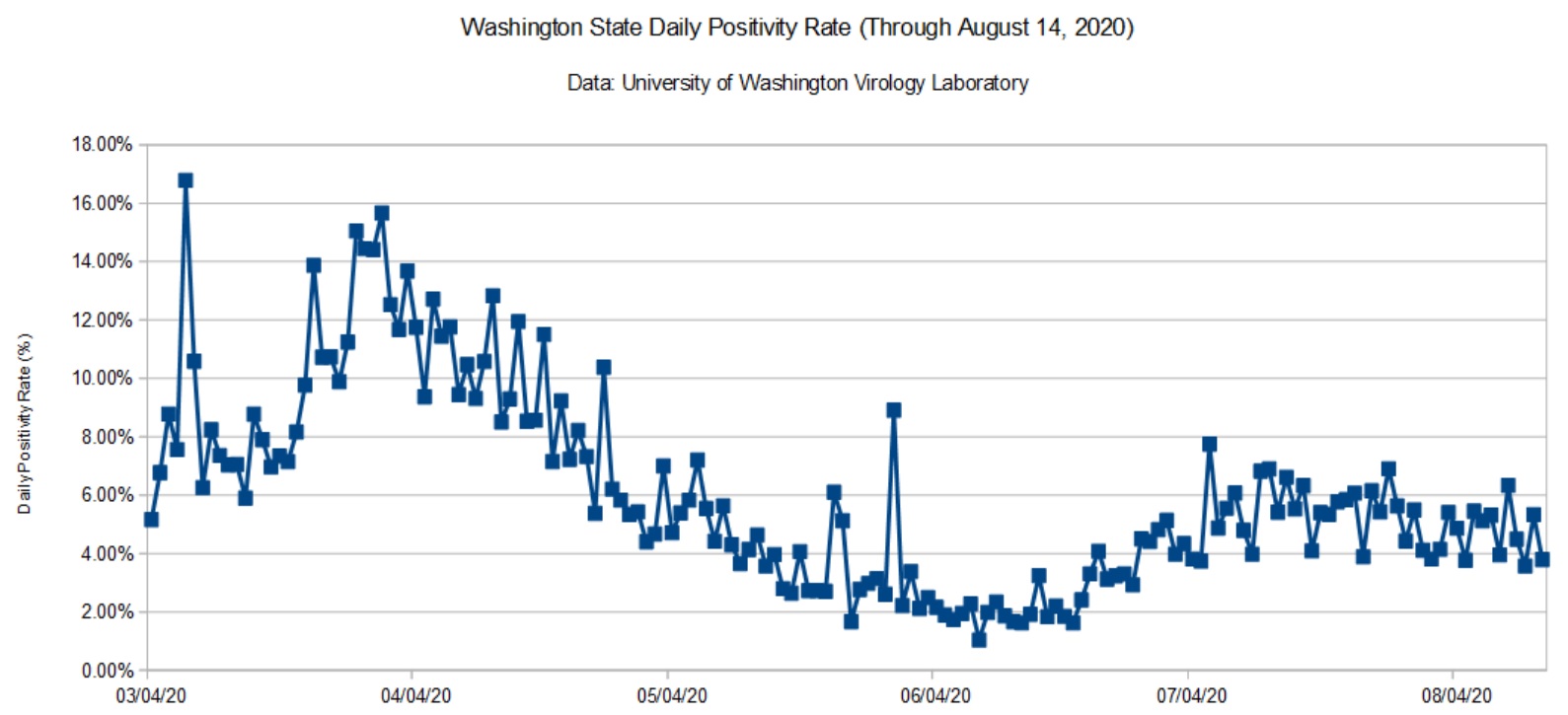
In the meantime, here is a graph of the daily positivity rate for Washington State using data from the University of Washington (UW) Virology Lab. UW does not break down test results by county, age, etc. It’s strictly specimens in, results out.
Washington State COVID-19 daily positivity rate (UW, August 14, 2020)
The State as a whole did quite well — for a while. The positivity rate for King County, the most populous county, is around 3 percent. Not bad. UW performs tests for the entire state and reflects problem areas elsewhere, notably Yakima and a few other agricultural areas. Snohomish county, where we live, is running at 5 to 7 percent — nothing to brag about and misses the state target (2 percent).
This situation demonstrates how one populous county can make a state appear better or worse overall. People outside of King County should check their local statistics and not feel comfortable thinking that COVID-19 is in check. Don’t ride on someone else’s coat tails!
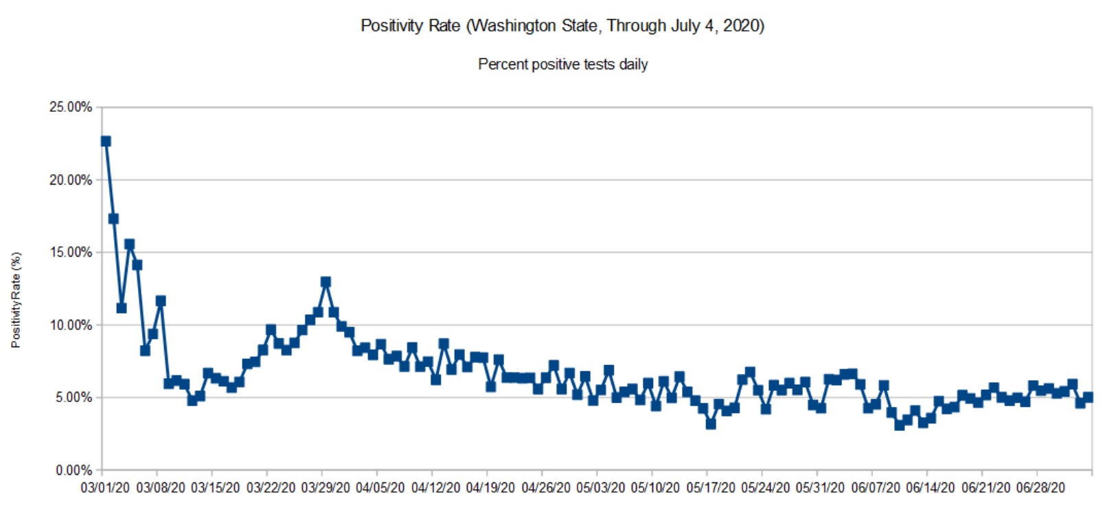
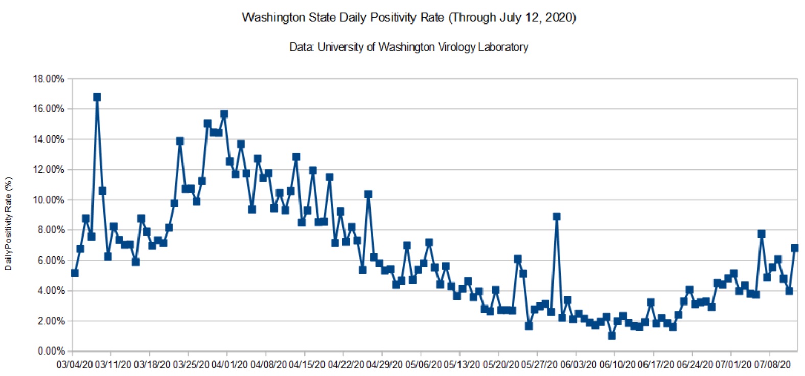
The graphs below summarize the Washington State COVID-19 positivity rate through July 12, 2020. Data are taken from the Washington State Department of Health (DOH) and the University of Washington Virology Lab (UW). The DOH data are complete through July 4, 2020 and that is what is shown here. [Click images to enlarge.] I don’t report partial results.
Washington State Positivity Rate (DOH, July 4, 2020)Washington State Positivity Rate (UW, July 12, 2020)
The UW data indicate an uptick in the positivity rate during the last week. This is consistent with my daily DOH tracker. Many states in the nation are experiencing a sharp increase and a few are heading into the weeds as indicated by their high positivity rates (15% and up). I dearly hope that we can reverse the most recent trend and suppress transmission.
I need to remind everyone that the positivity rate is a proxy for the true rates of COVID-19 incidence and prevalence.
We all need to renew our efforts — P.J. Drongowski
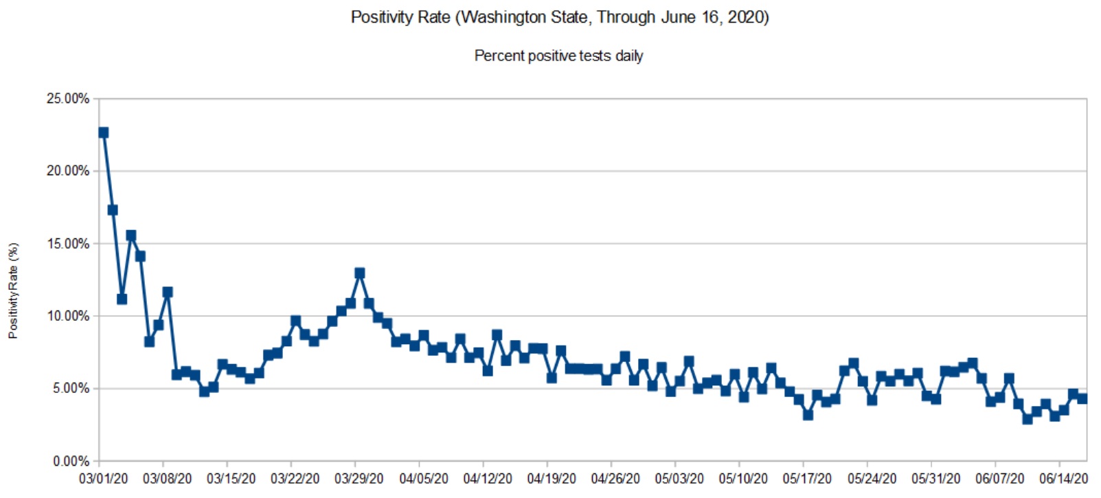
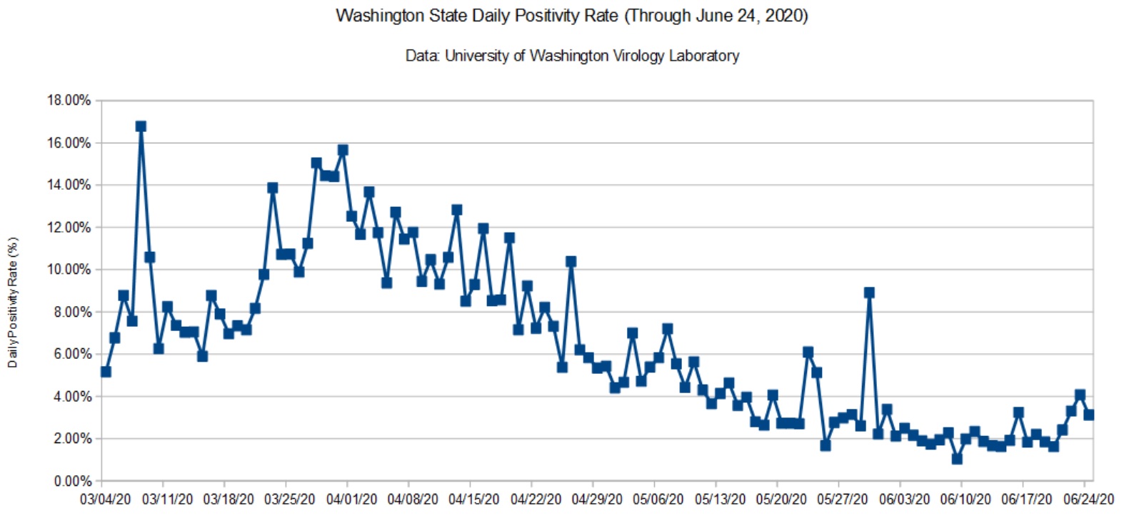
Here is my COVD-19 update taking us through June 24, 2020. Data are taken from the Washington State Department of Health (DOH) and the University of Washington Virology Lab (UW). The DOH data are complete through June 16, 2020 and that is what is shown here. [Click images to enlarge.]
Washington State Positivity Rate (DOH, June 16, 2020)Washington State Positivity Rate (UW, June 24, 2020)
We’re seeing a small uptick which is probably due to the BLM protests in Seattle (early June) and the worsening situation in Yakima County. My daily tracker indicates a roughly 5% positivity rate that is consistent with the charts above.
The recently announced NY/NJ/CT travel quarantine initially included Washington State. That really surprised me and sent me diving into the data. However, it appears that the NY/NJ/CT authorities reacted to a temporary “condition” in the data. Giving them the benefit of the doubt, the DOH did a massive update recently, taking seriology tests out of the daily testing statistics. I took a numerical tour of the hottest states recently and was appalled at the inconsistency and shortcomings in reporting. (CDC? Hello? Anybody home?) Confusion is somewhat understandable.
Washington State Daily Positivity Rate (DOH, May 26, 2020)
The DOH positivity has taken a definite upswing during the last week. Folks are getting antsy and highway traffic is noticeably heavier. The morning traffic report is back to yellow and red trouble spots on the local highways. Mobility has definitely increased as we will probably see in the next report from the Institute for Disease Modeling.
It will be 10 to 14 days before we see the effect of protests in the Seattle area. Large gatherings of people are definitely spreader events.
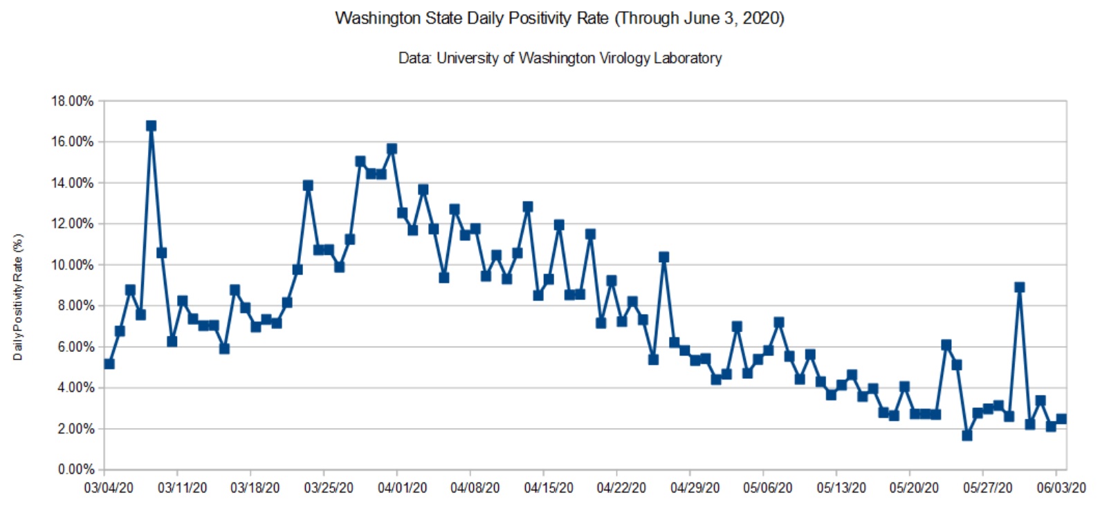
Washington State Daily Positivity Rate (UW, June 3, 2020)
The data from UW had a localized bump. This may be the result of contact tracing within a cluster. I wish the UW site was a little more informative, but interpretation is really DOH’s job.
I still see and hear local media reporting observations like “The number of cases dropped dramatically yesterday.” Raw case counts are relatively meaningless unless the number of tests are taken into account. That’s why I’m tracking the daily positivity rate — the percentage of positive test results for each day.
Here’s an example to show what I mean. Testing (and reporting) dips over the weekend. The number of weekend (Saturday and Sunday) tests is typically less than half of weekday tests. Here are the mostly values reported in the media
The first three columns are the cumulative metrics published by DOH. The last three columns are the number of positive tests, tests performed and positivity rate for each day. The date is the reporting date, so June 1 (Monday) covers the preceding Sunday.
Please note how fewer tests are performed on Sunday than Monday. Sure, the number of raw positive cases on Sunday is dramatically lower Monday. However, the positivity rate is higher for Sunday is actually higher. Yep, the local news station was touting the Sunday number! This is fundamental numeracy, people.
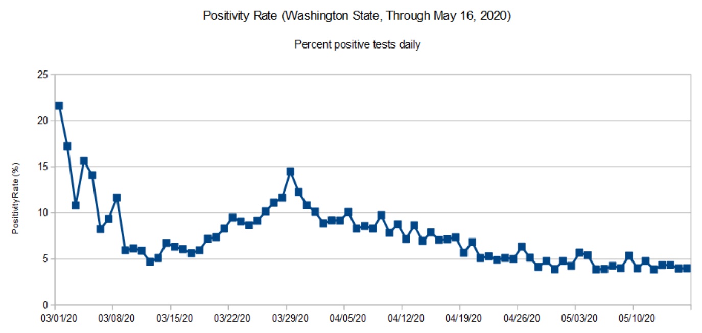
As noted in previous posts, data from the Washington State Department of Health (DOH) lags a little bit as reports arrive from county health departments. So, the DOH chart (below) covers the period up to May 16 (about ten days ago at the time of this writing).
Washington State daily positivity rate (DOH, May 16, 2020)
The trend in the DOH daily positivity rate (percent positive tests per day) is decidedly downward. It’s worth noting, however, how fast a community can move up the curve than down. The difference between the upward slope and downward slope should make people cautious — we don’t want to be on the wrong side of the curve again. It’s better to knock the disease to its knees and keep it there than to suffer a series of waves, even small waves.
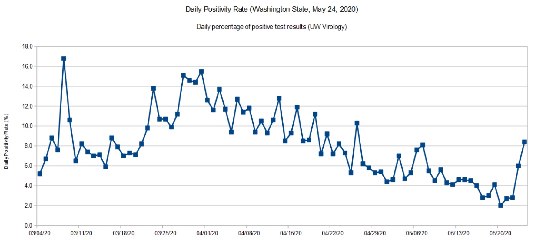
Washington State daily positivity rate (UW, May 24, 2020)
I don’t see a similar up-turn in the latest daily stats from the DOH, so I’m quite curious as to the cause for a higher positivity rate in UW’s most recent data. Did the lab test more samples from a COVID-19 cluster under investigation? Are there quality issues with the samples or test materials? I hope that they are looking into these questions.
I recommend reading this excellent report from the Imperial College COVID-19 Response Team: H Juliette Unwin, Swapnil Mishra, Valerie C Bradley et al. State-level tracking of COVID-19 in the United States (21-05-2020), doi: https://doi.org/10.25561/79231
The report provides a timely analysis and summary of COVID-19 in the United States, including an estimate of the effective transmission rate (Re) for each state. The report is licensed under a Creative Commons Attribution NonCommercial NoDerivatives 4.0 International License.
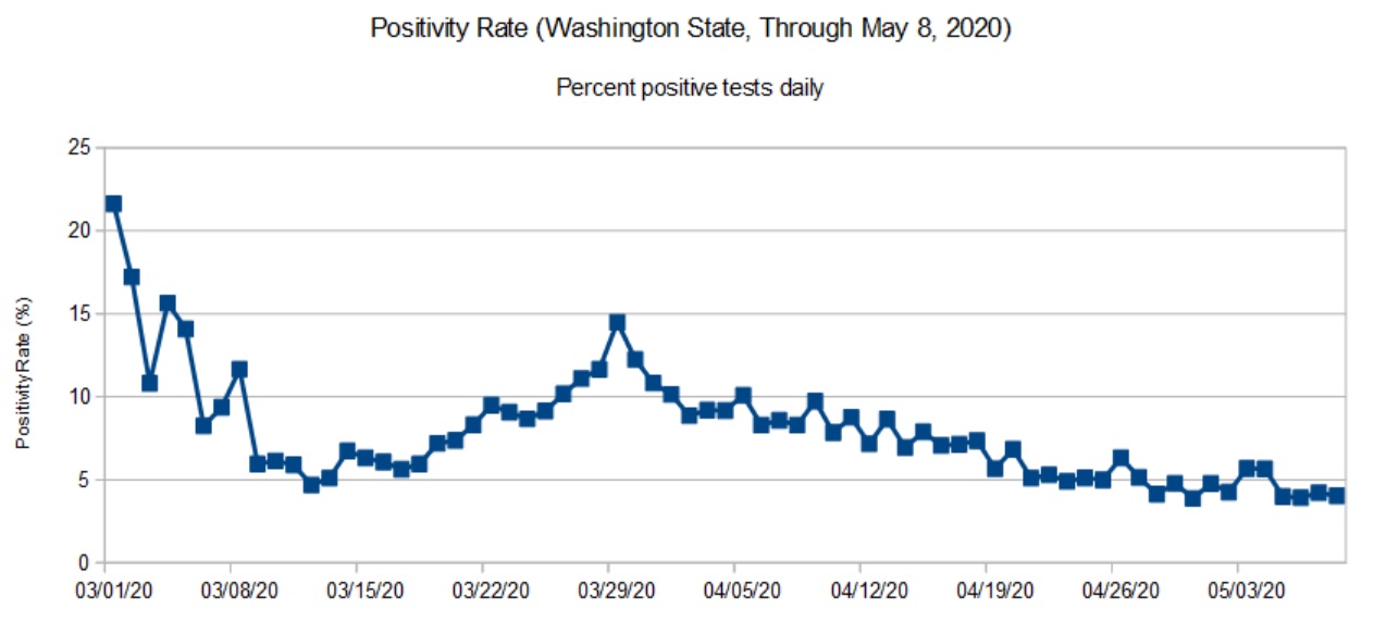
Daily positivity rate for Washington State (DOH, May 8, 2020)
The DOH reports (relatively) complete data through May 8. That’s why the title of this page refers to “May 8” even though I’m posting these charts on May 18.
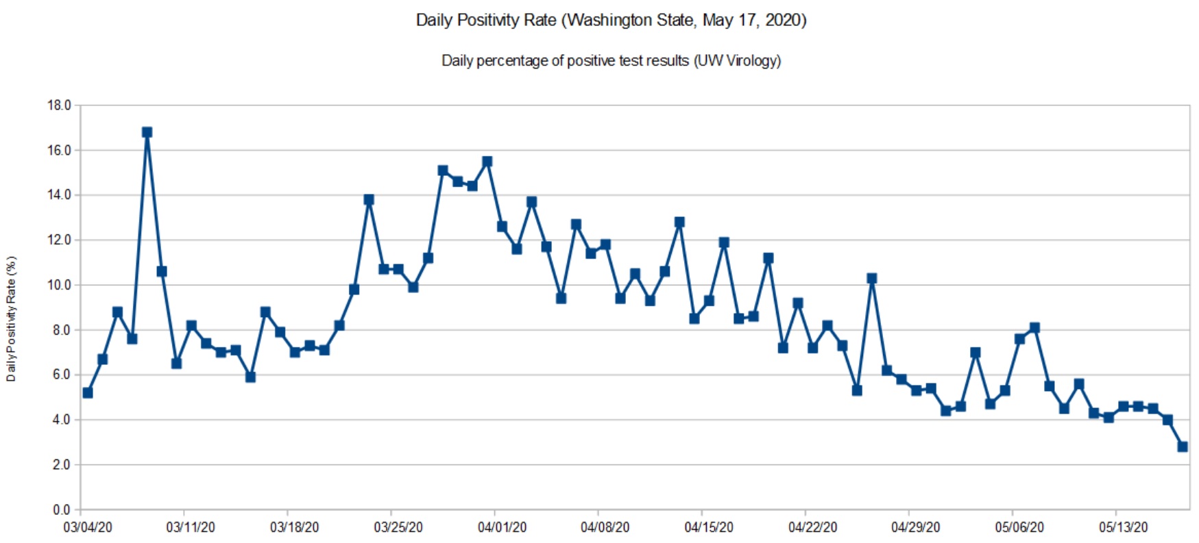
The UW Virology Laboratory performs a significant portion (about 40%) of the COVID-19 testing in Washington State. Approximately 90% of the tests performed by UW are for patients in Washington itself. [Click images to enlarge.]
Daily positivity rate for Washington (UW, May 17, 2020)
The UW data is current up to the present date (May 17, 2020). So, you may think about UW’s positivity rate as a glimpse at the past week before the DOH statistics roll out. Like the DOH trend, there was a slight up-tick at the end of April and beginning of May, which is now settling back down.
I’m quite happy to see the downward trend and that we are keeping the disease in check. We are going to the dentist tomorrow (!) and it will be interesting to see how they handle the situation.
The virus is still out there. The CDC MMWR should make everyone wonder about choir/music rehearsals and performance in the near- to medium-term future. We need to take this health threat seriously until people are vaccinated.
After making slow progress against COVID-19, Washington State lost a little ground during the last two weeks. We aren’t heading up the steep slope, but the unusually good weather has brought people out of isolation.
Here we see a more definite up-tick in recent days. As a state, we need to double-down on social distancing — it’s too soon to give up! I don’t think anyone really wants to go through another long lock-down. It’s better to quash COVID-19 and keep it down. Anything less delays economic recovery.
The Institute for Disease Modeling (IDM) estimates the effective reproductive number (Re) for King County, Washington. King County is the most populous county in Washington covering much of the Seattle metropolitan area. (Snohomish County fringes on the metro area, it’s main population center is Everett.)
IDM reports both a likely range for Re (95% confidence interval) and a best estimate for its value on a particular date. The table below summarizes their findings:
    Date            Lower  Upper  Best Est
    --------------  -----  -----  --------
    March 25, 2020   0.30   1.20      0.73
    April 4, 2020    0.55   1.33      0.94
    April 15, 2020   0.28   1.00      0.64
    April 27, 2020   0.47   1.32      0.89
IDM base their analysis on data from the Washington Department of Health and mobility (traffic) data. IDM’s best estimate of cumulative incidence through April 20 is 2.1%, meaning that 2.1% of the community has or has had COVID-19 as of April 20.
Worrisome, IDM hasn’t found Re to have dropped definitively below one for Eastern Washington. Although Western Washington has made progress, Eastern Washington is not improving. The number of new cases tracks Re. When Re increases, the number of new cases increases, too, lagging in time by the COVID-19 incubation period.
Please remember that we are shooting for an Re less than one, meaning that the spread of SARS-CoV-2 (the virus which causes COVID-19) is slow enough to prevent a rapid rise in new cases. Social distancing, contact tracing and isolation are all about keeping Re as far below one as possible.
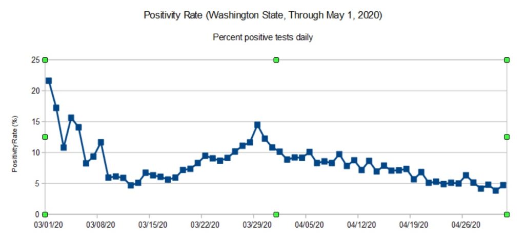
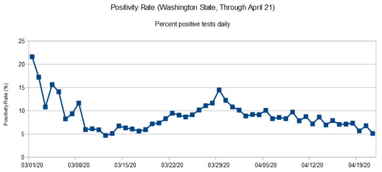
To kick things off, here are my latest graphs for the Washington State COVID-19 positivity rate. The positivity rate is the daily percentage of positive COVID-19 tests. Like the daily new case count, we’re hoping to see a downward trend over time as community mitigation (AKA “social distancing”) slows the effective infectiousness (REFF) of SARS-CoV-2.
Washington State daily positivity rate (DOH, April 21, 2020)
The first graph is based on data from the Washington State Department of Health (DOH). DOH aggregates data across the entire state. Data for most recent days are incomplete and I have not included partial results in the graph.
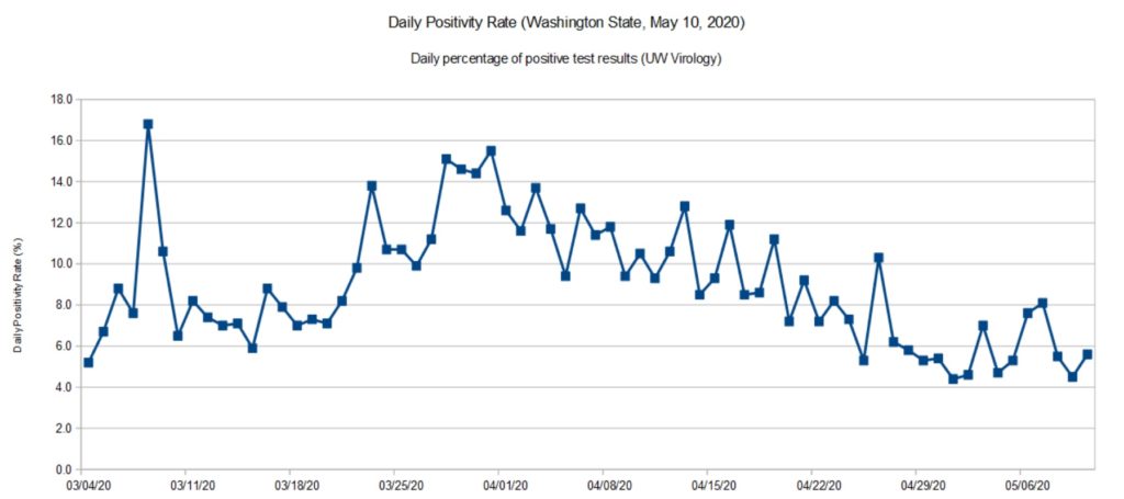
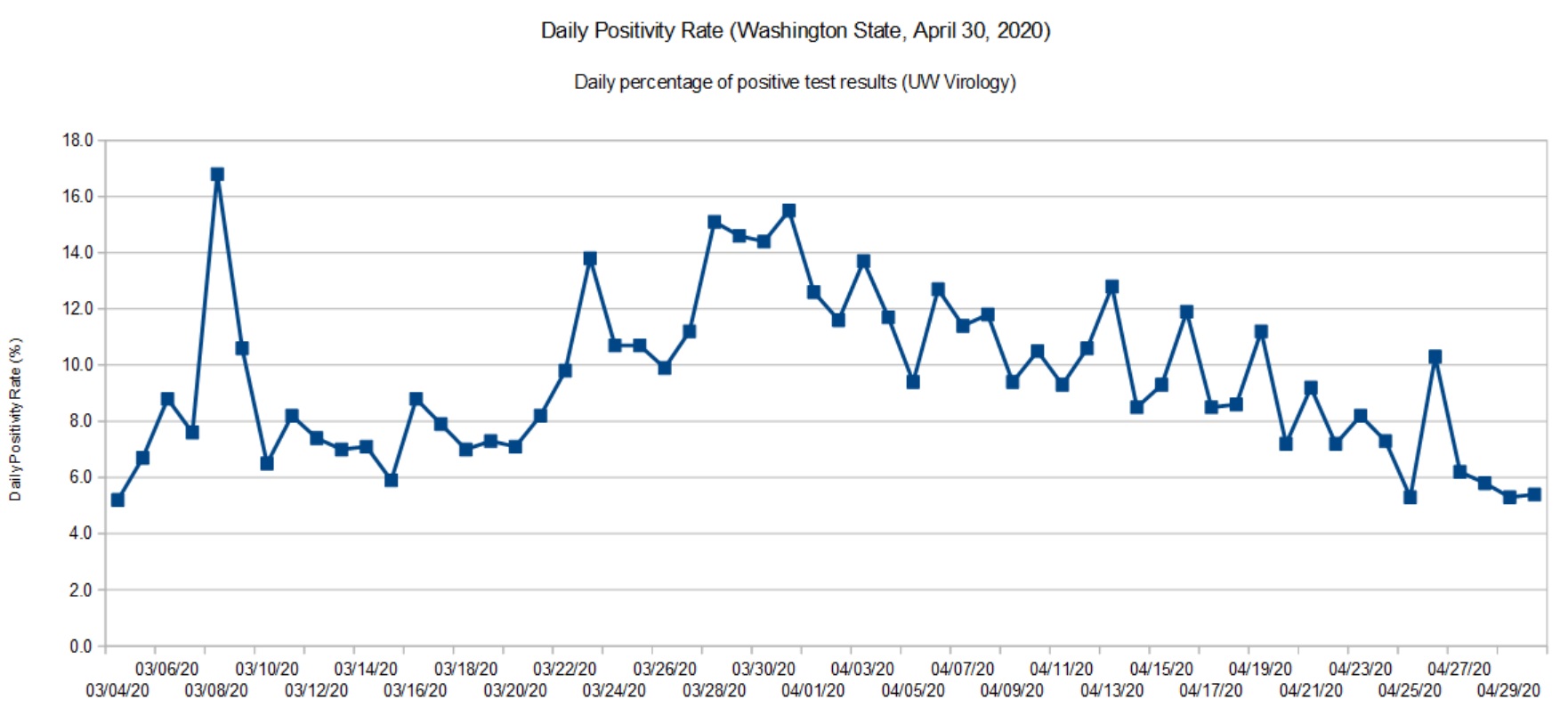
Washington State daily positivity rate (UW Virology, April 30, 2020)
The second graph is based on data for the University of Washington (UW) Virology Laboratory. The UW chart is up-to-date because they don’t have the same aggregation and reporting responsibility as DOH. For UW, it’s specimens in, and test results out. The UW results are sent to DOH where they are eventually folded in.
Both graphs show a steady decline. In terms of positivity rate, we’re back to where we were in mid-March. The peak occurred around March 28.
SARS-CoV-2 is still circulating in the community. I think Governor Inslee has made the right decision to go slow on “re-opening.”
The positivity rate is an imperfect indicator of the actual infection rate in the general population. Given the total number of confirmed cases (14,327) and assuming that ten times as many people are actually infected (143,000), that’s an overall infection rate of 2%. Normally, a disease doesn’t slow down until the infection rate is 50% to 60% (so-called herd immunity). Two percent is insignificant and SARS-CoV-2 could easily “burn” through the population if it is left unchecked.
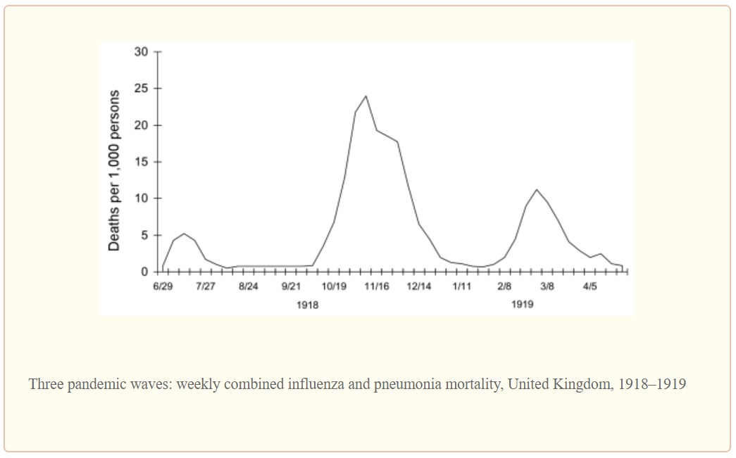
Are we heading toward 1918, again?
The Centers for Disease Control and Prevention (CDC) site has an extensive section about the 1918 influenza pandemic in the United States. The pandemic was caused by an H1N1 virus. The disease was first identified in the United States during the spring of 1918, eventually killing 675,000 people in the U.S. The number of deaths worldwide is estimated at 50 million people.
Due to poor record keeping and other factors, a true accurate tally of infections and deaths is not possible. All figures are estimates.
If you’re at all familar with recent events in the United States, the 1918 pandemic timeline should make your hair stand on end.
March 1918: Outbreaks of the flu are first detected. This is the beginning of the first wave.
April 1918: Cases and deaths are reported by public health officials.
Summer 1918: The first wave crests and declines.
September 1918: The second wave emerges.
October 1918: 195,000 Americans are killed by the virus during October alone.
November 1918: The fatal second wave subsides. America celebrates World War I Armistice (parades, etc.) setting up a third wave of infection.
December 1919: A third wave begins.
April 1919: The third wave subsides.
The second wave was the most deadly wave and was responsible for most of the losses in the U.S. The timing is eerily similar to the COVID-19 outbreak in the U.S.
The graph below illustrates the lethality of the three waves (as measured in the United Kingdom).
1918 Influenza: The Mother of All Pandemics, Taubenberger and Morens, January 2006
Barely two months into the COVID-19 pandemic, seventeen states are reopening partially and six states are lifting orders or reopening soon. [The New York Times, May 1, 2020] Some of the states have not satisfied the WhiteHouse/CDC gating criteria for reopening.
I fear that this is too soon to declare victory or to even imagine a return to a normal (pre-pandemic) state of affairs in one or two months. Dr. Anthony Fauci (NIH), Dr. Robert Redfield (CDC) and other health officials have warned about a second wave in Fall 2020. Be assured, SARS-CoV-2 will continue to circulate in the population during the summer months just like the 1918 H1N1 influenza virus. The American populace is just as vulnerable to an COVID-19 outbreak as it was in January 2020.
I genuinely hope and pray that we haven’t set outselves up for an extremely fatal second wave of COVID-19. Are we doomed to repeat history?
Stay the course and stay healthy — P.J. Drongowski
The daily positivity rate is the percentage of positive COVID-19 test results for each 24 hour period. The rate adjusts for the number of tests which varies from day to day.
The daily positivity rate is a useful metric, but an imperfect one. As I’ve said in previous posts, we need a proper epidemiologic study of COVID-19.
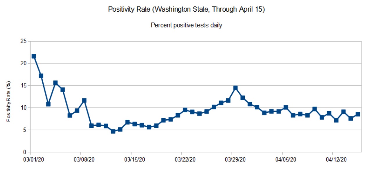
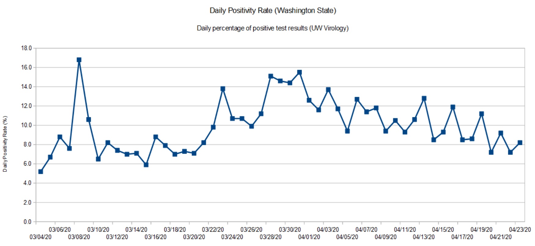
The first graph (below) is the daily positivity rate for Washington State though April 15. Why April 15 and not today, 24 April 2020? The Department of Health does not guarantee complete data for the most recent days. The data through April 15 is (nearly) complete although a few test results still trickle in.
Washington State daily positivity rate (April 15, 2020)
As noted in the graph posted last week, the state is past the peak and is in a slow decline. The peak occurred in late March. The daily positivity rate has declined to where it was in mid-March.
For comparison, here is the data from the UW Virology Lab. UW performs testing for and county and state health authorities. [Click images to enlarge.]
University of Washington positivity rate (April 23, 2020)
The shape of the graph is consistent with the overall state data. The Virology Lab data is up-to-date since they just report daily results for the lab itself (samples in, results out).
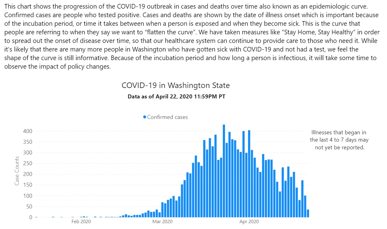
The Washington State epidemiologic curve (below) is informative, too. Known cases are tallied by the date of illness onset.
Washington State epidemiologic curve (April 22, 2020)
The epidemiologic curve shows a steady decline due to community mitigation, also known as “social distancing.” This is good news.
To complete the picture, here is the epidemiologic curve for Snohomish County, where I live.
Snohomish Country epidemiologic curve (April 15,2020)
Snohomish County shows a similar decline in new confirmed cases. Again, this is good news.
The big question for Governor Inslee and other decision makers is “How low is enough?” The answer to this question determines when social distancing can be relaxed. Currently, social distancing is expected to be in place until May 4th at the earliest. Hopefully, Washington will beef up contact tracing and isolation over the next two weeks. Then, it’s whack-a-mole.
Stay distant and stay healthy. Science works — P.J. Drongowski
My weekly chart showing the positivity rate for Washington State is a tad late. The Washington Department of Health (DOH) has been busy fixing and upgrading its web site. The new site is a quite an improvement with informative charts, graphs and tables.
Looking at their data, I can appreciate the depth of their collection and reporting problems. Their old database was a “peacetime” tool, collecting positive results from a few of Washington’s many counties. In the fight against COVID-19, all counties are reporting at once and epidemiologists and decision makers want and need additional data about the number of tests, sex, age, etc. Of course, doing all of this work in the middle of a crisis must raise the IT stress level!
The state DOH site now reports detailed testing information in the form of a bar chart. The bar chart shows the number of positive and negative tests each day based on specimen date. This is a meaningful time base as it allows a snapshot of the positivity rate on a given day. It’s much harder to organize test data in this way than just lumping test results willy-nilly as they come in. (See “stress level” above.)
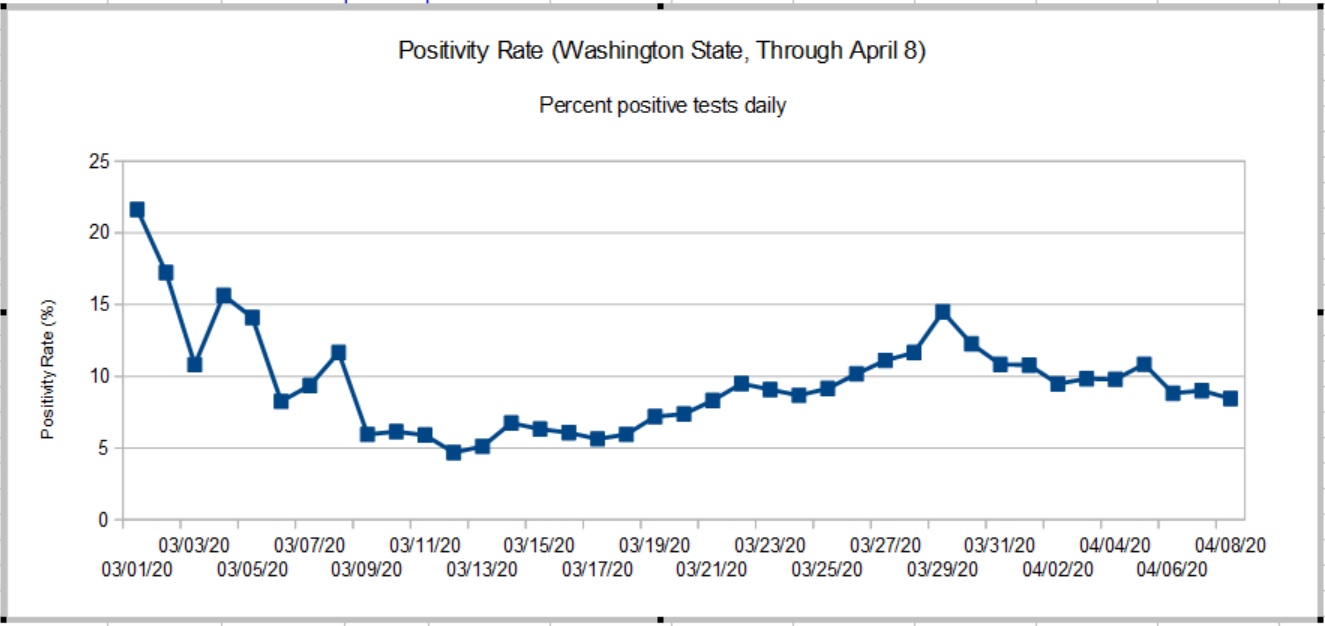
Because all test results for a given specimen day do not arrive at once, the DOH doesn’t guarantee complete results for the days just past. In keeping with their approach, my graph shows the Washington State positivity rate through April 8, 2020. [Click to enlarge graph.]
Washington State Positivity Rate (Through April 8, 2020)
The true peak in the rate occurred on March 28-29, 2020 when it hit 14.49%. The positivity rate has been slowly declining since then. The peak rate was more than double the 5% to 6% rate established around March 10. The new chart agrees reasonably well with raw statistics from the University of Washington Virology Laboratory. UW results, of course, are large portion of the State’s results. A back-of-the-envelope estimate shows that the rate has improved after April 8. Stay tuned.
So, what about those high rates in early March?
The positivity rate is a rather poor indicator which is subject to bias. COVID-19 tests are only administered under certain specific conditions because testing is rationed. Criteria include COVID-19 symptoms (fever, cough, tiredness, difficulty breathing) or contact with a known infected person. Properly, first responders may be given preference since they are most likely to come into contact with infectious people who may or may not be symptomatic. Further, COVID-19 hits nursing homes with vulnerable residents early and hard.
The general public has not been tested in a systematic epidemiological study, i.e., a random sampling of the population at large. Thus, the positivity rate as measured here is imperfect and may not accurately represent what the disease itself is doing in the overall community.
Contact is an important biasing factor and it is why I do not consider results in early March to be baseline. Public health authorities were actively pursuing contacts in early March after the first case of community spread was detected. The number of daily tests ranged from 74 to 500 — small numbers which are easily skewed.
As I’ve mentioned in earlier posts, today’s statistics tell us what the disease was doing 10 to 14 days ago due to the time required for incubation, development of symptoms, clinical presentation, and testing. Washington’s first community mitigation measures went into effect on March 11, with home-stay recommended on March 16 and home-stay ordered on March 16. I think we can safely say “Community mitigation works.”
Now we need the patience to finish the job and win the fight.