
Updated March 26, 2020.
State-by-state
Governor Cuomo, in his briefing today, asked why New York State is leading the United States in positive COVID-19 cases. Let’s compare the top four states:
                     Total   Total   Percent
    State            Tests   Cases  Positive  Date
    -------------   ------  ------  --------  ----
    New York        38,390  14,904     38.8%  3/24
    Massachusetts   13,749   1,159      8.4%  3/24
    California      27,650   2,102      7.6%  3/24
    Washington      33,933   2,221      6.5%  3/23
Indeed, New York State has the highest percentage of positive tests — substantially higher. There must be a factor in play. Could there be a difference in testing (i.e., difference in the test kits? different test protocol?) Did SARS-CoV-2 hit New York State sooner? Is COVID-19 more prevalent due to the population density in the New York City region, as the Governor speculated?
Only a good epidemiological study could really measure the prevalence of SAR-CoV-2 in the community. As to timing, I don’t think we will ever know when SARS-CoV-2 hit our shores. New York City is a major global transportation hub. Even so, Washington and California have strong business and family ties across the Pacific and Pacific rim and have major transportation hubs (Los Angeles, San Francisco, San Diego, Seattle).
If I get a chance today, I’m going to look into our neighbor to the north, Vancouver. Vancouver is also quite connected with Asia and the Pacific rim.
The Washington Department of Health has had difficulties with its COVID-19 database. Although they posted a new number of positive cases, 2,469 as of March 24, the number of negative cases was not updated, showing the same total negative test count as of March 23.
The national picture
The New York Times has published many informative graphs and simulations during the COVID-19 crisis. The chart below shows the spread of SARS-CoV-2 (the virus) and COVID-19 (the disease caused by SARS-CoV-2) across the United States as of March 19, 2020.
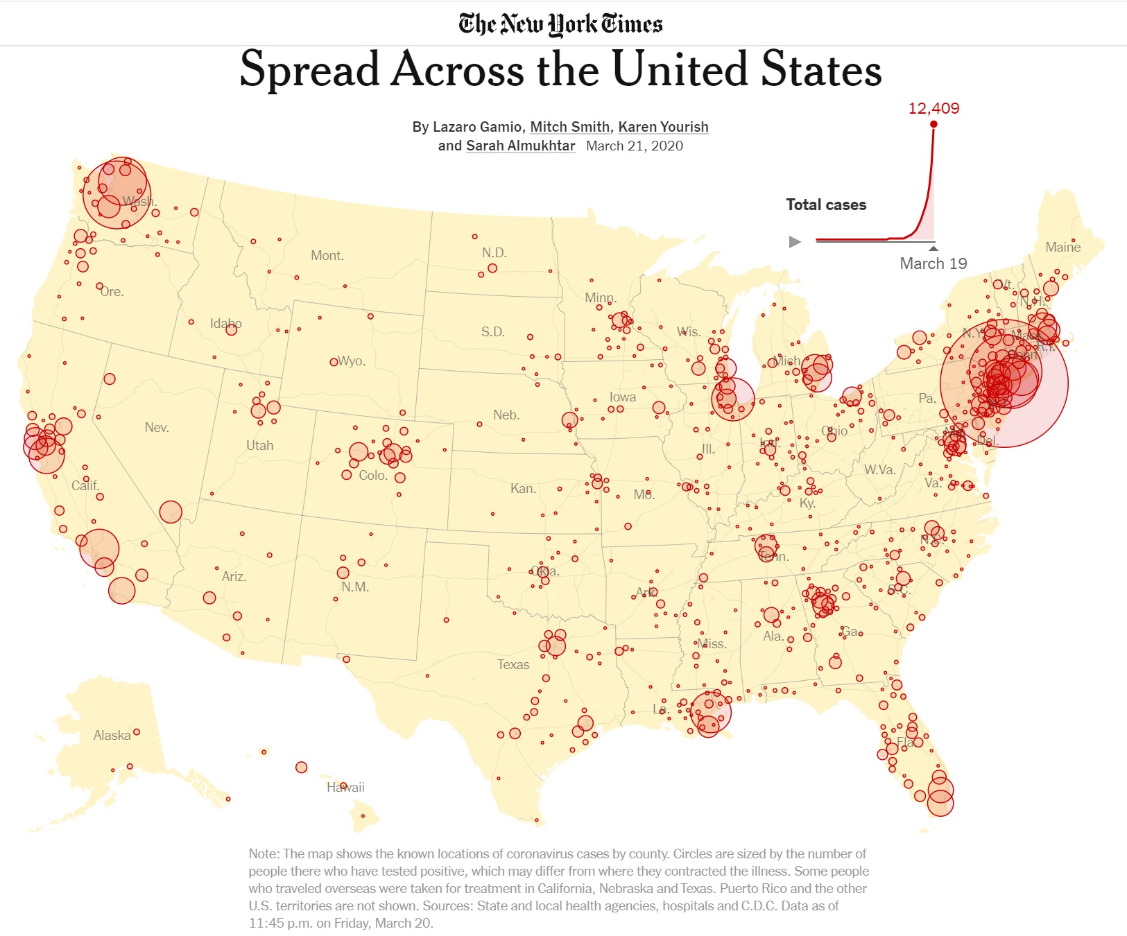
The chart illustrates how population density affects the number of COVID-19 cases. [Click to enlarge.] The biggest circles coincide with the major urban centers in the United States. On the west coast are Seattle-Tacoma-Washington, the San Francisco Bay area, and Los Angeles, for example.
The chart demonstrates why it isn’t appropriate to think numerically about the country as a whole. Sure, Americans want to know how the U.S. is doing overall. However, when it comes to actual COVID-19 containment and mitigation, it’s a local, regional problem. That’s why our county and municipal health departments are so important and local statistics are the most meaningful and practical.
All is not local, however. The urban centers are connected by highways and air routes, giving SARS-CoV-2 passage. As the disease plays out, the coastal urban centers with the greatest population and density will likely succumb first, followed by so-called second tier cities. When the disease subsides in major urban centers, the second tier will maintain active reservoirs of SARS-CoV-2. If major urban centers drop community mitigation (e.g., social distancing) too soon, the active pools in the second tier will cause COVID-19 flare-ups in any major urban center that drops its mitigration too early.
Major urban centers are more tightly connected to global business and commerce than the second tier. SARS-CoV-2 likely arrived much earlier than the second tier and SARS-CoV-2 has probably been circulating in the first tier population for a longer time.
Italy
Media outlets have drawn many comparisons between the Unitet States and Italy. Let’s consider a few facts about Italy from the CIA World Factbook.
Italy’s land area is 294,140 sq km (square kilometers), roughly the size of Arizona (294,207 sq km). Italy’s population is estimated to be 62,402,659 people (July 2020). California is the most populous state with 39,512,223 residents (July 2019). Overall, Italy has as many people as California and New York State combined in a smaller land mass (Arizona).
Italy’s Lombardy region is, arguably, the Italian region most severely affected by COVID-19. Lombardy is located in northern Italy with the major urban center Milan as its capital.
Lombardy has 10,078,012 people (August 2019). It is the most populated region in Italy. It’s population is roughly the size of Michigan (or North Carolina, or Georgia). Lombardy, by population, would be the tenth largest state in the U.S. Lombardy is 23,844 sq km, roughly the size of West Virginia. Lombardy has a population density of 420 people per sq km.
The city of Milan has 1.369 million people. (The World Fact Book claims 3.140 million people, but it depends on how one draws boundaries.) Milan has a population density of 7,572 people per sq km (2019). That’s roughly the same density as Huntington Park (Los Angeles metro) or Somerville (Boston metro). New York City has a population density of 10,431 people per sq km. [I taught in Somerville; it’s dense.]
Lombardy accounts for 68% of COVID-19 fatalities in Italy. 23% of Italians are 65 or older, making it the second oldest population in the world. (Japan is first.) Age and underlying health conditions are known COVID-19 vulnerabilities. High population density and more elderly people (with existing health issues) are a fatal combination of factors.
Temperature
One final observation because it involves maps. The Kinsa US Health Weather Map has received media attention including MSNBC’s The Rachel Maddow Show. (Hi, Rachel.)
The Health Weather Map is a visualization of seasonal illness linked to fever as measured by Kinsa Smart Thermometers. The Kinsa Thermometer connects to your device (and the Kinsa App) via Bluetooth. The Kinsa Thermometer costs about $20-$25 USD retail and requires the Kinsa App for Web communication.
Here is today’s map (March 26). [Click to enlarge.]
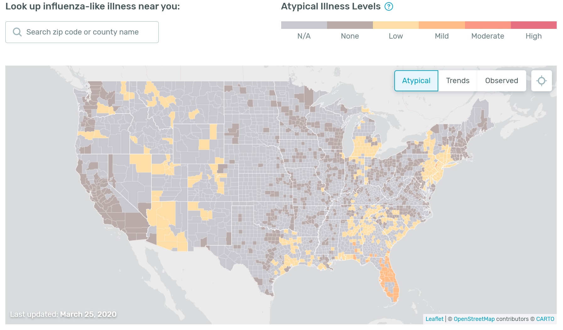
I look at the Health Weather Map with interest, but take it with a grain of salt. There are two factors to consider.
- Although the Kinsa Thermometer is inexpensive, it needs an expensive smart device in order to communicate results via the Web.
- It’s not clear how people use the thermometer, i.e., do they take their temperature every day? When they feel sick?
Given the need for a smart device and Internet connection, I’m not sure if Kinsa users represent the population at large. Use of the device may bias results, too. If users take their temperature only when they are sick, then the map will show more high temperatures. Ah, well, I need to dig into their study. [Thank you, Kinsa, for posting your methodology.]
Stay apart, mate, and we’ll both be healthy — P.J. Drongowski