
New York, New York
Life has dropped into a bit of a routine. Get up, start the coffee pot and watch the briefing by Andrew Cuomo, Governor of New York. The Guv can be a little tedious and pedantic (well-known characteristics to New Yorkers), but he is a wonderful communicator. First, he speaks slowly and in simple, clear sentences — good for people for which English is not their first language.
He also has been presenting clear statistics on testing and the number of new COVID-19 cases. His interpetation and remarks are correct. The more you test, the more you will find the disease. One of his charts today had three columns: locality (county and entire state), cumulative COVID-19 cases to date and the number of new cases identified for the preceding 24 hour period. At the very least, the Governor needs to add a fourth column, the number of tests performed during the preceding 24 hour period. The fourth column would show the concurrent growth of new cases and tests.
I also heard the Governor struggling, just a bit, to put the number of new cases in context with the growth in testing. [New York has done an excellent job of ramping up its testing, BTW.] That’s where the ratio of new cases to tests comes into play:
Percentage of new positive cases = ((New cases) / (New tests)) * 100
I get that most people do not think in terms of ratios between 0.0 and 1.0, so this measure can and should be expressed as a percentage.
The percentage (ratio) accounts for the growth in testing. I believe that this percentage (ratio) is a better tracking metric than the raw number of new cases alone. It is certainly better than the cumulative number of COVID-19 cases since the beginning of the epidemic. The cumulative number expresses the depth of suffering, but it does not adequately convey the growth or decline of the disease. Given that we will experience recurring waves of COVID-19 (if we suppress this disease successfully), the cumulative number of cases alone will obscure the rise and ebb of COVID-19.
I was encouraged to see New York using a metric similar to my COVID-19 Key Performance Indicator (KPI). New York officials are monitoring the number of all acute care patients. This is the most relevant number with respect to the capacity of the health care system. Please note that acute care includes all of the “every day” acute care patients (heart attacks, strokes, etc.) and COVID-19 patients. All of these patients need to be hospitalized and all of them put a load on the health care system.
If I have to add a public service announcement (PSA) of my own, please don’t drive under the influence and please don’t drive distracted (i.e., texting). Hospital emergency rooms don’t need additional patients. And be careful with that axe, Eugene.
The Seattle Times
I’d like to give a shout-out to my (new) hometown newspaper, The Seattle Times. They publish a concise daily summary of new and cumulative test results (March 19, 2020 below; click to enlarge).
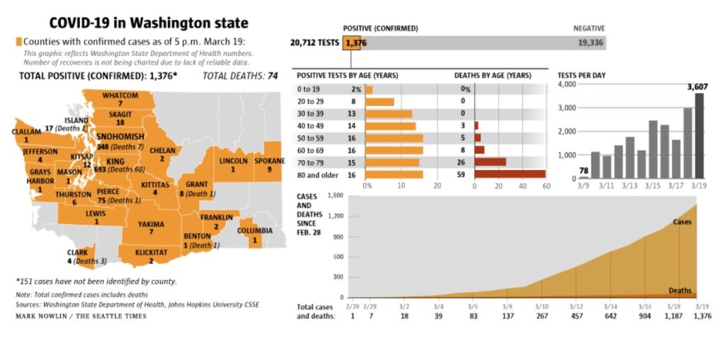
The summary has the daily number of tests performed, positive cases identified and negative cases. Charts break out positive cases and deaths by age. Tests per day has its own chart and shows the growing number of tests. There is a chart showing the cumulative number of positive cases and deaths over time since February 28.
All good work. The raw figures come from the Washington State Department of Health, who should be commended for their transparency.
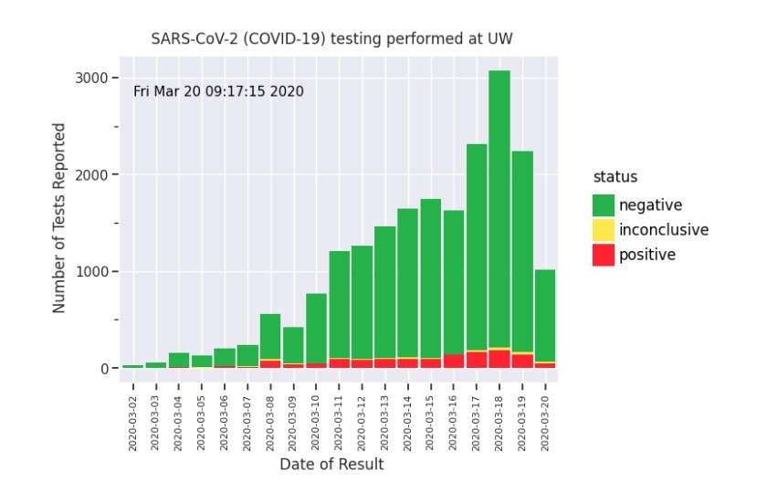
My one suggestion is to add a chart showing the test results over time, like the graph published by the University of Washington Virology Laboratory (below).
UW Virology
The UW Virology Laboratory upped their game and publish daily results in the UW Virology COVID-19 Dashboard. [Click images to enlarge.]
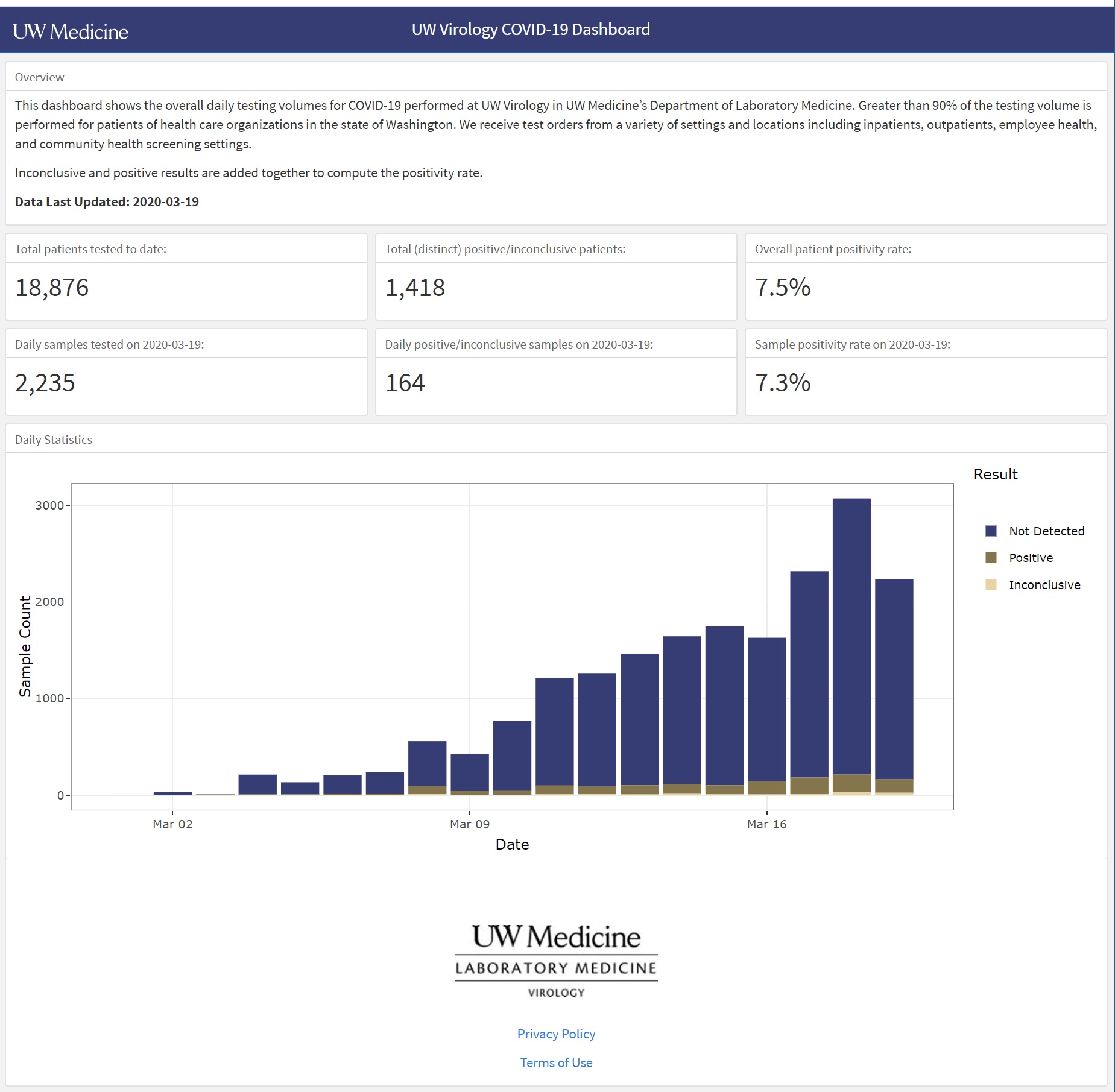
This is a screenshot of the dashboard for March 19, 2020. It’s easy to see the number of tests (“Sample Count”) performed each day, the number of positive and negative cases identified, and the number of inconclusive results. You can hover the cursor over a bar segment and get the raw count for the chosen segment.
Very nice work. The trend of positive cases is easy to see. The chart shows the raw number of positive cases, so interpretation is still biased by the number of tests performed. A separate chart is needed which plots the percentage of new positive cases over time.
One additional suggestion for UW Medicine — Please explain “Inconclusive”.
As I mentioned yesterday, each day’s results are a glimpse into the past. COVID-19 has a 2 to 14 day incubation period according to the CDC. Other medical experts estimate the infection to test delay at 10 to 14 days (infection, incubation, symptoms, clinical presentation, test). Even though the trend of new COVID-19 cases is relatively flat, we won’t really know for another 14 to 21 days if we successfully flattened the curve and delayed onset of the disease in the community.
Keep the faith and keep healthy — P.J. Drongowski