Washington State Daily Positivity Rate (DOH, May 26, 2020)
The DOH positivity has taken a definite upswing during the last week. Folks are getting antsy and highway traffic is noticeably heavier. The morning traffic report is back to yellow and red trouble spots on the local highways. Mobility has definitely increased as we will probably see in the next report from the Institute for Disease Modeling.
It will be 10 to 14 days before we see the effect of protests in the Seattle area. Large gatherings of people are definitely spreader events.
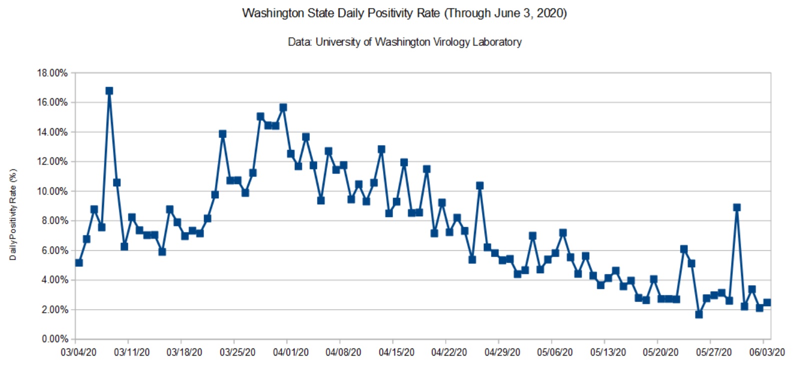
Washington State Daily Positivity Rate (UW, June 3, 2020)
The data from UW had a localized bump. This may be the result of contact tracing within a cluster. I wish the UW site was a little more informative, but interpretation is really DOH’s job.
I still see and hear local media reporting observations like “The number of cases dropped dramatically yesterday.” Raw case counts are relatively meaningless unless the number of tests are taken into account. That’s why I’m tracking the daily positivity rate — the percentage of positive test results for each day.
Here’s an example to show what I mean. Testing (and reporting) dips over the weekend. The number of weekend (Saturday and Sunday) tests is typically less than half of weekday tests. Here are the mostly values reported in the media
The first three columns are the cumulative metrics published by DOH. The last three columns are the number of positive tests, tests performed and positivity rate for each day. The date is the reporting date, so June 1 (Monday) covers the preceding Sunday.
Please note how fewer tests are performed on Sunday than Monday. Sure, the number of raw positive cases on Sunday is dramatically lower Monday. However, the positivity rate is higher for Sunday is actually higher. Yep, the local news station was touting the Sunday number! This is fundamental numeracy, people.
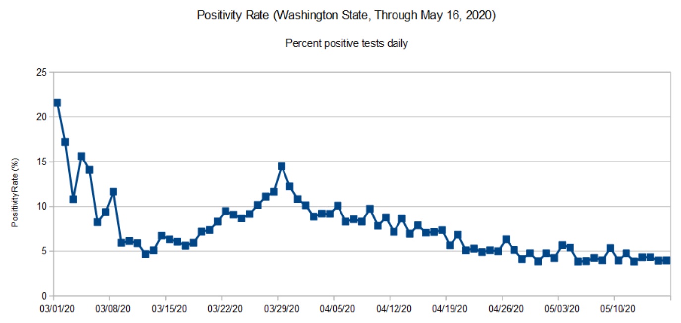
As noted in previous posts, data from the Washington State Department of Health (DOH) lags a little bit as reports arrive from county health departments. So, the DOH chart (below) covers the period up to May 16 (about ten days ago at the time of this writing).
Washington State daily positivity rate (DOH, May 16, 2020)
The trend in the DOH daily positivity rate (percent positive tests per day) is decidedly downward. It’s worth noting, however, how fast a community can move up the curve than down. The difference between the upward slope and downward slope should make people cautious — we don’t want to be on the wrong side of the curve again. It’s better to knock the disease to its knees and keep it there than to suffer a series of waves, even small waves.
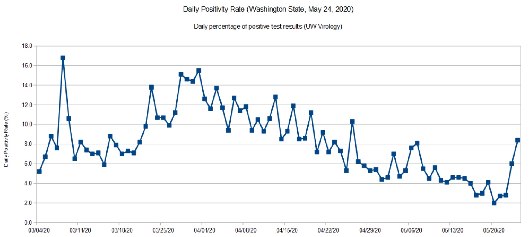
Washington State daily positivity rate (UW, May 24, 2020)
I don’t see a similar up-turn in the latest daily stats from the DOH, so I’m quite curious as to the cause for a higher positivity rate in UW’s most recent data. Did the lab test more samples from a COVID-19 cluster under investigation? Are there quality issues with the samples or test materials? I hope that they are looking into these questions.
I recommend reading this excellent report from the Imperial College COVID-19 Response Team: H Juliette Unwin, Swapnil Mishra, Valerie C Bradley et al. State-level tracking of COVID-19 in the United States (21-05-2020), doi: https://doi.org/10.25561/79231
The report provides a timely analysis and summary of COVID-19 in the United States, including an estimate of the effective transmission rate (Re) for each state. The report is licensed under a Creative Commons Attribution NonCommercial NoDerivatives 4.0 International License.
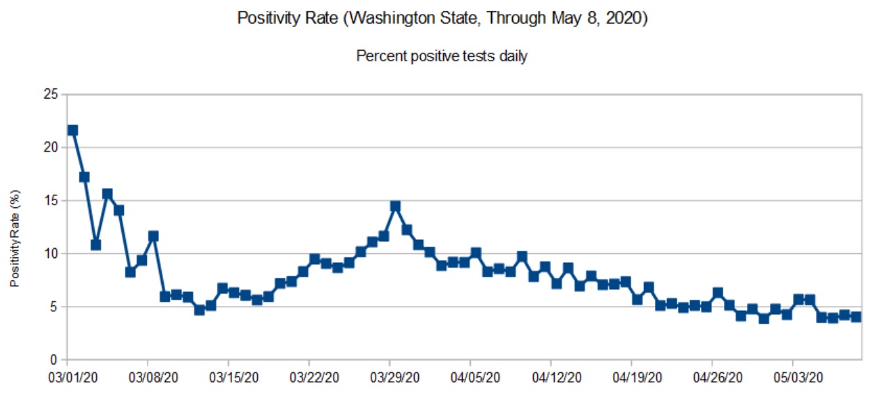
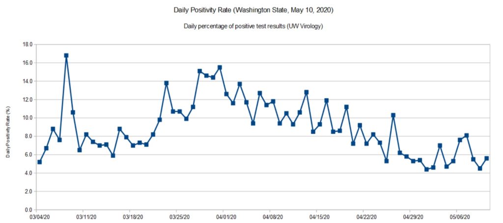
Daily positivity rate for Washington State (DOH, May 8, 2020)
The DOH reports (relatively) complete data through May 8. That’s why the title of this page refers to “May 8” even though I’m posting these charts on May 18.
The UW Virology Laboratory performs a significant portion (about 40%) of the COVID-19 testing in Washington State. Approximately 90% of the tests performed by UW are for patients in Washington itself. [Click images to enlarge.]
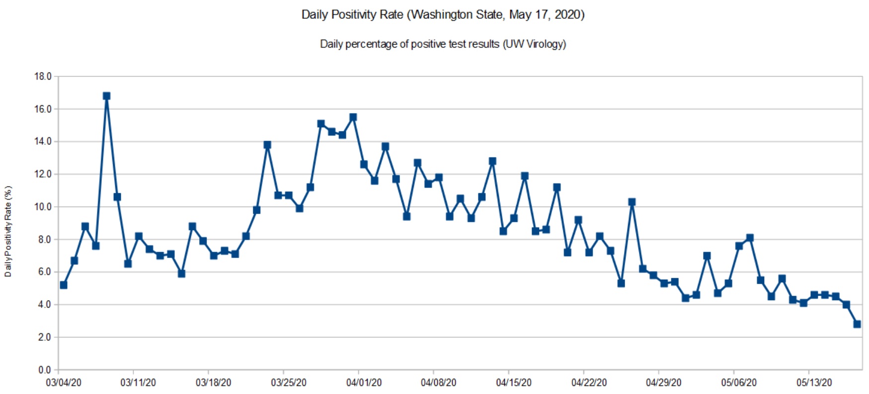
Daily positivity rate for Washington (UW, May 17, 2020)
The UW data is current up to the present date (May 17, 2020). So, you may think about UW’s positivity rate as a glimpse at the past week before the DOH statistics roll out. Like the DOH trend, there was a slight up-tick at the end of April and beginning of May, which is now settling back down.
I’m quite happy to see the downward trend and that we are keeping the disease in check. We are going to the dentist tomorrow (!) and it will be interesting to see how they handle the situation.
The virus is still out there. The CDC MMWR should make everyone wonder about choir/music rehearsals and performance in the near- to medium-term future. We need to take this health threat seriously until people are vaccinated.
After making slow progress against COVID-19, Washington State lost a little ground during the last two weeks. We aren’t heading up the steep slope, but the unusually good weather has brought people out of isolation.
Here we see a more definite up-tick in recent days. As a state, we need to double-down on social distancing — it’s too soon to give up! I don’t think anyone really wants to go through another long lock-down. It’s better to quash COVID-19 and keep it down. Anything less delays economic recovery.
The Institute for Disease Modeling (IDM) estimates the effective reproductive number (Re) for King County, Washington. King County is the most populous county in Washington covering much of the Seattle metropolitan area. (Snohomish County fringes on the metro area, it’s main population center is Everett.)
IDM reports both a likely range for Re (95% confidence interval) and a best estimate for its value on a particular date. The table below summarizes their findings:
    Date            Lower  Upper  Best Est
    --------------  -----  -----  --------
    March 25, 2020   0.30   1.20      0.73
    April 4, 2020    0.55   1.33      0.94
    April 15, 2020   0.28   1.00      0.64
    April 27, 2020   0.47   1.32      0.89
IDM base their analysis on data from the Washington Department of Health and mobility (traffic) data. IDM’s best estimate of cumulative incidence through April 20 is 2.1%, meaning that 2.1% of the community has or has had COVID-19 as of April 20.
Worrisome, IDM hasn’t found Re to have dropped definitively below one for Eastern Washington. Although Western Washington has made progress, Eastern Washington is not improving. The number of new cases tracks Re. When Re increases, the number of new cases increases, too, lagging in time by the COVID-19 incubation period.
Please remember that we are shooting for an Re less than one, meaning that the spread of SARS-CoV-2 (the virus which causes COVID-19) is slow enough to prevent a rapid rise in new cases. Social distancing, contact tracing and isolation are all about keeping Re as far below one as possible.
To kick things off, here are my latest graphs for the Washington State COVID-19 positivity rate. The positivity rate is the daily percentage of positive COVID-19 tests. Like the daily new case count, we’re hoping to see a downward trend over time as community mitigation (AKA “social distancing”) slows the effective infectiousness (REFF) of SARS-CoV-2.
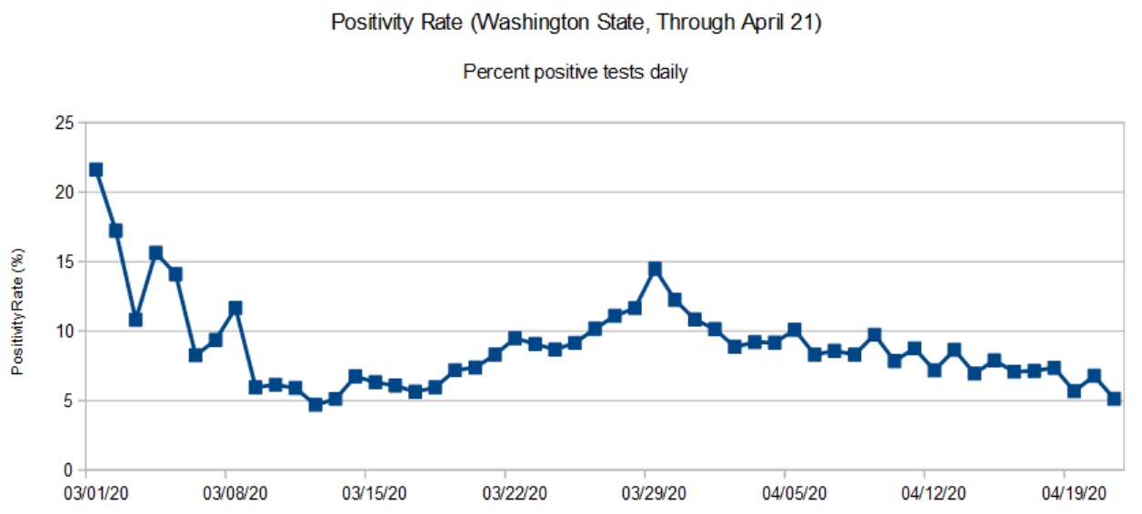
Washington State daily positivity rate (DOH, April 21, 2020)
The first graph is based on data from the Washington State Department of Health (DOH). DOH aggregates data across the entire state. Data for most recent days are incomplete and I have not included partial results in the graph.
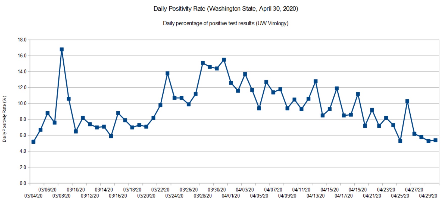
Washington State daily positivity rate (UW Virology, April 30, 2020)
The second graph is based on data for the University of Washington (UW) Virology Laboratory. The UW chart is up-to-date because they don’t have the same aggregation and reporting responsibility as DOH. For UW, it’s specimens in, and test results out. The UW results are sent to DOH where they are eventually folded in.
Both graphs show a steady decline. In terms of positivity rate, we’re back to where we were in mid-March. The peak occurred around March 28.
SARS-CoV-2 is still circulating in the community. I think Governor Inslee has made the right decision to go slow on “re-opening.”
The positivity rate is an imperfect indicator of the actual infection rate in the general population. Given the total number of confirmed cases (14,327) and assuming that ten times as many people are actually infected (143,000), that’s an overall infection rate of 2%. Normally, a disease doesn’t slow down until the infection rate is 50% to 60% (so-called herd immunity). Two percent is insignificant and SARS-CoV-2 could easily “burn” through the population if it is left unchecked.
Are we heading toward 1918, again?
The Centers for Disease Control and Prevention (CDC) site has an extensive section about the 1918 influenza pandemic in the United States. The pandemic was caused by an H1N1 virus. The disease was first identified in the United States during the spring of 1918, eventually killing 675,000 people in the U.S. The number of deaths worldwide is estimated at 50 million people.
Due to poor record keeping and other factors, a true accurate tally of infections and deaths is not possible. All figures are estimates.
If you’re at all familar with recent events in the United States, the 1918 pandemic timeline should make your hair stand on end.
March 1918: Outbreaks of the flu are first detected. This is the beginning of the first wave.
April 1918: Cases and deaths are reported by public health officials.
Summer 1918: The first wave crests and declines.
September 1918: The second wave emerges.
October 1918: 195,000 Americans are killed by the virus during October alone.
November 1918: The fatal second wave subsides. America celebrates World War I Armistice (parades, etc.) setting up a third wave of infection.
December 1919: A third wave begins.
April 1919: The third wave subsides.
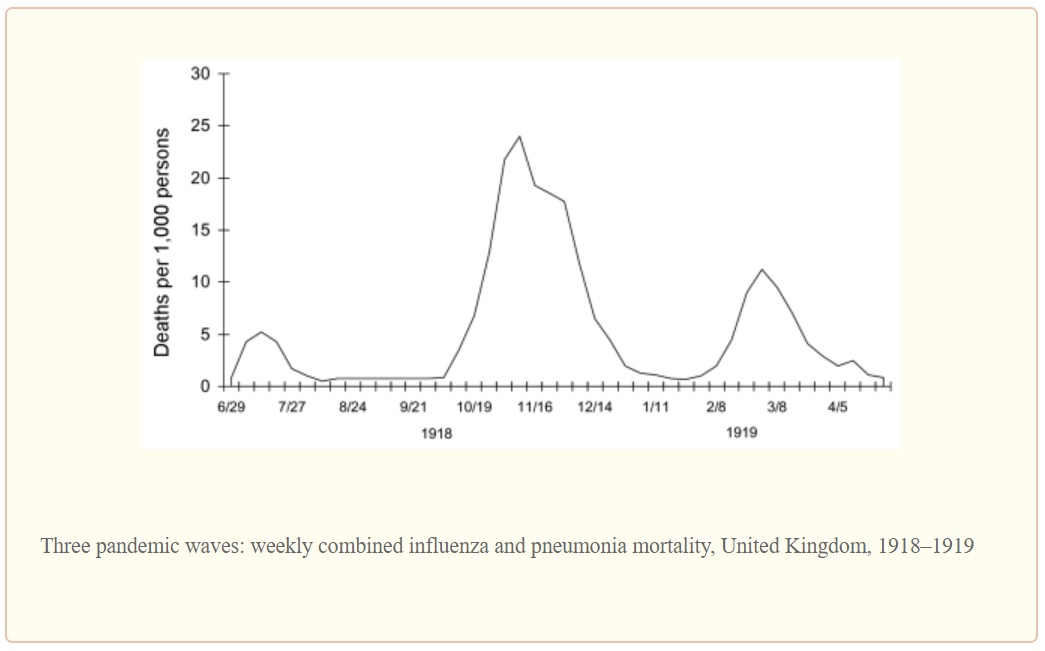
The second wave was the most deadly wave and was responsible for most of the losses in the U.S. The timing is eerily similar to the COVID-19 outbreak in the U.S.
The graph below illustrates the lethality of the three waves (as measured in the United Kingdom).
1918 Influenza: The Mother of All Pandemics, Taubenberger and Morens, January 2006
Barely two months into the COVID-19 pandemic, seventeen states are reopening partially and six states are lifting orders or reopening soon. [The New York Times, May 1, 2020] Some of the states have not satisfied the WhiteHouse/CDC gating criteria for reopening.
I fear that this is too soon to declare victory or to even imagine a return to a normal (pre-pandemic) state of affairs in one or two months. Dr. Anthony Fauci (NIH), Dr. Robert Redfield (CDC) and other health officials have warned about a second wave in Fall 2020. Be assured, SARS-CoV-2 will continue to circulate in the population during the summer months just like the 1918 H1N1 influenza virus. The American populace is just as vulnerable to an COVID-19 outbreak as it was in January 2020.
I genuinely hope and pray that we haven’t set outselves up for an extremely fatal second wave of COVID-19. Are we doomed to repeat history?
Stay the course and stay healthy — P.J. Drongowski
COVID-19 testing is very much in the news these days. Let’s take a look.
There are two main types of testing: detection of the pathogen (SARS-CoV-2) itself and antibody testing. In detective-speak, the first kind of testing looks for the perpetrator while the second kind of testing looks for the perpetrator’s footprints. The science and machinery are quite different. This article discusses the first kind of test: pathogen detection.
SARS-CoV-2 detection looks for the presence (or absence) of the pathogen’s genetic material. Genetic testing doesn’t try to match a sample against the entire SARS-CoV-2 genome. Instead, genetic tests target specific genes within the genome. It looks for specific sequences within SAR-CoV-2 genetic RNA. Unlike cells which store genetic information in DNA (deoxyribonucleic acid), the SARS-CoV-2 virus stores genetic information in RNA (ribonucleic acid).
The World Health Organization guidance recommends five target sequences which can be used to identify the presence of SARS-CoV-2:
Nucleocapsid gene (N)
Envelope gene (E)
Spike gene (S)
RNA-dependent RNA polymerase gene (RdRP)
The capsid and envelope genes code for the proteins forming the shell around the virus. The spikes are the proteins protruding from the shell and are the attachment points for cell infection. The RdRP gene codes for the chemical enzyme (polymerase) that assist the replication of virus RNA. The RdRP in this case is specific to SARS-CoV-2. All of these genes are SARS-CoV-2 fingerprints. (See “COVID-19: Know Your Foe.”)
The amount of RNA in a sample is very minute and is not sufficient for immediate chemical analysis. The sample RNA must be amplified, a fancy way of increasing the concentration (amount) of targeted RNA. These kinds of tests are called nucleic acid amplification tests (NAAT).
One form of NAAT is the reverse-transcription polymerase chain reaction (RT-PCR). You may have seen the term “RT-PCR” in the news. RT-PCR is a bread-and-butter technique in genetics research and drug development. Reverse transcrption (RT) turns the RNA into DNA which is amplified using polymerase chain reaction (PCR).
Without deep diving PCR (there are many good on-line tutorials), the term “chain reaction” hints at the technique. We know how an uncontrolled nuclear chain reaction leads to explosive fission. One nucleus splits causing two other nuclei to split and so on. PCR is a chain reaction in which DNA splits into two halves producing two new complete strands of DNA which split into four halves and so on. Each cycle doubles the concentration of the DNA in the sample. Eventually, enough DNA is available in the sample to reliably detect the presence of target genetic sequences.
Real time RT-PCR uses flourescent dyes to reveal the presence of targeted genetic material. Results are produced much faster than older methods employing radioactive isotope markers. Because speed matters, real time RT-PCR is widely used throughout the research and medical communities.
Real time RT-PCR is automated and many manufacturers, like Abbott Molecular, sell machines. Real time RT-PCR machines run a sample through multiple amplification cycles, typically, 30 to 40 cycles. Fluorescence is measured after each cycle. When fluorescence exceeds a threshold, the test is positive, confirming the presence of the targeted genetic sequence (and the pathogen). The machine counts the number of cycles needed to exceed the threshold. Severe infection (i.e., more pathogen RNA in the original sample) requires fewer cycles.
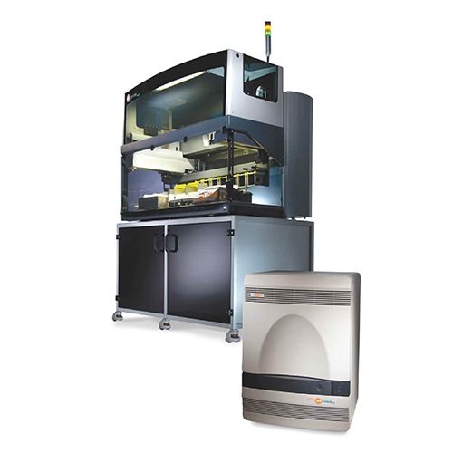
The Abbott M2000 RealTime System is one example of a real time RT-PCR testing machine. The M2000 can test up to 96 samples in one run: 93 patient samples and 3 control samples. Control samples are required to assure valid results. Both positive and negative control samples are required.
Abbott M2000 RealTime System
The M2000 is a large machine suitable for a laboratory setting.
Like the RT-PCR machines from other vendors, the M2000 requires consumable supplies. Consumable supplies are usually machine-specific. If you own a laser or inkjet printer, you’re already familiar with this concept. 😉 The vendor develops and manufactures pathogen-specific test kits in the form of cartridges, etc. that are physically compatible with their machines.
The Abbott RealTime SARS-CoV-2 EUA test is Abbott’s COVID-19 test for the M2000. “EUA” means “Emergency Use Authorization.” Authorization is issued by the U.S. Food and Drug Administration (FDA). EUA limits the use of the SARS-CoV-2 EUA test and is not full FDA approval. The Abbott RealTime SARS-CoV-2 EUA test is designed specifically for the M2000 real time RT-PCR system for use by authorized laboratories in the U.S.
The M2000 can process up to 470 patient samples in 24 hours, roughly five runs per day, 93 patient samples per run. Abbott planned to ramp up U.S. production to one million tests per week by the end of March. This goal is far short of the millions of tests which experts believe are needed in order to re-open the economy.
Reagents are one of the consumables and you’ve probably heard the term “reagents” in the news as an item which is in short supply. Reagents are one of the main components of the Abbott SARS-CoV-2 test kit. The reagents break open the SAR-CoV-2 virus and release its genetic material (viral RNA). The reagents recognize targeted segments of the SARS-CoV-2 genome, ignoring genetic material from other viruses. The reagents select targeted genes for amplification. The Abbott RealTime SARS-CoV-2 test (assay) targets the RdRP and N genes.
The fine print notes “Negative results do not preclude SARS-CoV-2 infection and should not be used as the sole basis for patient management decisions. Negative results must be combined with clinical observations, patient history, and epidemiological information.” Thus, Abbott acknowledges that false negatives are possible.
The M2000 made the news in early April when Dr. Birx (White House coronavirus response coordinator) stated that 80% of the 175 Abbott machines in 120 laboratories across the U.S. were not being fully utilized. The machines are located in academic medical centers and hospital laboratories [Bloomberg News]. I suspect that the bottleneck is collecting samples and getting samples to the central laboratories. New York State plans to have pharmacies collect samples thereby increasing the number of tests per day and improving RT-PCR utilization.
Other big players in the market are Thermo Fisher Scientific (Applied Biosystems TaqPath), Roche )Cobas 6800/8800 System) and BD Molecular (BD MAX System). These tests target other SARS-CoV-2 genes like S and ORF-1AB in addition to N and RdRP.
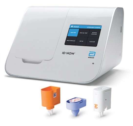
Abbott ID Now
The Abbott ID NOW™ system is a small machine suitable for a doctor’s office or portable use (8.15″W x 5.7″H x 7.64″D). The Abbott machine was developed originally by Alere. (Abbott acquired Alere in October 2017.) The ID NOW is used to detect the influenza A and B2 viruses as well as COVID-19. ID NOW costs about $12,000USD.
Abbott ID NOW™ system
Multi-cycle RT-PCR tests raise and lower the sample temperature during each cycle. ID NOW operates at a single constant temperature, so-called isothermal chemistry. Thus, ID NOW can obtain results faster than conventional real time RT-PCR.
The overall test process is similar. Reagents break open viral RNA in the sample. The reagents recognize the target sequence in the pathogen. The isothermal amplification chemistry amplifies the selected genetic sequence. Fluorescent probes recognize and attach to each replicated sequence. The probe molecules fluoresce. The ID NOW hardware monitors fluorescence. When fluorescence exceeds a trigger threshold, a positive result is displayed.
Like the M2000, it uses consumable supplies like its reagent test cartridge, e.g., the ID NOW COVID-19 assay. A single test costs about $50USD.
The COVID-19 assay targets the SARS-CoV-2 RdRP gene. Results come fast — a positive result in 5 minutes (minimum) or a negative result in 13 minutes. The ID NOW COVID-19 assay is available for use under FDA EUA and is only available in the U.S. The ID NOW COVID-19 test is not yet approved or cleared by the U.S. FDA.
Machines like the Abbott ID NOW™ could greatly speed up COVID-19 testing. Big M2000 machines are centrally located and patient samples must be sent to the lab. The sample may await other samples for a full run. Then results must be reported back to the physician and patient. The round-trip takes too long; a delay of several days is not uncommon. The Abbott ID NOW can be located on site, potentially reducing the round-trip to an hour or two.
The chief disadvantage is cost. The ID NOW single test, cartiridge approach is nore expansive than M2000’s batch testing. ID NOW targets a single SARS-CoV-2 gene, RdRP, making it vulnerable to a mutation in this one gene. The M2000 targets three genes and is less vulnerable to a mutation.
The daily positivity rate is the percentage of positive COVID-19 test results for each 24 hour period. The rate adjusts for the number of tests which varies from day to day.
The daily positivity rate is a useful metric, but an imperfect one. As I’ve said in previous posts, we need a proper epidemiologic study of COVID-19.
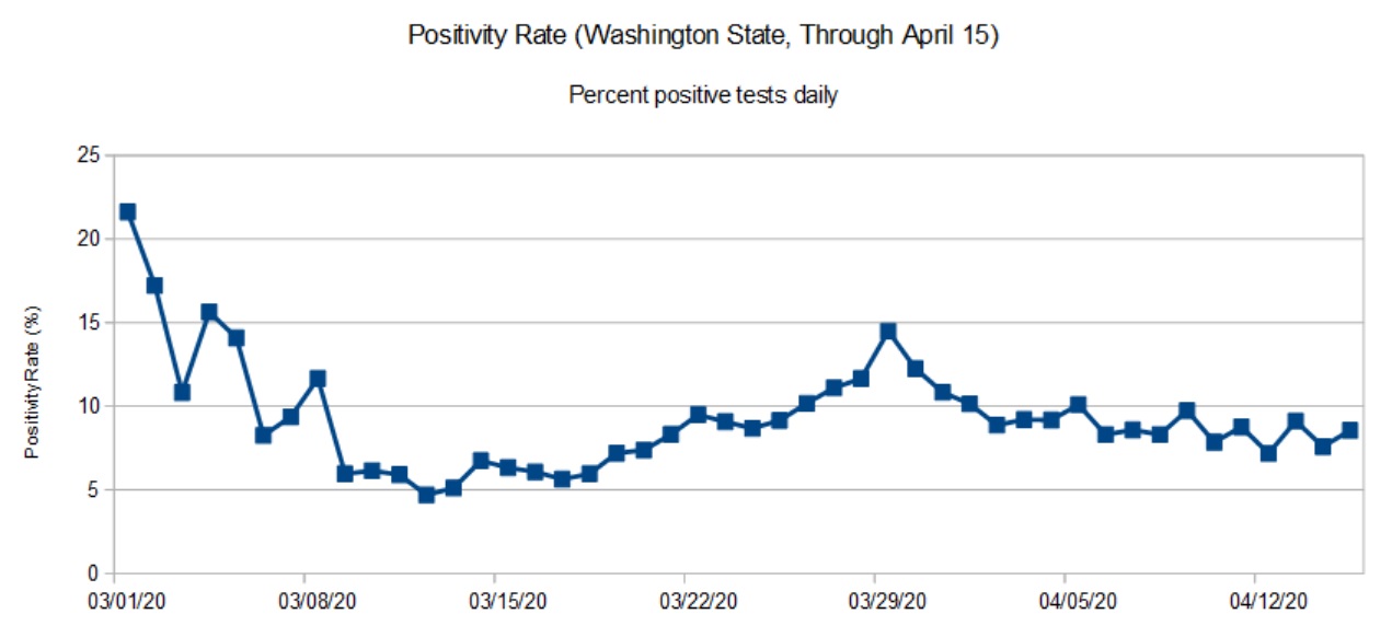
The first graph (below) is the daily positivity rate for Washington State though April 15. Why April 15 and not today, 24 April 2020? The Department of Health does not guarantee complete data for the most recent days. The data through April 15 is (nearly) complete although a few test results still trickle in.
Washington State daily positivity rate (April 15, 2020)
As noted in the graph posted last week, the state is past the peak and is in a slow decline. The peak occurred in late March. The daily positivity rate has declined to where it was in mid-March.
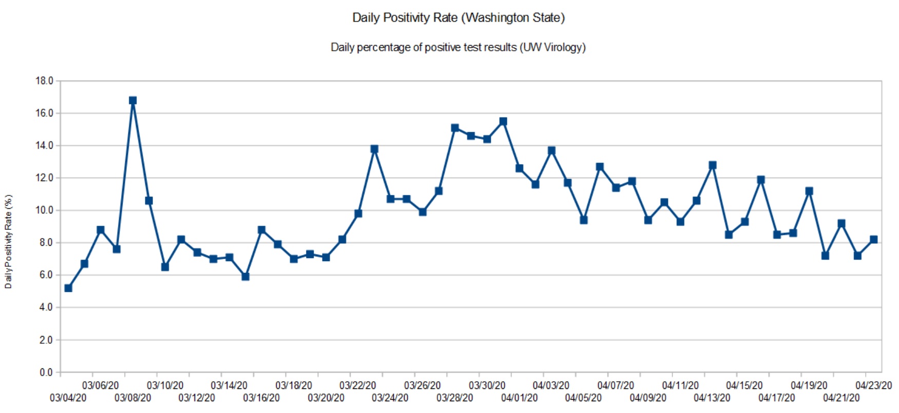
For comparison, here is the data from the UW Virology Lab. UW performs testing for and county and state health authorities. [Click images to enlarge.]
University of Washington positivity rate (April 23, 2020)
The shape of the graph is consistent with the overall state data. The Virology Lab data is up-to-date since they just report daily results for the lab itself (samples in, results out).
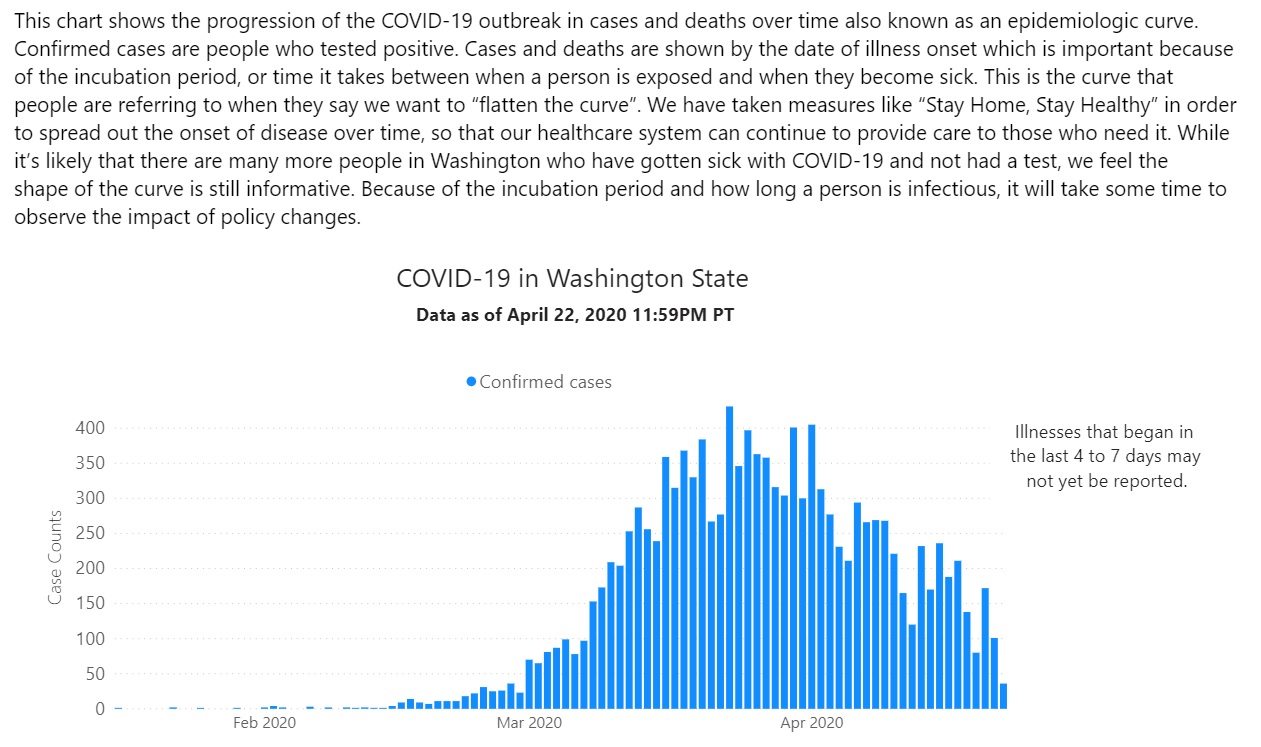
The Washington State epidemiologic curve (below) is informative, too. Known cases are tallied by the date of illness onset.
Washington State epidemiologic curve (April 22, 2020)
The epidemiologic curve shows a steady decline due to community mitigation, also known as “social distancing.” This is good news.
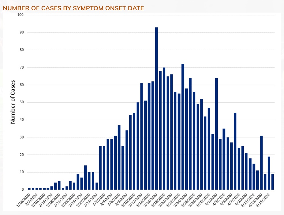
To complete the picture, here is the epidemiologic curve for Snohomish County, where I live.
Snohomish Country epidemiologic curve (April 15,2020)
Snohomish County shows a similar decline in new confirmed cases. Again, this is good news.
The big question for Governor Inslee and other decision makers is “How low is enough?” The answer to this question determines when social distancing can be relaxed. Currently, social distancing is expected to be in place until May 4th at the earliest. Hopefully, Washington will beef up contact tracing and isolation over the next two weeks. Then, it’s whack-a-mole.
Stay distant and stay healthy. Science works — P.J. Drongowski
My weekly chart showing the positivity rate for Washington State is a tad late. The Washington Department of Health (DOH) has been busy fixing and upgrading its web site. The new site is a quite an improvement with informative charts, graphs and tables.
Looking at their data, I can appreciate the depth of their collection and reporting problems. Their old database was a “peacetime” tool, collecting positive results from a few of Washington’s many counties. In the fight against COVID-19, all counties are reporting at once and epidemiologists and decision makers want and need additional data about the number of tests, sex, age, etc. Of course, doing all of this work in the middle of a crisis must raise the IT stress level!
The state DOH site now reports detailed testing information in the form of a bar chart. The bar chart shows the number of positive and negative tests each day based on specimen date. This is a meaningful time base as it allows a snapshot of the positivity rate on a given day. It’s much harder to organize test data in this way than just lumping test results willy-nilly as they come in. (See “stress level” above.)
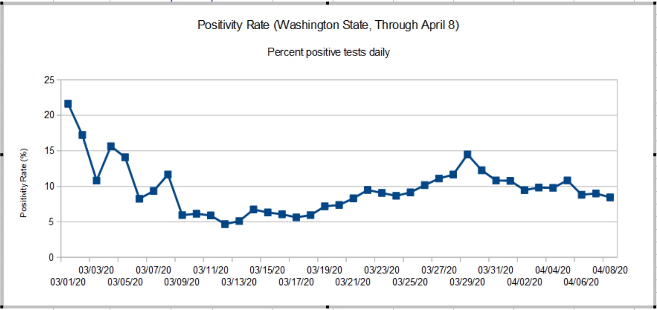
Because all test results for a given specimen day do not arrive at once, the DOH doesn’t guarantee complete results for the days just past. In keeping with their approach, my graph shows the Washington State positivity rate through April 8, 2020. [Click to enlarge graph.]
Washington State Positivity Rate (Through April 8, 2020)
The true peak in the rate occurred on March 28-29, 2020 when it hit 14.49%. The positivity rate has been slowly declining since then. The peak rate was more than double the 5% to 6% rate established around March 10. The new chart agrees reasonably well with raw statistics from the University of Washington Virology Laboratory. UW results, of course, are large portion of the State’s results. A back-of-the-envelope estimate shows that the rate has improved after April 8. Stay tuned.
So, what about those high rates in early March?
The positivity rate is a rather poor indicator which is subject to bias. COVID-19 tests are only administered under certain specific conditions because testing is rationed. Criteria include COVID-19 symptoms (fever, cough, tiredness, difficulty breathing) or contact with a known infected person. Properly, first responders may be given preference since they are most likely to come into contact with infectious people who may or may not be symptomatic. Further, COVID-19 hits nursing homes with vulnerable residents early and hard.
The general public has not been tested in a systematic epidemiological study, i.e., a random sampling of the population at large. Thus, the positivity rate as measured here is imperfect and may not accurately represent what the disease itself is doing in the overall community.
Contact is an important biasing factor and it is why I do not consider results in early March to be baseline. Public health authorities were actively pursuing contacts in early March after the first case of community spread was detected. The number of daily tests ranged from 74 to 500 — small numbers which are easily skewed.
As I’ve mentioned in earlier posts, today’s statistics tell us what the disease was doing 10 to 14 days ago due to the time required for incubation, development of symptoms, clinical presentation, and testing. Washington’s first community mitigation measures went into effect on March 11, with home-stay recommended on March 16 and home-stay ordered on March 16. I think we can safely say “Community mitigation works.”
Now we need the patience to finish the job and win the fight.
OK, that’s a little bit over the top. I was trying to find a way to work NPH into this post. 🙂
Viruses are the simplest biological forms. Viruses are obligate parasites. A virus must invade a host cell in order to reproduce. Viruses contain genetic material, but do not have ribosomes which replicate the genetic material. Viruses use ribosomes in the host cell for replication.
Since a virus cannot reproduce on its own, one may ask if a virus is alive. The question “What is life?” is non-trivial and is not as easy to answer as you may think. Another interesting question to consider is “How did viruses and life begin?”
Please note the term “genetic material.” Viruses are exceptionally diverse. Some viruses are DNA-based, some are RNA-based. Further, the genetic material may be single-stranded or double-stranded. On top of these characteristics, the material may have a linear or a circular structure, or be segmented or non-segmented. Amazing.
RNA-based retroviruses are a huge exception to Francis Crick’s central dogma: DNA makes RNA and RNA makes protein. In a retrovirus, reverse transcriptase (a chemical enzyme/catalyst) synthesizes a DNA copy from viral RNA. The DNA copy integrates into the host genome (in eukaryotic cells). Then, the cell’s protein and replication factory takes over. Eventually, the cell bursts or otherwise expunges the particles and a new cells are infected.
Both ribonucleic acid (RNA) and deoxyribonucleic acid (DNA) are large molecules (polymers) — chains of nucleic acid molecules. Genetic material (RNA or DNA) is rather fragile. Strong UV light or heat causes the chemical bonds in RNA and DNA to break. Whether it’s a cell or a virus, genetic material needs to be protected. A virus typically has a hard protein “shell”, called a “capsid,” that surrounds and protects the genetic material inside.
At this point, I recommend the NOVA Labs and Khan Academy tutorial about RNA before reading on. They do quite a decent job of describing RNA, transcription (copying), and protein synthesis. If you want to cut to the chase, jump to the Virus Wars section of the tutorial.
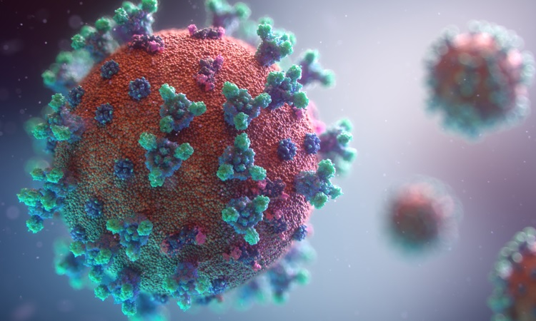
SARS-CoV-2
SARS-CoV-2 is the virus which causes COVID-19, the disease. It is a type of coronavirus. Calling SARS-CoV-2 “coronavirus” is really refering to this specific type of virus by a generic name. (Not quite correct semantically.)
Coronaviruses contain positive-stranded RNA. The RNA is surrounded by an envelope with spike glycoproteins on the envelope. Without a doubt, you’ve seen the SARS-CoV-2 protein model on television — a grey envelope with red spikes. The spikey glycoproteins are composed of two subunits (S1 and S2). The spikes assist binding to a host cell and injection.
SARS-CoV-2 protein model (CDC)
SARS-CoV-2 is approximately 60 to 140 nm in diameter. That’s darned small. A human hair has a diameter of 15 to 181 um, 1000 times larger. The bactrium E. coli is 1 to 2 um in length, still much larger than SARS-CoV-2. Viruses are exceptionally small; they must be small enough to invade host cells like E.coli.
SARS-CoV-2 has a single-stranded RNA genome. Its RNA strand contains 29891 nucleotides and encodes for 9860 amino acids. In biology-speak, that’s almost 30 kb (kilobases, not kilobytes). AS RNA-based viruses go, that’s a fairly large genome.
The Nucleocapsid gene (N), Envelope gene (E), Spike gene (S) and RNA-dependent RNA polymerase (RdRP) genes are important for testing. The WHO and CDC have developed nucleic acid amplification tests (NAAT) via reverse-transcription polymerase chain reaction (RT-PCR). Targeted genes include the N, E, S, and RdRP genes in the SARS-CoV-2 genome (WHO guidance). RT-PCR amplifies minute quantities of extracted SARS-CoV-2 RNA in a sample (if present) making it possible to assay one or more of the targeted subsequences (genes).
By now, you’ve come a long way along the journey and are ready for the summit. In closing, I recommend Features, Evaluation and Treatment Coronavirus (COVID-19) by Marco Cascella, et al. from the Istituto Nazionale Tumori – IRCCS – Fondazione Pascale. This paper is published by the National Center for Biotechnology Information (NCBI), a part of the U.S. National Institutes of Health (NIH).
If you would like to try your hand at sequencing, you can download the SARS-CoV-2 genome from NCBI. Don’t forget to snag a copy of BLAST. “BLAST finds regions of similarity between biological sequences. The program compares nucleotide or protein sequences to sequence databases and calculates the statistical significance.” STEM teachers, please take note of these resources. NCBI has many other genomes available for download.
Another week has past and it’s time for new charts. I’ve been tracking the daily positivity rate for Washington State. The “positivity rate” is the percentage of positive test results for each 24 hour period. Dividing by the number of tests each day adjusts for variations in daily testing throughput, i.e., the number of tests performed each day is different.
Daily positivity rate (Washington State, April 3, 2020)
The gaps in the data are due to database issues at DOH. DOH receives and integrates test reports from around the state. Their database has been stressed and has not been tallying negative test results from which one can compute the number of tests per day (i.e., the sum of positive and negative results). Thus, I wasn’t able to compute a daily positivity rate for certain days.
Fortunately, I have the University of Washington Virology Laboratory as back-up. The UW Virology Lab is performing a large portion of tests in Washington. The Lab maintains a dashboard showing the number of tests they performed, the positives, negatives and inconclusives. Inconclusive tests are presumed positive. So, the daily positivity rate is the sum of the positive and inconclusive tests divided by the number of tests performed that day.
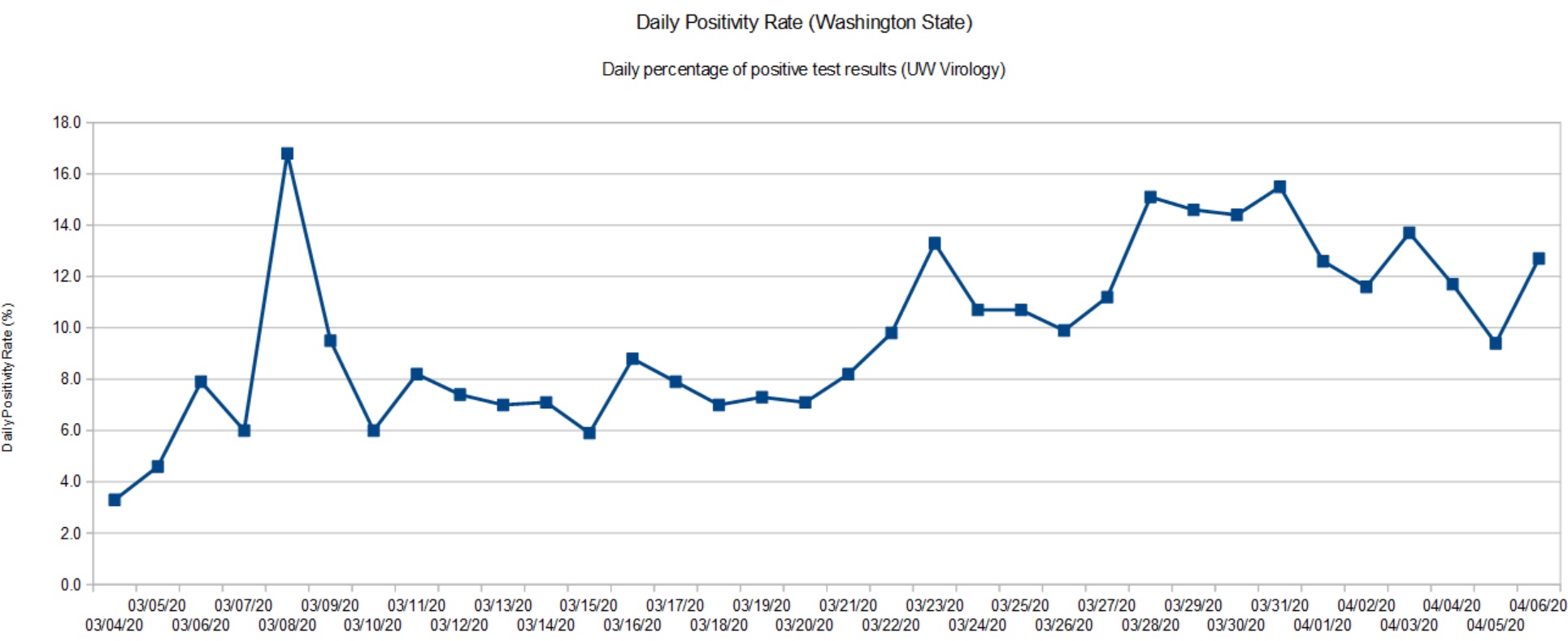
Daily positivity rate (UW Virology Lab, April 6, 2020)
Both graphs have a similar shape which shouldn’t be surprising as the UW Virology Lab is a major component in the DOH results. The positivity rate has more than doubled since early March. As of today (April 6), the positivity rate appears to be at a plateau and may show the beginning of a downturn. That’s good news and we need to remain committed to social distancing and other community mitigation measures.
Washington State recommended home-stay on March 16 and closed some businesses (e.g., hair salons, gyms, churches, etc.) I regard these measures as “social distancing lite.” On March 24, the State imposed a stay-at-home order. Given the time lag (10 to 14 days), the turn in the positivity rate is most likely due to the full stay-at-home order.
Fortunately, Governor Inslee has not declared victory. Instead, social distancing measures have been extended to May 4. Further, school has been cancelled through the end of the Spring term.
From my own observations, people in our part of Snohomish County (near Bothell and Everett) are treating COVID-19 seriously and are complying with the stay-at-home order. If a state, county or city is waiting for signs of an outbreak, don’t wait to issue a stay-at-home order. Response now will keep the size of your problem manageable. An ounce of prevention is worth a pound of cure.
Cleveland, OH
I keep an eye on the old hometown for no other reason than the Cavs and Browns. Cleveland.com published a few useful looking charts and graphs.
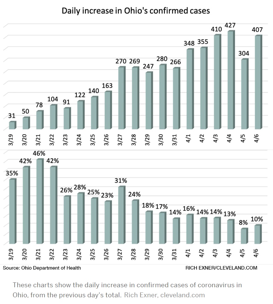
As we all go forward, we need to know when our communities have turned the corner and, importantly, when we can restart some business activities. The Ohio Department Health tracks the percentage increase in confirmed cases day-over-day.
Credit: Cleveland.com
Like Washington, Ohio has not hesitated to issue a stay-at-home order and to implement other forms of community mitigation. Gov. Mike DeWine, like Gov. Inslee, may not be the most dynamic individual, but he, too, is leading his state effectively in this crisis. I’m pulling for the folks at home!
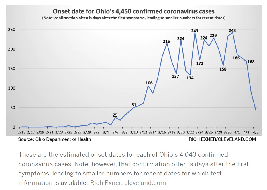
Credit: Cleveland.com
This is another Ohio DOH chart which caught my eye. It plots confirmed cases by the onset of symptoms. This chart better aligns case count with the actual time frame in which a patient was infected.
NYT: What’s next?
The New York Times published two good articles on community mitigation and the next phase in our battle against SAR-CoV-2 (COVID-19) — cycles of “suppress and lift” as restrictions are applied and relaxed, so-called waves.