A New York Times article (March 29) suggests that social distancing is beginning to pay off in the Seattle area. The NYT article refers to work performed at the Institute for Disease Modeling in Bellevue, WA. The authors are cautious saying that data is preliminary and unpublished.
Quoting the IDM web site:
IDM shapes global efforts to eradicate infectious diseases and to achieve permanent improvements in the health of those most in need. By developing, using, and freely sharing computational modeling tools, we advise policymakers, promote quantitative decision-making and advance scientific methodologies.
IDM is an institute within the Global Good Fund, a collaboration between Intellectual Ventures and Bill and Melinda Gates.
Currently, IDM is working on disease transmission dynamics for malaria, polio, tuberculosis, HIV, pneumonia, typhoid, and more.
Personal thanks to Bill and Melinda Gates for their philanthropic work.
IDM has a COVID-19 InfoHub. For the latest results, I recommend the IDM InfoHub Research and Reports page. This is the real deal.
IDM published a report (as of March 29) on the effects of social distancing and mobility reductions on COVID-19 in King County, WA. Quoting the report:
Still, based on this data for King County, the trend clearly shows Re decreasing from about 2.7 in late February to roughly 1.4 on March 18th. These estimates come with high uncertainty, and while the trend is encouraging, it remains unlikely that COVID transmission in King County was below the 1.0 threshold on the 18th.
[We] cannot say with confidence if Re is below or above the critical threshold of 1 today.
Re is the effective reproductive number for COVID-19.
Thank goodness, Governor Inslee is not declaring victory either. Community mitigation measures remain in place and likely will be extended. (The federal guideline is currently April 30.) In his interview on CNN’s “State of the Union” on Sunday, the Governor cited shortfalls in testing supplies (swabs, vials, etc.) which are limiting the number of tests performed daily. As I’ve said before, we need community-wide epidemiological studies to get ahead of the disease. We cannot perform epidemiological tests (surveillance testing) when we can barely perform diagnostic testing for symptomatic patients.
The Fine Print
Let’s get nerdy. How do IDM define R0 and Re. Quoting the IDM glossary:
R0 (R Naught, Basic reproductive number): The average number of secondary cases a typical infectious individual will generate without any interventions in place to reduce transmission. The number of secondary cases per source is expected to change over time and space with different interventions and as the proportion of the population with immunity grows (REff).
REff (R Effective) or Re: The number of secondary cases each infectious individual will generate, on average, after interventions are in place and/or part of the population is immune. We would expect REff to be less than R0.
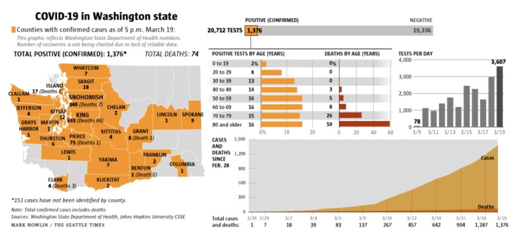
Washington Department of Health
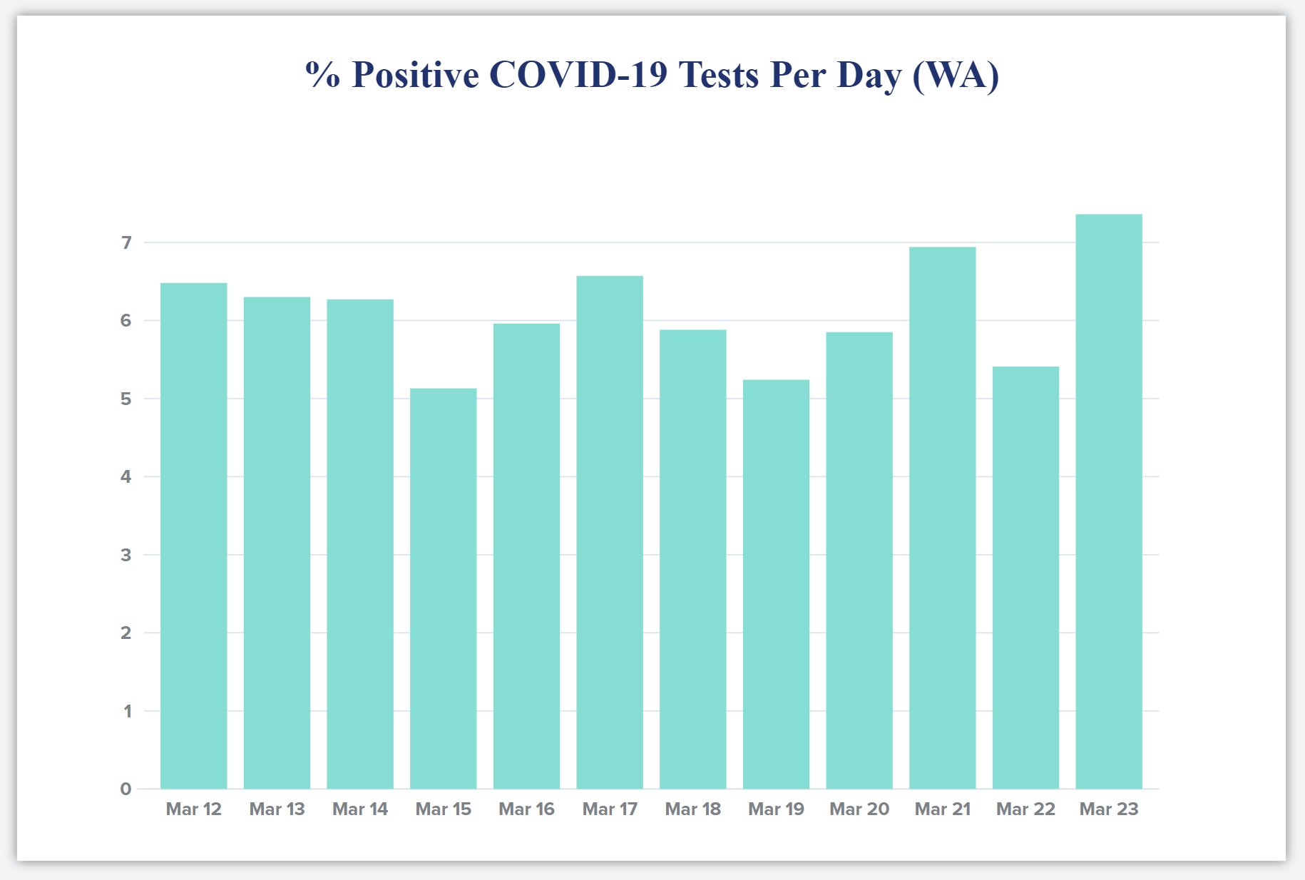
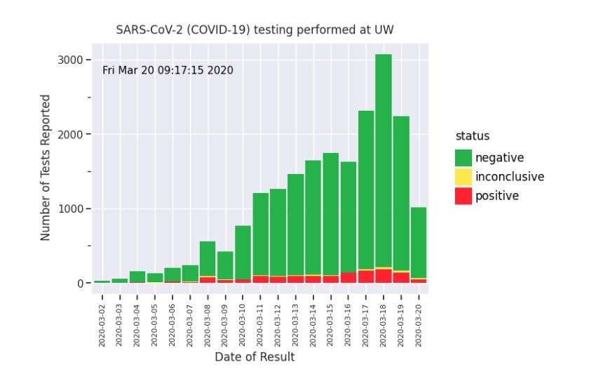
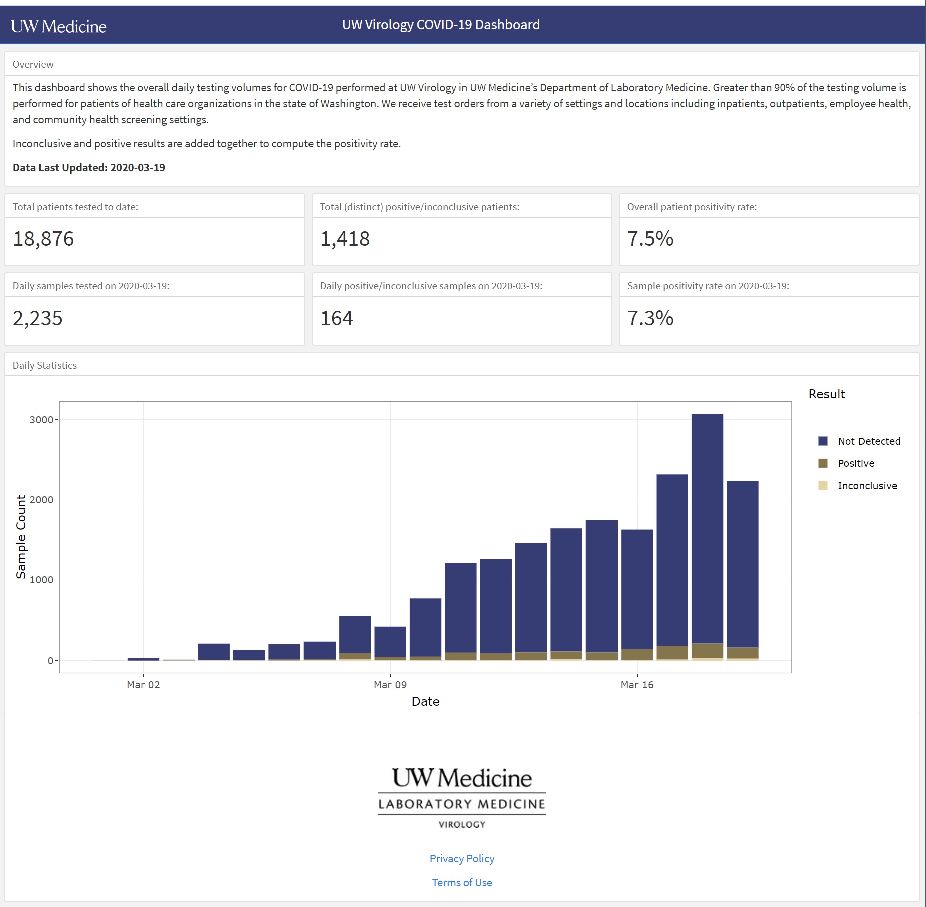
The Washington State Department of Health upgraded COVID-19 reporting on their web site. They are publishing better graphs and data, especially data about testing. I’d like to see graphs for the posivity rate over time since the ratio of daily positive tests divided by the daily number of tests adjusts for day-to-day variations in testing. (“Daily” means for each 24 hour period.)
Positivity Rate
Governor Inslee referred to this ratio as the “Positivity Rate” and I like that term. It’s more concise than “Percentage of positive tests per day.”
Below is my plot of the Washington State positivity rate starting March 12 to March 29. Although the press is optimistic, The positivity rate has doubled over the time period. [Click image to enlarge.]
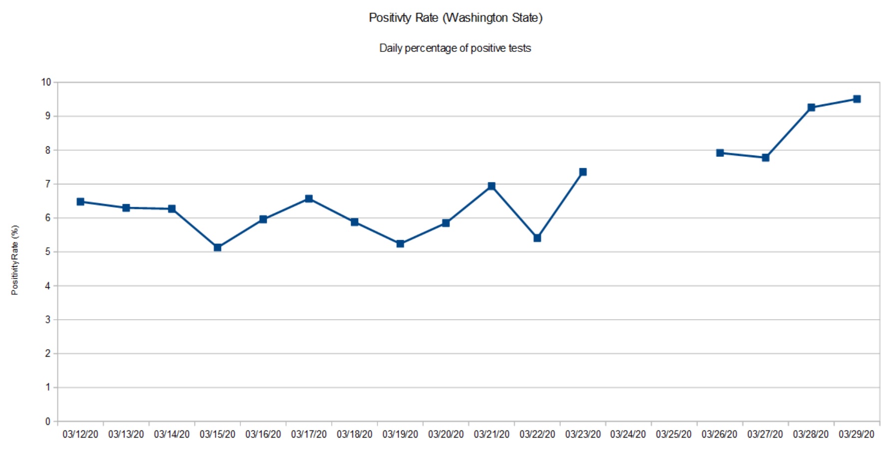
The gap in the graph is due to missing data from the Washington State Department of Health. They ran into database glitches March 24 and 25. The March 26 data point aggregates positive cases and tests across the gap.
There are several factors that affect the positivity rate. First off, this is not a random sample of the population at large. People are tested only if they satisfy a protocol, that is, satisfy a set of criteria. Criteria include presence of COVID-19 symptoms (fever, cough, shortness of breath), contact with a known infected COVID-19 patient, or in-coming travel from a known COVID-19 hot-spot (e.g., China, Italy, New York City metro, etc.) No doubt, some of the tests are due to contact tracing as officials try to identify possible carriers in order to isolate them. Bottom line, the positivity rate is far from a controlled epidemiological study (surveillance).
Please remember that any measurements we take today show what the virus (SARS-CoV-2) was doing 10 to 14 days ago. The delay is due to incubation, development of symptoms, clinical presentation and testing.
At this point in time (March 30), I’m glad that Washington State is staying the course and is looking at additional restrictions.
BTW, I’m still trying to absorb the changes to the Washington State Department of Health site. Their graphs don’t always jibe with my table of previously published data.
Cautionary tale
Here is a cautionary tale from The Seattle Times.
At the beginning of March, The Skagit Valley Chorale discussed weekly rehearsals and whether they should go ahead. Skagit County had not yet reported any cases of COVID-19. On March 6, they decided to go ahead with rehearsal on March 10. The chorale members used hand sanitizer and minimized contact during rehearsal.
None of those precautions, however, prevented an outbreak. Three weeks later, 45 members have been diagnosed with COVID-19 or have had symptoms. At least three members were hospitalized and two are dead.
Fortunately, our own church group passed on rehearsal during the same time frame.
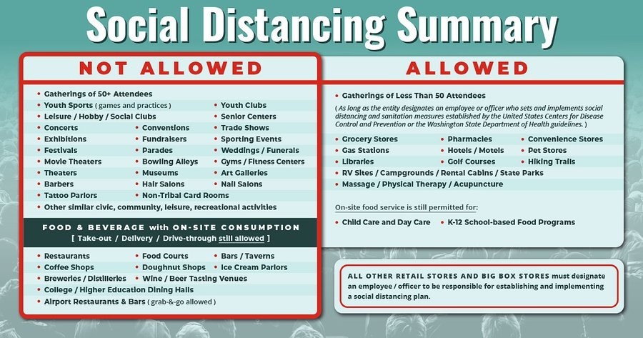
This tale should be a warning to any community that feels safe because they have not yet experienced the disease. Please pay attention to our public health officials who predict eventual outbreak everywhere. Start social distancing and isolation now.
    Car crash fatalities (2019)    38,800 people
    Vietnam War fatal casualties   58,220 people
    Hiroshima fatal casualties     90,000 to 146,000 people
    Nagasaki fatal casualties      39,000 to 80,000 people
    COVID-19                       ?
— P.J. Drongowski