Wire Less: Part 2, Belkin RockStar™

Well, as you might have guessed, your Apple iPad synthesis rig cannot be entirely wireless (at least inexpensively so). The audio part ain’t there yet. Bluetooth audio has too much latency and Apple does not provide any other built-in solution. So, it’s wires, again, folks.

In my first post, I discussed the MIDI part: an Apple iPad running Korg Module Pro communicating with a Korg Microkey Air 49 over MIDI BLE. The MIDI part works quite well and I haven’t had any issues.

As to the audio part, I absolutely detest the iPad 3.5mm phone connector. Any plug is exposed and even the slightest movement emits a nasty grind from a powered speaker or other downstream audio device. Buzzzzzz — literally. I simply wouldn’t risk this method in a high volume situation in front of a church congregation.

The Lightning connector, however, is relatively snug and secure. Like most people, I opt for a Lightning-based solution. With Bluetooth handling MIDI duties, one needs only an audio interfacing solution.

Sorry, USB-C people, I don’t have a USB-C iPad and don’t address USB-C solutions here.

By now, everyone knows that the Apple Lightning to USB Camera Adapter is not just for cameras. Thanks to the Camera Adapter, you can hook up a USB-based audio interface to your iPad (or iPhone). The Camera Adapter’s street price has dipped to $9USD, making this a very inexpensive solution. If — if — your bus-powered audio interface draws a small amount of power, the Camera Adapter will supply power although the iPad battery drains faster. If your bus-powered audio interface is a power hog, you will get the infamous “This accessory requires too much power” message and iPad will refuse to play along, shutting down the interface.

Enter the Apple Apple Lightning to USB3 Camera Adapter ($39USD). The USB3 Camera Adapter has two ports: a USB3 host port and a Lightning charge port. The USB3 port connects to your audio interface while the Lightning port connects to an AC adapter. The Lightning port both charges the iPad battery and supplies power to your audio interface.

At one time, I considered the Steinberg UR22C as a solution for both desktop use and mobile. The UR22C has the necessary functional features and sports its own external power port. This is definitely another way to go and I wish more manufacturers would provide an external power port and not rely solely on bus power. I decided to eschew “yet another box at the gig” in favor of an even smaller, lighter solution. (For desktop, I eventually chose the Yamaha AG06, BTW).

Belkin adapter and the tangled mess o’cables

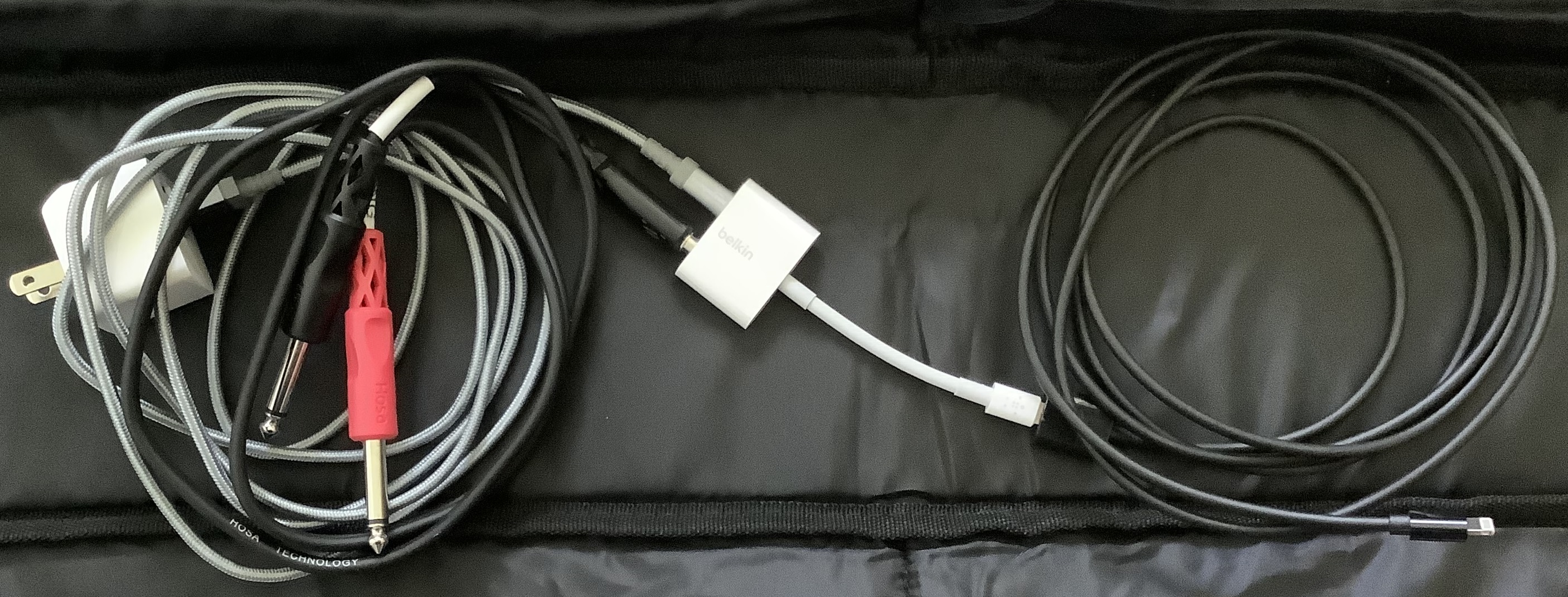
For smaller and lighter, I went with the somewhat neglected Belkin 3.5mm Audio + Charge RockStar™ ($40). This Belkin adapter provides a more robust 3.5mm jack and a Lightning charge port. My only beef is the short iPad to adapter Lightning cable. The short cable is good enough for casual listeners, but I feel that it still requires too much stress on the 3.5mm jack. I added a 2 meter Lightning extension cable, letting me rest the adapter and 3.5mm plug on the floor. This arrangement reduces the physical stress on the iPad Lightning port, too. One flexible cable to the iPad makes it easier and safer to move the iPad during a gig.

A few fine points. I configure Korg Module Pro for MONO out and use a 3.5mm stereo to 1/4″ breakout cable (tip and ring) for the final audio connection. MONO is close enough for rock’n’roll. I realize this is audio religion to purists. 🙂

If you don’t want 3.5mm audio, Belkin offers the Belkin Lightning Audio + Charge RockStar™ ($45USD). It has a two Lightning ports: one for audio and one for charge.

Before closing, I want to mention an ultra-cheap, simple solution: an Apple Lightning to 3.5mm Headphone Jack Adapter plus an extension cable. You may already have one of these adapters! When Apple dropped the 3.5mm jack, it began selling these adapters so people could connect their headphones to the jackless iPhone. It’s ultra-inexpensive at $8USD (street).

Check out these related blog posts:

Copyright © 2021 Paul J. Drongowski

RTL SDR Blog V3 HF reception

I wanted to spend more time experimenting with HF before posting a follow-up about the RTL-SDR Blog V3 software defined radio. Due to shifting ionospheric conditions and such, a 5 minute snap evaluation is no evaluation at all. Here’s the scoop after really working with the V3.

Yes, the V3 does HF — with limitations. What it does, it does surprisingly well for $35 USD.

I configured the V3 with a nooelec 9:1 V2 balun (unun) and a 23 foot (7 meter) long-wire antenna. I did a number of experiments in grounding and eventually just went with the simplest solution: long-wire to the antenna input and no ground. Electrical ground (wall outlet) was unsatisfactory and cold water pipe didn’t produce any improvement. [More on these experiments some day.] I compared the V3 against my old Drake R8 communication receiver using both long-wire (23 feet) and Datong DA270 active dipole antennas. The old Datong DA270 is long in the tooth and I got slightly better results with the long wire. The Drake is in terrific shape for its age (25 years). Wish I could say the same for myself. 🙂

The V3 tunes in quite a few stations! It took a bit of time to find my way around SDR#, trying this feature (noise reduction) and that (audio filtering). Reception-wise, the Drake has the edge, but not by much. I can easily tune the stronger shortwave stations out of Asia, for example.

The SDR# spectrum display makes a good companion to the Drake. I could pick out the most likely candidates on the spectrum display, then turn to the Drake and dial them in. Using the V3, I could tune in some weaker stations like a Honolulu weather station and the U.S. Air Force High Frequency Global Communications System (HFGCS). You haven’t done nothin’ till you hear an EAM. 🙂 The SDR# memory feature made it easy to follow an HFGCS simulcast through its primary stations. I may stick with this productive workflow in the future.

The RTL-SDR blog documentation states the V3’s limitations clearly and accurately. The V3 has an analog-to-digital converter (ADC) that samples the baseband radio frequency (RF) signal directly. Quoting the data sheet and user’s guide:

The result is that 500 kHz to about 24 MHz can be received in direct sampling mode.

Direct sampling could be more sensitive than using an upconverter, but dynamic won’t be as good as with an upconverter. It can overload easily if you have strong signals since there is no gain control. And you will see aliasing of signals mirrored around 14.4 MHz due to the Nyquist theorem. But, direct sampling mode should at least give the majority of users a decent taste of what’s on HF. If you then find HF interesting, then you can consider upgrading to an upconverter like the SpyVerter (the SpyVerter is the only upconverter we know of that is compatible with our bias tee for easy operation, other upconverters require external power).

Note that [the V3] makes use of direct sampling and so aliasing will occur. The RTL-SDR samples at 28.8 MHz, thus you may see mirrors of strong signals from 0 – 14.4 MHz while tuning to 14.4 – 28.8 MHz and the other way around as well. To remove these images you need to use a low pass filter for 0 – 14.4 MHz, and a high pass filter for 14.4 – 28.8 MHz, or simply filter your band of interest.

I definitely saw and heard aliases. The best example is WWV at 15.0MHz. Yep, I could tune in 15.0MHz directly. But, what’s this strong signal in the 20 meter shortwave band at 13.8MHz? It’s a WWV alias. Hmmm, 15MHz is 600kHz above 14.4MHz and 13.8MHz is 600kHz below 14.4MHz. Not a coincidence? I also found aliases of strong medium wave AM broadcast stations up around 27 to 28MHz.

SDR# spectrum display: WWV and its alias
SDR# spectrum display: AM broadcast aliased near CB radio band

So, I would say that the V3 is quite a good low-cost HF receiver, especially in the range from 2 to 15MHz, where I spent most of my time. I have an AM band-stop filter on order and hope to attenuate the strong AM broadcast stations. I did a quick survey of local transmitters and discovered three powerful stations within a few miles of my location. All transmit several thousand watts or more — enough to be troublesome. In addition to the aliasing issue, the stations may be overloading the V3 and degrading its weak signal performance. [More on this some other time.]

I find RTL-SDR’s assessment of the V3’s HF capabilities to be fair and transparent. If you’re a serious radio hobbyist, I recommend an up-converter (e.e., the nooelec Ham It Up) or an upscale SDR like the SDRplay RSP1A/RSPdx or the AirSpy HF+. The upscale models cost more, but have better HF support (no aliases, better RF front-end, etc.)

I’m good with the nooelec baluns, by the way, and have purchased a second one for the Drake R8. Rather than buy another SDR, I’m going to spend time on antennas instead. As to workflow, I like getting an overview of the spectrum via SDR and then focusing through the Drake R8. I want to try and evaluate an AM band-stop filter, too. I will post results once I get more experience under my belt. If I didn’t have the Drake R8, I would probably look into an RSPdx or an HF+ as the next step.

Want more? Check out my short review of the nooelec Nano 2+ SDR.

Copyright © 2020 Paul J. Drongowski, N2OQT

RTL SDR Blog V3 Radio

Based on my positive experience with the nooelec Nano 2+ software defined radio, I bought an RTL-SDR Blog V3 receiver bundle. I meant to write a quick review of the RTL-SDR Blog V3 (henceforth, the “V3”), but I wound up having too much fun with the new toys!

For $35USD, you get the USB receiver stick, a dipole antenna kit with telescoping elements, cables, a tripod and a suction mount. The V3 uses SMA connectors everywhere. In comparison, the nooelec Nano 2+ bundle includes a small magnetic mount telescoping antenna and uses tiny MCX connectors.

RTL SDR Blog V3 Software Defined Radio bundle

If you want to mix and match components between bundles, you will need adapters. SMA connecters thread onto each other and provide a more firm and reliable connections than MCX. On that basis, I give the V3 points.

Further points go to V3 for its build quality. The V3 is somewhat larger, but the electronics are mounted in a metal (shielded) case. The case is also the heat sink. If you want metal shielding in the nooelec line, you should purchase the nooelec Nano 3. Both the V3 and Nano 2+ run warm, so heat dissipation is important.

Both units make adequate low-cost VHF/UHF receivers when used with their respective bundled antenna system. If you’re most interested in broadcast FM or aircraft band, you can’t go wrong either way. I give the V3 points for the option of HF reception and the ability to tune antenna length for the radio band to be monitored. You can see the effect of tuning with your own eyes. Dial in a weather station, for example, and adjust the antenna elements. You’ll see the signal increase and decrease in strength as you change element length.

Tips: The V3 antenna system is a dipole, so you need to make both elements the same length. Divide the frequency (in MHz) into 468 to get the total antenna length (in feet). Then divide the total length by two to obtain the length of each element. Pop the cap on the central Y junction and find the element which is connected to the coax shield. Orient the shield-side element down towards the earth.

So far, the V3 is winning on points. Then consider HF. The V3 receiver is HF capable, but you will need to build or add an HF antenna. This is where life gets a little bit tricky. Short story — Yes, the V3 receives HF. I’ll save the longer story for a future blog post.

Bottom line. If you are only interested in VHF/UHF, then either unit will do the business. If you prefer a magnetic mount antenna, go with a nooelec Nano bundle. If you want to optimize tuning for a VHF/UHF band, then go with the V3 bundle. If you want to get your feet wet with HF and don’t want to spend a lot of money, then pick up the V3 bundle, a nooelec balun and at least 23 feet of wire.

Even though the V3 won this match-up, nooelec won my respect as a solid citizen. They make the Ham It Up HF up-converter which adds HF reception to a VHF/UHF only SDR. Based on my experience with the Nano 2+, I would give the Ham It Up a try without trepidation.

Most of all, have fun!

Copyright © 2020 Paul J. Drongowski, N2OQT

Nooelec Nano 2+ Software Defined Radio

One side-benefit of unpacking after a move is getting reacquainted with old electronic gear, in this case, a Drake R8 shortwave receiver. HF is definitely alive, but it whet my appetite for more listening, more action.

Rather than pull out the old Radio Shack 2006PRO — another old acquaintance — I decided to give software defined radio (SDR) a try.

Like everything else electronic, VLSI digital signal processing revolutionized radio design. Smart folks realized that the RTL2832U chipset could be repurposed into a wideband SDR receiver. The RTL2832U chipset was originally designed as a DVB-T TV tuner and repurposing it is a spiffy hack!

Even better, the RTL2832U SDR is dirt cheap. Why spring for a $300 ICOM when you can buy a dongle for about $25USD? There are “high end” solutions such as the Airspy R2 ($169USD) or SDRPlay RSPdx ($199USD).
The Airspy HF+ Discovery extends coverage to HF (0.5kHz to 31MHz) for $169USD. Mid-range solutions include the Airspy Mini SDR ($99USD) and SDRPlay RSP1A ($109USD) among others. If you’re interested in adding HF, the Nooelec Ham It Up up-converter ($65USD) is an option.

Cheapskate that I am, I believe in the low-end theory — how much can I do with the least amount of money. 🙂 Thus, I chose the Nooelec NESDR Nano 2+ for $24. The original Nooelec Nano had a reputation for running hot. The Nano 2+ mitigates heat dissipation; the newer Nano 3 ($30) has a metal case/heatsink.

nooelect Nano 2+ Software Defined Radio

I went cheap. Yes, the Nano 2+ gets warm to the touch, but not to the level of concern. An x86 running full tilt is HOT — not the Nano 2+. It doesn’t run much hotter than my vintage Datong AD270 active antenna.

For software, I installed SDR#. The “sharp” comes from C#, the implementation language. There are many good getting started guides on-line. I especially like:

There are several more software options out there like CubicSDR. I chose SDR# because it has a number of useful plug-ins including a frequency manager/scanner.

The Nano 2+ is the size of a USB flash drive. The low-cost Adafruit dongle is similar, but it’s out of stock. The Nano 2+ is a nice replacement. The Nano 2+ is bundled with a tiny magnetic-mount telescoping antenna which is good enough for VHF/UHF. I placed the mag-mount on a small electrical junction box cover which provides a more stable base.

FM broadcast via SDR# and Nooelec Nano 2+ software defined radio

Follow the on-line guides! RTL SDR is quite mature for “hobby” software. I tuned in FM broadcast literally within minutes.

Based on this short experience, I splurged for an RTL-SDR Blog V3 receiver and antenna bundle ($35USD). The V3 has a metal enclosure and enables HF reception through direct sampling. The bundle includes a dipole antenna with a variety of mounting options. I believe that the innards of the dipole antenna can be adapted for HF, but decided to buy a Nooelec Balun One Nine V2 ($15), too. The balun can be used as an unun in order to match impedance with a long-wire antenna.

I also recommend a set of antenna adapters. The Nooelec Nano 2+ uses an MCX antenna connector and the V3 uses an SMA connector. So, if you want to mix and match components, be prepared with adapters.

HF for $35? I can’t vouch for receiver sensitivity, etc. at this point, not having received the V3. The potential, however, is amazing. If you’re good with just VHF and UHF, then give the Nooelec Nano 2+ a try.

Copyright © 2020 Paul J. Drongowski

COVID-19 Washington State August 14, 2020

Although I’m posting about music technology again, I still track the local COVID-19 situation. This disease, unfortunately, is still out there with months to go until a safe, tested vaccine.

The Washington State Department of Health web site is changing the way it counts and reports negative tests. The DOH site has left us blind about testing for over one week; they promise to have negative test results beginning August 24. I will do a major revision of my own when the new data are available.

In the meantime, here is a graph of the daily positivity rate for Washington State using data from the University of Washington (UW) Virology Lab. UW does not break down test results by county, age, etc. It’s strictly specimens in, results out.

Washington State COVID-19 daily positivity rate (UW, August 14, 2020)

The State as a whole did quite well — for a while. The positivity rate for King County, the most populous county, is around 3 percent. Not bad. UW performs tests for the entire state and reflects problem areas elsewhere, notably Yakima and a few other agricultural areas. Snohomish county, where we live, is running at 5 to 7 percent — nothing to brag about and misses the state target (2 percent).

This situation demonstrates how one populous county can make a state appear better or worse overall. People outside of King County should check their local statistics and not feel comfortable thinking that COVID-19 is in check. Don’t ride on someone else’s coat tails!

COVID-19: Washington State July 12

The graphs below summarize the Washington State COVID-19 positivity rate through July 12, 2020. Data are taken from the Washington State Department of Health (DOH) and the University of Washington Virology Lab (UW). The DOH data are complete through July 4, 2020 and that is what is shown here. [Click images to enlarge.] I don’t report partial results.

Washington State Positivity Rate (DOH, July 4, 2020)
Washington State Positivity Rate (UW, July 12, 2020)

The UW data indicate an uptick in the positivity rate during the last week. This is consistent with my daily DOH tracker. Many states in the nation are experiencing a sharp increase and a few are heading into the weeds as indicated by their high positivity rates (15% and up). I dearly hope that we can reverse the most recent trend and suppress transmission.

I need to remind everyone that the positivity rate is a proxy for the true rates of COVID-19 incidence and prevalence.

We all need to renew our efforts — P.J. Drongowski

COVID-19: Washington State June 24

Here is my COVD-19 update taking us through June 24, 2020. Data are taken from the Washington State Department of Health (DOH) and the University of Washington Virology Lab (UW). The DOH data are complete through June 16, 2020 and that is what is shown here. [Click images to enlarge.]

Washington State Positivity Rate (DOH, June 16, 2020)
Washington State Positivity Rate (UW, June 24, 2020)

We’re seeing a small uptick which is probably due to the BLM protests in Seattle (early June) and the worsening situation in Yakima County. My daily tracker indicates a roughly 5% positivity rate that is consistent with the charts above.

The recently announced NY/NJ/CT travel quarantine initially included Washington State. That really surprised me and sent me diving into the data. However, it appears that the NY/NJ/CT authorities reacted to a temporary “condition” in the data. Giving them the benefit of the doubt, the DOH did a massive update recently, taking seriology tests out of the daily testing statistics. I took a numerical tour of the hottest states recently and was appalled at the inconsistency and shortcomings in reporting. (CDC? Hello? Anybody home?) Confusion is somewhat understandable.

Please mask up — P.J. Drongowski

COVID-19: Washington June 6

Here is my latest update for the COVID-19 positivity rate in Washington State. The Department of Health (DOH) data are relatively complete through June 6, 2020 and the University of Washington Virology Lab (UW) data are complete through June 14. [Click images to enlarge.]

Washington State daily positivity rate (DOH, June 6, 2020)
Washington State daily positivity rate (UW, June 14, 2020)

The DOH rate was roughly 5% at the beginning of June. The UW rate is slightly lower, around 3%. The UW rate and my daily tracker do not indicate a rise due to the recent protests in Seattle (King County). I hope the rate remains low or declines further.

Washington State has added considerable test capacity in recent days. During most of May, the State performed about 4,000 to 5,000 tests per day. Now, the State is performing about 10,000 tests per day. The UW dashboard shows a big increase in their test capacity.

Although the situation in King and Snohomish Counties has improved, a few counties in eastern Washington — most notably, Yakima County — are deteriorating.

Mobility

INRIX is a traffic management company which bases its analysis on road sensors and vehicle data. As a public service, INRIX posts an analysis for nationwide vehicle travel data to assist the COVID-19 fight. I recommend visiting the INRIX COVID-19 pages. You will find several informative tables like the one below, plus a national heat map depicting the change in travel at a few snapshot dates (April 11, May 24, May 29).

Traffic volume hit a lull in early April and has been steadily increasing in many parts of the United States. Travel is still lower in certain urban centers, especially those which were hardest hit by COVID-19. Rural travel has come roaring back.

INRIX has heat maps for key urban centers. So, if you want to see how your city is doing, be sure to visit their pages. The Seattle area heat map shows higher traffic, which is consistent with my personal (anecdotal) observations.

Stay healthy — P.J. Drongowski

COVID-19: Washington State May 26

The Washington State Department of Health (DOH) and the University of Washington Virology Laboratory have done some data cleaning in recent weeks. I decided to bite the bullet and import the latest data from both sites. I also updated my spreadsheet — changes that were long overdue. [Click images to enlarge.]

Washington State Daily Positivity Rate (DOH, May 26, 2020)

The DOH positivity has taken a definite upswing during the last week. Folks are getting antsy and highway traffic is noticeably heavier. The morning traffic report is back to yellow and red trouble spots on the local highways. Mobility has definitely increased as we will probably see in the next report from the Institute for Disease Modeling.

It will be 10 to 14 days before we see the effect of protests in the Seattle area. Large gatherings of people are definitely spreader events.

Washington State Daily Positivity Rate (UW, June 3, 2020)

The data from UW had a localized bump. This may be the result of contact tracing within a cluster. I wish the UW site was a little more informative, but interpretation is really DOH’s job.

I still see and hear local media reporting observations like “The number of cases dropped dramatically yesterday.” Raw case counts are relatively meaningless unless the number of tests are taken into account. That’s why I’m tracking the daily positivity rate — the percentage of positive test results for each day.

Here’s an example to show what I mean. Testing (and reporting) dips over the weekend. The number of weekend (Saturday and Sunday) tests is typically less than half of weekday tests. Here are the mostly values reported in the media

               Cumulative                  Daily
-------------------------- ----------------------
Date Positive Negative Tests Positive Tests Rate
----- -------- -------- ------ -------- ----- -----
Jun 1 22157 346642 368799 180 3527 5.10%
Jun 2 22484 354843 377327 327 8528 3.83%

The first three columns are the cumulative metrics published by DOH. The last three columns are the number of positive tests, tests performed and positivity rate for each day. The date is the reporting date, so June 1 (Monday) covers the preceding Sunday.

Please note how fewer tests are performed on Sunday than Monday. Sure, the number of raw positive cases on Sunday is dramatically lower Monday. However, the positivity rate is higher for Sunday is actually higher. Yep, the local news station was touting the Sunday number! This is fundamental numeracy, people.

Please stay healthy — P.J. Drongowski

COVID-19: Washington State May 16

As noted in previous posts, data from the Washington State Department of Health (DOH) lags a little bit as reports arrive from county health departments. So, the DOH chart (below) covers the period up to May 16 (about ten days ago at the time of this writing).

Washington State daily positivity rate (DOH, May 16, 2020)

The trend in the DOH daily positivity rate (percent positive tests per day) is decidedly downward. It’s worth noting, however, how fast a community can move up the curve than down. The difference between the upward slope and downward slope should make people cautious — we don’t want to be on the wrong side of the curve again. It’s better to knock the disease to its knees and keep it there than to suffer a series of waves, even small waves.

The data from the University of Washington Virology Laboratory (UW) has shown a sharp up-turn in recent days. [Click on images to enlarge.]

Washington State daily positivity rate (UW, May 24, 2020)

I don’t see a similar up-turn in the latest daily stats from the DOH, so I’m quite curious as to the cause for a higher positivity rate in UW’s most recent data. Did the lab test more samples from a COVID-19 cluster under investigation? Are there quality issues with the samples or test materials? I hope that they are looking into these questions.

I recommend reading this excellent report from the Imperial College COVID-19 Response Team: H Juliette Unwin, Swapnil Mishra, Valerie C Bradley et al. State-level tracking of COVID-19 in the United States (21-05-2020), doi: https://doi.org/10.25561/79231

The report provides a timely analysis and summary of COVID-19 in the United States, including an estimate of the effective transmission rate (Re) for each state. The report is licensed under a Creative Commons Attribution NonCommercial NoDerivatives 4.0 International License.

Stay healthy — P.J. Drongowski