COVID-19: Washington State April 8

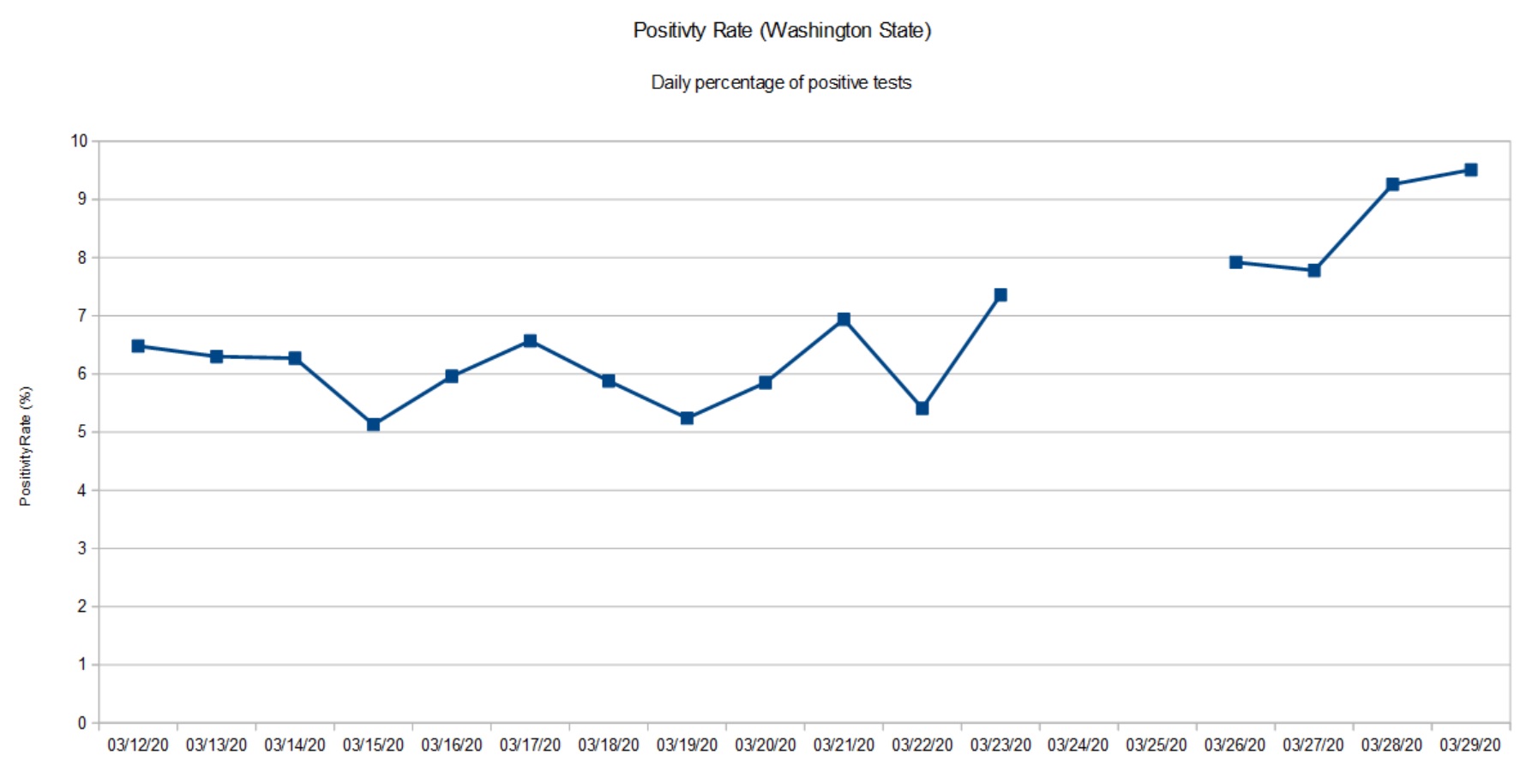
My weekly chart showing the positivity rate for Washington State is a tad late. The Washington Department of Health (DOH) has been busy fixing and upgrading its web site. The new site is a quite an improvement with informative charts, graphs and tables.

Looking at their data, I can appreciate the depth of their collection and reporting problems. Their old database was a “peacetime” tool, collecting positive results from a few of Washington’s many counties. In the fight against COVID-19, all counties are reporting at once and epidemiologists and decision makers want and need additional data about the number of tests, sex, age, etc. Of course, doing all of this work in the middle of a crisis must raise the IT stress level!

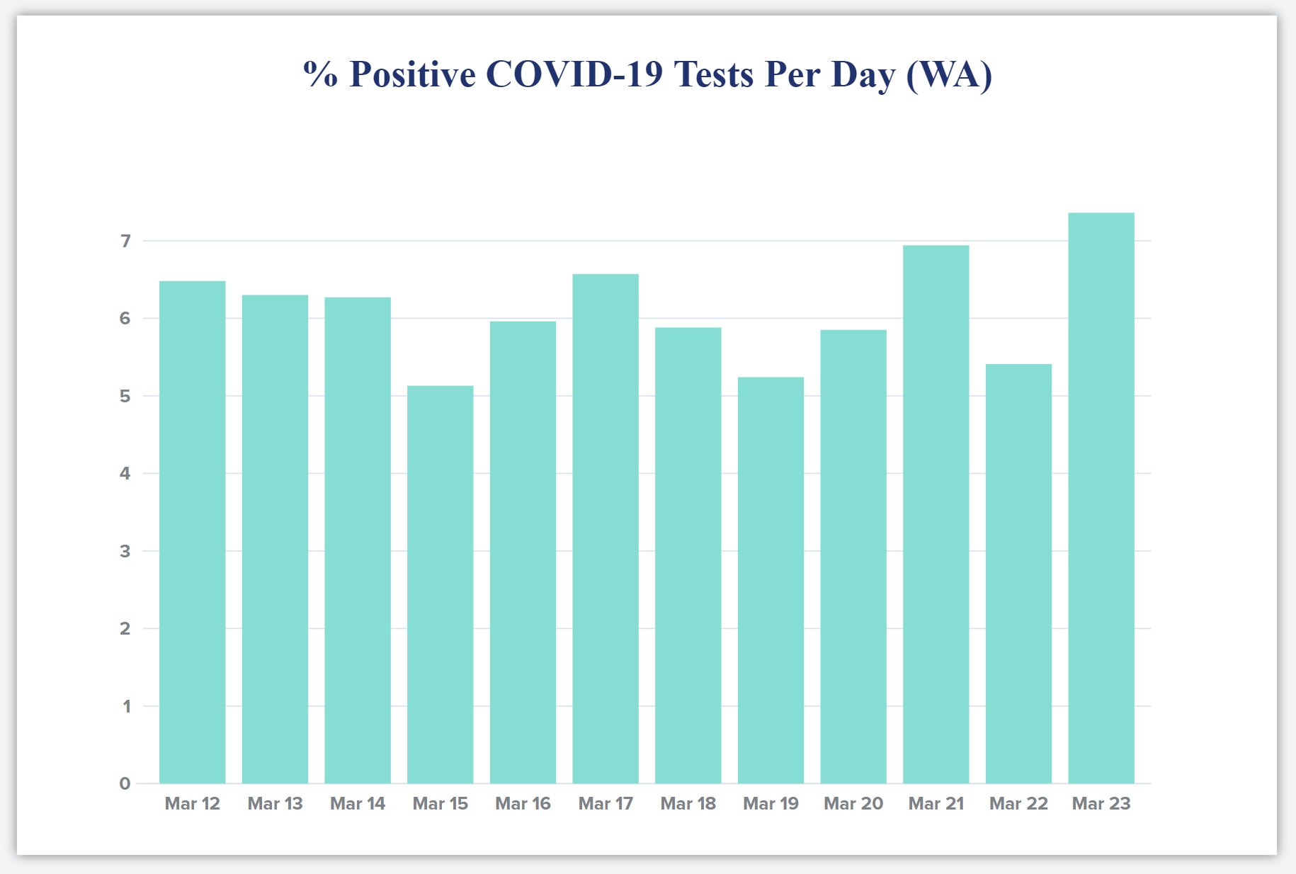
The state DOH site now reports detailed testing information in the form of a bar chart. The bar chart shows the number of positive and negative tests each day based on specimen date. This is a meaningful time base as it allows a snapshot of the positivity rate on a given day. It’s much harder to organize test data in this way than just lumping test results willy-nilly as they come in. (See “stress level” above.)

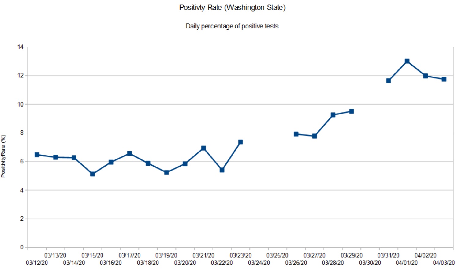
Because all test results for a given specimen day do not arrive at once, the DOH doesn’t guarantee complete results for the days just past. In keeping with their approach, my graph shows the Washington State positivity rate through April 8, 2020. [Click to enlarge graph.]

Washington State Positivity Rate (Through April 8, 2020)

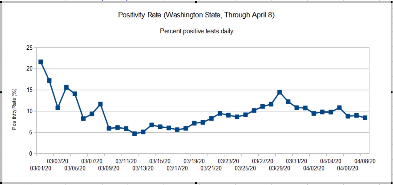
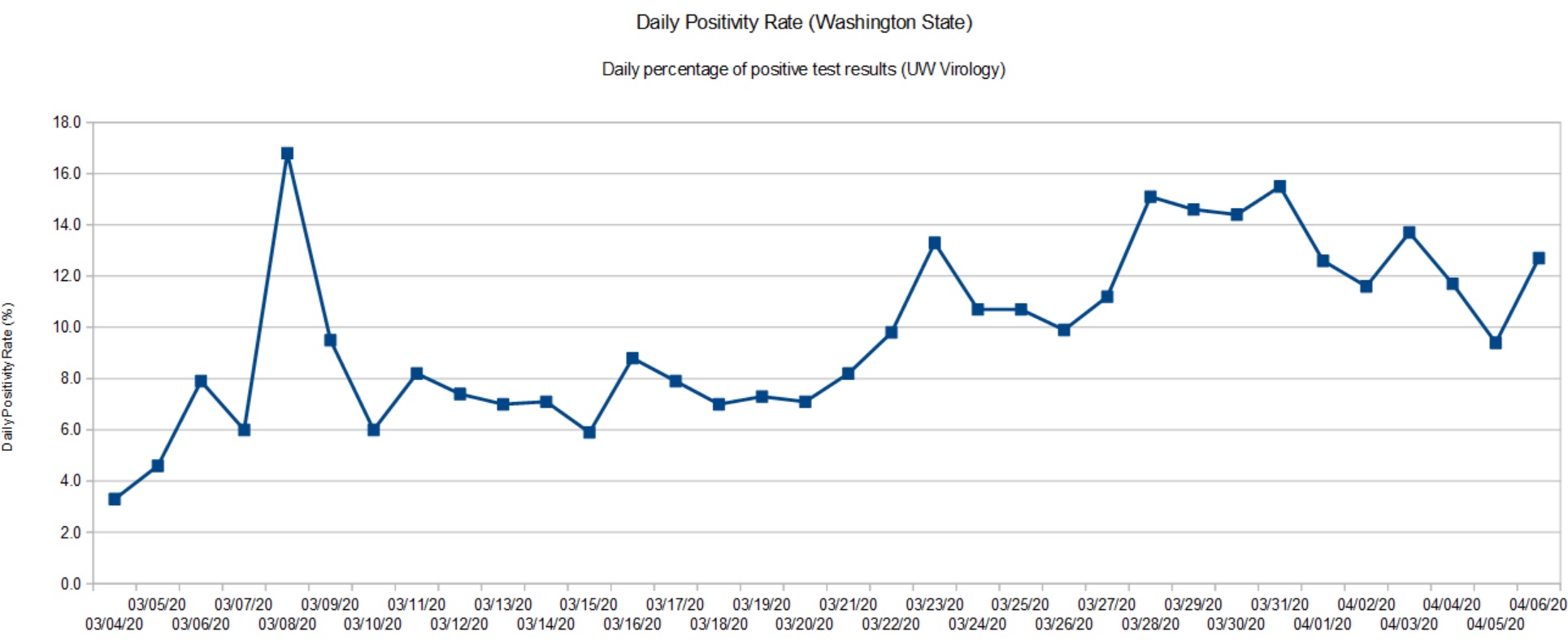
The true peak in the rate occurred on March 28-29, 2020 when it hit 14.49%. The positivity rate has been slowly declining since then. The peak rate was more than double the 5% to 6% rate established around March 10. The new chart agrees reasonably well with raw statistics from the University of Washington Virology Laboratory. UW results, of course, are large portion of the State’s results. A back-of-the-envelope estimate shows that the rate has improved after April 8. Stay tuned.

So, what about those high rates in early March?

The positivity rate is a rather poor indicator which is subject to bias. COVID-19 tests are only administered under certain specific conditions because testing is rationed. Criteria include COVID-19 symptoms (fever, cough, tiredness, difficulty breathing) or contact with a known infected person. Properly, first responders may be given preference since they are most likely to come into contact with infectious people who may or may not be symptomatic. Further, COVID-19 hits nursing homes with vulnerable residents early and hard.

The general public has not been tested in a systematic epidemiological study, i.e., a random sampling of the population at large. Thus, the positivity rate as measured here is imperfect and may not accurately represent what the disease itself is doing in the overall community.

Contact is an important biasing factor and it is why I do not consider results in early March to be baseline. Public health authorities were actively pursuing contacts in early March after the first case of community spread was detected. The number of daily tests ranged from 74 to 500 — small numbers which are easily skewed.

As I’ve mentioned in earlier posts, today’s statistics tell us what the disease was doing 10 to 14 days ago due to the time required for incubation, development of symptoms, clinical presentation, and testing. Washington’s first community mitigation measures went into effect on March 11, with home-stay recommended on March 16 and home-stay ordered on March 16. I think we can safely say “Community mitigation works.”

Now we need the patience to finish the job and win the fight.

Stay distant and stay healthy — P.J. Drongowski

COVID-19: Know Your Foe

OK, that’s a little bit over the top. I was trying to find a way to work NPH into this post. 🙂

Viruses are the simplest biological forms. Viruses are obligate parasites. A virus must invade a host cell in order to reproduce. Viruses contain genetic material, but do not have ribosomes which replicate the genetic material. Viruses use ribosomes in the host cell for replication.

Since a virus cannot reproduce on its own, one may ask if a virus is alive. The question “What is life?” is non-trivial and is not as easy to answer as you may think. Another interesting question to consider is “How did viruses and life begin?”

Please note the term “genetic material.” Viruses are exceptionally diverse. Some viruses are DNA-based, some are RNA-based. Further, the genetic material may be single-stranded or double-stranded. On top of these characteristics, the material may have a linear or a circular structure, or be segmented or non-segmented. Amazing.

RNA-based retroviruses are a huge exception to Francis Crick’s central dogma: DNA makes RNA and RNA makes protein. In a retrovirus, reverse transcriptase (a chemical enzyme/catalyst) synthesizes a DNA copy from viral RNA. The DNA copy integrates into the host genome (in eukaryotic cells). Then, the cell’s protein and replication factory takes over. Eventually, the cell bursts or otherwise expunges the particles and a new cells are infected.

Both ribonucleic acid (RNA) and deoxyribonucleic acid (DNA) are large molecules (polymers) — chains of nucleic acid molecules. Genetic material (RNA or DNA) is rather fragile. Strong UV light or heat causes the chemical bonds in RNA and DNA to break. Whether it’s a cell or a virus, genetic material needs to be protected. A virus typically has a hard protein “shell”, called a “capsid,” that surrounds and protects the genetic material inside.

At this point, I recommend the NOVA Labs and Khan Academy tutorial about RNA before reading on. They do quite a decent job of describing RNA, transcription (copying), and protein synthesis. If you want to cut to the chase, jump to the Virus Wars section of the tutorial.

SARS-CoV-2

SARS-CoV-2 is the virus which causes COVID-19, the disease. It is a type of coronavirus. Calling SARS-CoV-2 “coronavirus” is really refering to this specific type of virus by a generic name. (Not quite correct semantically.)

Coronaviruses contain positive-stranded RNA. The RNA is surrounded by an envelope with spike glycoproteins on the envelope. Without a doubt, you’ve seen the SARS-CoV-2 protein model on television — a grey envelope with red spikes. The spikey glycoproteins are composed of two subunits (S1 and S2). The spikes assist binding to a host cell and injection.

SARS-CoV-2 protein model (CDC)

SARS-CoV-2 is approximately 60 to 140 nm in diameter. That’s darned small. A human hair has a diameter of 15 to 181 um, 1000 times larger. The bactrium E. coli is 1 to 2 um in length, still much larger than SARS-CoV-2. Viruses are exceptionally small; they must be small enough to invade host cells like E.coli.

SARS-CoV-2 has a single-stranded RNA genome. Its RNA strand contains 29891 nucleotides and encodes for 9860 amino acids. In biology-speak, that’s almost 30 kb (kilobases, not kilobytes). AS RNA-based viruses go, that’s a fairly large genome.

The folks at Fusion Medical Animation have produced a new SARS-CoV-2 animation. The image below is taken from their animation.

Credit: Fusion Medical Animation

A tour of the genome

The New York Times published an excellent tour of the SARS-CoV-2 genome — Bad News Wrapped in Protein: Inside the Coronavirus Genome .

The Nucleocapsid gene (N), Envelope gene (E), Spike gene (S) and RNA-dependent RNA polymerase (RdRP) genes are important for testing. The WHO and CDC have developed nucleic acid amplification tests (NAAT) via reverse-transcription polymerase chain reaction (RT-PCR). Targeted genes include the N, E, S, and RdRP genes in the SARS-CoV-2 genome (WHO guidance). RT-PCR amplifies minute quantities of extracted SARS-CoV-2 RNA in a sample (if present) making it possible to assay one or more of the targeted subsequences (genes).

By now, you’ve come a long way along the journey and are ready for the summit. In closing, I recommend Features, Evaluation and Treatment Coronavirus (COVID-19) by Marco Cascella, et al. from the Istituto Nazionale Tumori – IRCCS – Fondazione Pascale. This paper is published by the National Center for Biotechnology Information (NCBI), a part of the U.S. National Institutes of Health (NIH).

If you would like to try your hand at sequencing, you can download the SARS-CoV-2 genome from NCBI. Don’t forget to snag a copy of BLAST. “BLAST finds regions of similarity between biological sequences. The program compares nucleotide or protein sequences to sequence databases and calculates the statistical significance.” STEM teachers, please take note of these resources. NCBI has many other genomes available for download.

Stay healthy, friends — P.J. Drongowski

COVID-19: Washington April 6

Another week has past and it’s time for new charts. I’ve been tracking the daily positivity rate for Washington State. The “positivity rate” is the percentage of positive test results for each 24 hour period. Dividing by the number of tests each day adjusts for variations in daily testing throughput, i.e., the number of tests performed each day is different.

First, here is the chart using test results from the Washington State Department of Health (DOH). [Click to enlarge.]

Daily positivity rate (Washington State, April 3, 2020)

The gaps in the data are due to database issues at DOH. DOH receives and integrates test reports from around the state. Their database has been stressed and has not been tallying negative test results from which one can compute the number of tests per day (i.e., the sum of positive and negative results). Thus, I wasn’t able to compute a daily positivity rate for certain days.

Fortunately, I have the University of Washington Virology Laboratory as back-up. The UW Virology Lab is performing a large portion of tests in Washington. The Lab maintains a dashboard showing the number of tests they performed, the positives, negatives and inconclusives. Inconclusive tests are presumed positive. So, the daily positivity rate is the sum of the positive and inconclusive tests divided by the number of tests performed that day.

Daily positivity rate (UW Virology Lab, April 6, 2020)

Both graphs have a similar shape which shouldn’t be surprising as the UW Virology Lab is a major component in the DOH results. The positivity rate has more than doubled since early March. As of today (April 6), the positivity rate appears to be at a plateau and may show the beginning of a downturn. That’s good news and we need to remain committed to social distancing and other community mitigation measures.

Washington State recommended home-stay on March 16 and closed some businesses (e.g., hair salons, gyms, churches, etc.) I regard these measures as “social distancing lite.” On March 24, the State imposed a stay-at-home order. Given the time lag (10 to 14 days), the turn in the positivity rate is most likely due to the full stay-at-home order.

Fortunately, Governor Inslee has not declared victory. Instead, social distancing measures have been extended to May 4. Further, school has been cancelled through the end of the Spring term.

From my own observations, people in our part of Snohomish County (near Bothell and Everett) are treating COVID-19 seriously and are complying with the stay-at-home order. If a state, county or city is waiting for signs of an outbreak, don’t wait to issue a stay-at-home order. Response now will keep the size of your problem manageable. An ounce of prevention is worth a pound of cure.

Cleveland, OH

I keep an eye on the old hometown for no other reason than the Cavs and Browns. Cleveland.com published a few useful looking charts and graphs.

As we all go forward, we need to know when our communities have turned the corner and, importantly, when we can restart some business activities. The Ohio Department Health tracks the percentage increase in confirmed cases day-over-day.

Credit: Cleveland.com

Like Washington, Ohio has not hesitated to issue a stay-at-home order and to implement other forms of community mitigation. Gov. Mike DeWine, like Gov. Inslee, may not be the most dynamic individual, but he, too, is leading his state effectively in this crisis. I’m pulling for the folks at home!

Credit: Cleveland.com

This is another Ohio DOH chart which caught my eye. It plots confirmed cases by the onset of symptoms. This chart better aligns case count with the actual time frame in which a patient was infected.

NYT: What’s next?

The New York Times published two good articles on community mitigation and the next phase in our battle against SAR-CoV-2 (COVID-19) — cycles of “suppress and lift” as restrictions are applied and relaxed, so-called waves.

These articles are flying by so fast and so thick that you’ll miss them if you blink.

Stay 2 meters apart and stay healthy — P.J. Drongowski

COVID-19 Numeracy: Round-up

Time for what’s known in the journalism biz as a “round-up.”

I started blogging about COVID-19 numeracy (AKA “by the numbers”) as a way to get my head around all of the data thrown at us by media outlets. Blogging also gave me a way to have the illusion of control over that which I cannot control, namely, the spread of COVID-19.

I hope that my blog posts are a resource for math and science teachers. (I try to keep these posts free of politics, BTW.) If there is a silver lining in all of this, what an opportune time to teach critical thinking and numeracy! I tried to collect the best and most useful examples of data presentation and, I collected a few stinkers, too.

So, here they are, links to my blog posts about COVID-19 numeracy:

If you’re a regular reader, you know that I usually deep-dive music technology and electronics. Fear not, I have been plugging away on music projects, too: Blokas MidiBoy, Toontrack EZKeys, recording demos with Genos, and more. All the projects for which I didn’t have time. Guess I’ve got the time now, just like everyone else. 🙂

I hope to blog about music-related topics as I’m not sure how much value I can add to the on-going COVID-19 discussion. I will continue to track the positivity rate for Washington State since this is my home with family and friends nearby. Plus, there are always subjects (e.g., reverse transcription polymerase chain reaction/RT-PCR testing) that pique my scientific interest.

Washington Post: Bending the curve

Here’s a quick hit from the Washington Post. It’s a set of graphs illustrating the effect of social distancing for select U.S. cities.

Source: Washington Post (April 2, 2020)

With respect to Washington State (Seattle), it’s still early days, really. I think my original guidance holds — we won’t really see a bend from another 7 to 14 days out from this point (April 2). Washington State imposed its first social distancing on March 16 followed by a stay-at-home order on March 23. With the delay due to SARS-CoV-2 incubation, development of symptoms, clinical presentation and testing (10 to 14 days according to medical experts), we should just now be seeing a bend in the curve.

The Washington State Department of Health (WADOH) has had technical issues with its disease reporting database. The original database could not handle the incoming stream of reports including negative test reports. So, the WADOH database went dark for a few days recently and is just now coming back. Due to these technical glitches, we need a little extra time to see the effect of social distancing in Washington.

Stay apart and keep all of us healthy — P.J. Drongowski

COVID-19 Numeracy: Seattle scene

A New York Times article (March 29) suggests that social distancing is beginning to pay off in the Seattle area. The NYT article refers to work performed at the Institute for Disease Modeling in Bellevue, WA. The authors are cautious saying that data is preliminary and unpublished.

Quoting the IDM web site:

IDM shapes global efforts to eradicate infectious diseases and to achieve permanent improvements in the health of those most in need. By developing, using, and freely sharing computational modeling tools, we advise policymakers, promote quantitative decision-making and advance scientific methodologies.

IDM is an institute within the Global Good Fund, a collaboration between Intellectual Ventures and Bill and Melinda Gates.

Currently, IDM is working on disease transmission dynamics for malaria, polio, tuberculosis, HIV, pneumonia, typhoid, and more.

Personal thanks to Bill and Melinda Gates for their philanthropic work.

IDM has a COVID-19 InfoHub. For the latest results, I recommend the IDM InfoHub Research and Reports page. This is the real deal.

IDM published a report (as of March 29) on the effects of social distancing and mobility reductions on COVID-19 in King County, WA. Quoting the report:

Still, based on this data for King County, the trend clearly shows Re decreasing from about 2.7 in late February to roughly 1.4 on March 18th. These estimates come with high uncertainty, and while the trend is encouraging, it remains unlikely that COVID transmission in King County was below the 1.0 threshold on the 18th.

[We] cannot say with confidence if Re is below or above the critical threshold of 1 today.

Re is the effective reproductive number for COVID-19.

Thank goodness, Governor Inslee is not declaring victory either. Community mitigation measures remain in place and likely will be extended. (The federal guideline is currently April 30.) In his interview on CNN’s “State of the Union” on Sunday, the Governor cited shortfalls in testing supplies (swabs, vials, etc.) which are limiting the number of tests performed daily. As I’ve said before, we need community-wide epidemiological studies to get ahead of the disease. We cannot perform epidemiological tests (surveillance testing) when we can barely perform diagnostic testing for symptomatic patients.

The Fine Print

Let’s get nerdy. How do IDM define R0 and Re. Quoting the IDM glossary:

R0 (R Naught, Basic reproductive number): The average number of secondary cases a typical infectious individual will generate without any interventions in place to reduce transmission. The number of secondary cases per source is expected to change over time and space with different interventions and as the proportion of the population with immunity grows (REff).

REff (R Effective) or Re: The number of secondary cases each infectious individual will generate, on average, after interventions are in place and/or part of the population is immune. We would expect REff to be less than R0.

Washington Department of Health

The Washington State Department of Health upgraded COVID-19 reporting on their web site. They are publishing better graphs and data, especially data about testing. I’d like to see graphs for the posivity rate over time since the ratio of daily positive tests divided by the daily number of tests adjusts for day-to-day variations in testing. (“Daily” means for each 24 hour period.)

Positivity Rate

Governor Inslee referred to this ratio as the “Positivity Rate” and I like that term. It’s more concise than “Percentage of positive tests per day.”

Below is my plot of the Washington State positivity rate starting March 12 to March 29. Although the press is optimistic, The positivity rate has doubled over the time period. [Click image to enlarge.]

Washington State Positivity Rate (March 12 to March 29)

The gap in the graph is due to missing data from the Washington State Department of Health. They ran into database glitches March 24 and 25. The March 26 data point aggregates positive cases and tests across the gap.

There are several factors that affect the positivity rate. First off, this is not a random sample of the population at large. People are tested only if they satisfy a protocol, that is, satisfy a set of criteria. Criteria include presence of COVID-19 symptoms (fever, cough, shortness of breath), contact with a known infected COVID-19 patient, or in-coming travel from a known COVID-19 hot-spot (e.g., China, Italy, New York City metro, etc.) No doubt, some of the tests are due to contact tracing as officials try to identify possible carriers in order to isolate them. Bottom line, the positivity rate is far from a controlled epidemiological study (surveillance).

Please remember that any measurements we take today show what the virus (SARS-CoV-2) was doing 10 to 14 days ago. The delay is due to incubation, development of symptoms, clinical presentation and testing.

At this point in time (March 30), I’m glad that Washington State is staying the course and is looking at additional restrictions.

BTW, I’m still trying to absorb the changes to the Washington State Department of Health site. Their graphs don’t always jibe with my table of previously published data.

Cautionary tale

Here is a cautionary tale from The Seattle Times.

At the beginning of March, The Skagit Valley Chorale discussed weekly rehearsals and whether they should go ahead. Skagit County had not yet reported any cases of COVID-19. On March 6, they decided to go ahead with rehearsal on March 10. The chorale members used hand sanitizer and minimized contact during rehearsal.

None of those precautions, however, prevented an outbreak. Three weeks later, 45 members have been diagnosed with COVID-19 or have had symptoms. At least three members were hospitalized and two are dead.

Fortunately, our own church group passed on rehearsal during the same time frame.

This tale should be a warning to any community that feels safe because they have not yet experienced the disease. Please pay attention to our public health officials who predict eventual outbreak everywhere. Start social distancing and isolation now.

    Car crash fatalities (2019)    38,800 people 
Vietnam War fatal casualties 58,220 people
Hiroshima fatal casualties 90,000 to 146,000 people
Nagasaki fatal casualties 39,000 to 80,000 people
COVID-19 ?

— P.J. Drongowski

COVID-19 Numeracy: Epidemiologic Testing

Epidemiologic testing

Yesterday, CNN carried interviews with Dr. Anthony Fauci and Bill Gates. Both gentlemen called for community-wide epidemiological studies of COVID-19. We need to know the prevelance of the disease in our communities in order to assess the effectiveness of community mitigation (i.e., social distancing).

Broadly speaking, there are two kinds of COVID-19 testing:

  1. Diagnostic testing
  2. Epidemiologic testing

Diagnostic testing is patient-focused. It determines if the tested individual is infected with SARS-CoV-2 (the virus which causes disease COVID-19) in order to isolate and treat the patient. Due to limited test capacity, all testing to date is diagnostic in purpose.

There are variants of diagnostic testing on the horizon such as a test to determine if an individual has acquired immunity to COVID-19 or not (antibody testing).

Epidemiologic testing is like a political poll. People are selected at random from the community, statistically called the “population.” The selected people are tested for SARS-CoV-2 infection using the same kind of medical test employed in diagnostic testing. Personal information is also collected such as age, sex, presence of underlying medical conditions, previous COVID-19 diagnosis, and so forth. Statistics are tallied and summarized such as the percentage infected, susceptible (not yet infected) and immunity. Like a political poll, the statistics are broken out by age, sex and so forth.

We have not yet performed a single community-wide epidemiological study of COVID-19. This leaves us blind to one important segment in the community — people in the community who are infected and are asymptomatic. We know that asymptomatic people are a significant factor in the spread of SARS-CoV-2 and COVID-19.

Impatient people are already chomping at the bit to restart the American economy. Given that we are only 2 weeks (at best) into community mitigation, this is preposterous. [Some communities have not even started social distancing and they are late.] At some point, though, we must restart the economy. Epidemiological studies will help us to decide if it is safe to reduce community mitigation and allow the free flow of commerce again.

One important factor in the decision to reduce mitigration is the degree of immunity in the community, the so-called “herd immunity.” The community (the herd) becomes protected from a disease when a large portion of the population (typically, 60%) is immune to infection. Infected individuals often become immune when they successfully fight off and recover from the disease (acquired immunity). Better yet, individuals can be made immune through vaccination.

Acquired COVID-19 immunity has not been confirmed by scientific study at this time. Based on prior experience with other coronaviruses, medical experts believe that recovered individuals will be immune to SARS-CoV-2.

“Flattening the curve” has two benefits. First, it reduces the strain on the health care system (hospitals, doctors, nurses and other caregivers). Second, it buys us the necessary time to develop a safe vaccine and to get a vaccination program ramped up and put in place. In some sense, developing the vaccine is the easy part. The time-consuming part is the medical trials and studies needed to assume safety and efficacy.

The Seattle Flu Study

During the Bill Gates interview, he mentioned The Seattle Flu Study.

The Seattle Flu Study was initially started to detect, monitor and control influenza outbreaks in Seattle using rapid virus genetic sequencing and mapping chains of transmission. The study is led by the Brotman Baty Institute, in collaboration with UW Medicine, The Fred Hutchinson Cancer Research Center, and Seattle Children’s.

With the outbreak of COVID-19, the Seattle Flu Study was “repurposed” to COVID-19. Quoting:

We are partnering with Public Health — Seattle & King County to launch the greater Seattle Coronavirus Assessment Network — or SCAN for short.

To track the spread of COVID-19, SCAN will collect nasal swabs from a sample of people across Seattle and King County, working to mirror the area’s population as closely as possible. We’ll collect swabs from both those who are healthy and those who feel sick and will also test de-identified clinical residual samples (these are left-over samples from tests performed for other reasons at clinical laboratories). The results of these tests will help us understand the outbreak more completely and, along with other data sources, help inform public health decisions. SCAN is not able to offer testing to every individual but the whole community will benefit from the program.

I look forward to the results of the SCAN study since we live a stone’s throw away from King County, Washington. This is our ‘hood.

Logarithmic graphs

Logarithmic graphs are good tools when analyzing phenomena with exponential growth. At this point, we’ve all seen linear scale graphs showing the steep rise of COVID-19 cases. Each tick in a linear scale graph has the same statistical weight, e.g., 100, 200, 300, 400, etc.

A logarithmic graph has a logarithmic scale. Each tick increases by a power of 10, e.g., 100, 1,000, 10,000, 100,000, etc. An exponential trend appears as a straight line in a logarithmic graph. Here is a logarithmic graph (from The Guardian, March 27).

Source: The Guardian (March 27)

Sadly, the United States is on an exponential trajectory. China and South Korea, in particular, have asymptotic curves, showing successul COVID-19 community mitigation. Those two countries are “flattening the curve.”

New York State Hospitalizations

Gov. Andrew Cuomo of New York presented an important and useful graph during his briefing this morning.

New York State COVID-19 Hospitalizations Through March 26

This chart shows the number of hospitalizations per day. Please note that the number of hospitalizations is increasing by almost 1,200 new patients per day. No health care system can sustain this kind of growth. New York State expects the apex of hospitalizations in 21 days, adding a further 25,200 hospitalized patients, if the current rate continues.

COVID-19 Numeracy: More NYT

As I mentioned earlier today, The New York Times staff has published some excellent maps, charts and interactive simulations.

Their latest interactive simulation illustrates the effect of community mitigation (i.e., social distancing) for varying periods of time. I took snapshots at weekly intervals (social distancing for 7 days, 14 days, 21 days, etc.) [Click to enlarge.]

Effect of community mitigation for different time periods (NYT)

The curve in the lightest shade is the number of infected people. The middle shade curve is the number of people hospitalized and the darkest shade curve is the number of deaths. Each tick in the vertical scale is 10 million. Yes, millions. I recommend reading the article itself for assumptions and caveats on the mathematical model.

From this time series, it’s easy to see that two weeks (14 days) of community mitigation is wholly inadequate for suppressing the disease, let alone stopping it. To my eye, the shortest reasonable duration is 42 days (6 weeks).

Here is the latest NYT map (March 26, 2020) depicting the spread of COVID-19 across the United States. [Click to enlarge.]

Spread of COVID-19 (The New York Times, March 26, 2020)

Dedicated to Edward Tufte, who is still kicking around, thank goodness.

COVID-19 Numeracy: Geography

Updated March 26, 2020.

State-by-state

Governor Cuomo, in his briefing today, asked why New York State is leading the United States in positive COVID-19 cases. Let’s compare the top four states:

                     Total   Total   Percent    
State Tests Cases Positive Date
------------- ------ ------ -------- ----
New York 38,390 14,904 38.8% 3/24
Massachusetts 13,749 1,159 8.4% 3/24
California 27,650 2,102 7.6% 3/24
Washington 33,933 2,221 6.5% 3/23

Indeed, New York State has the highest percentage of positive tests — substantially higher. There must be a factor in play. Could there be a difference in testing (i.e., difference in the test kits? different test protocol?) Did SARS-CoV-2 hit New York State sooner? Is COVID-19 more prevalent due to the population density in the New York City region, as the Governor speculated?

Only a good epidemiological study could really measure the prevalence of SAR-CoV-2 in the community. As to timing, I don’t think we will ever know when SARS-CoV-2 hit our shores. New York City is a major global transportation hub. Even so, Washington and California have strong business and family ties across the Pacific and Pacific rim and have major transportation hubs (Los Angeles, San Francisco, San Diego, Seattle).

If I get a chance today, I’m going to look into our neighbor to the north, Vancouver. Vancouver is also quite connected with Asia and the Pacific rim.

The Washington Department of Health has had difficulties with its COVID-19 database. Although they posted a new number of positive cases, 2,469 as of March 24, the number of negative cases was not updated, showing the same total negative test count as of March 23.

The national picture

The New York Times has published many informative graphs and simulations during the COVID-19 crisis. The chart below shows the spread of SARS-CoV-2 (the virus) and COVID-19 (the disease caused by SARS-CoV-2) across the United States as of March 19, 2020.

Source: The New York Times

The chart illustrates how population density affects the number of COVID-19 cases. [Click to enlarge.] The biggest circles coincide with the major urban centers in the United States. On the west coast are Seattle-Tacoma-Washington, the San Francisco Bay area, and Los Angeles, for example.

The chart demonstrates why it isn’t appropriate to think numerically about the country as a whole. Sure, Americans want to know how the U.S. is doing overall. However, when it comes to actual COVID-19 containment and mitigation, it’s a local, regional problem. That’s why our county and municipal health departments are so important and local statistics are the most meaningful and practical.

All is not local, however. The urban centers are connected by highways and air routes, giving SARS-CoV-2 passage. As the disease plays out, the coastal urban centers with the greatest population and density will likely succumb first, followed by so-called second tier cities. When the disease subsides in major urban centers, the second tier will maintain active reservoirs of SARS-CoV-2. If major urban centers drop community mitigation (e.g., social distancing) too soon, the active pools in the second tier will cause COVID-19 flare-ups in any major urban center that drops its mitigration too early.

Major urban centers are more tightly connected to global business and commerce than the second tier. SARS-CoV-2 likely arrived much earlier than the second tier and SARS-CoV-2 has probably been circulating in the first tier population for a longer time.

Italy

Media outlets have drawn many comparisons between the Unitet States and Italy. Let’s consider a few facts about Italy from the CIA World Factbook.

Italy’s land area is 294,140 sq km (square kilometers), roughly the size of Arizona (294,207 sq km). Italy’s population is estimated to be 62,402,659 people (July 2020). California is the most populous state with 39,512,223 residents (July 2019). Overall, Italy has as many people as California and New York State combined in a smaller land mass (Arizona).

Italy’s Lombardy region is, arguably, the Italian region most severely affected by COVID-19. Lombardy is located in northern Italy with the major urban center Milan as its capital.

Lombardy has 10,078,012 people (August 2019). It is the most populated region in Italy. It’s population is roughly the size of Michigan (or North Carolina, or Georgia). Lombardy, by population, would be the tenth largest state in the U.S. Lombardy is 23,844 sq km, roughly the size of West Virginia. Lombardy has a population density of 420 people per sq km.

The city of Milan has 1.369 million people. (The World Fact Book claims 3.140 million people, but it depends on how one draws boundaries.) Milan has a population density of 7,572 people per sq km (2019). That’s roughly the same density as Huntington Park (Los Angeles metro) or Somerville (Boston metro). New York City has a population density of 10,431 people per sq km. [I taught in Somerville; it’s dense.]

Lombardy accounts for 68% of COVID-19 fatalities in Italy. 23% of Italians are 65 or older, making it the second oldest population in the world. (Japan is first.) Age and underlying health conditions are known COVID-19 vulnerabilities. High population density and more elderly people (with existing health issues) are a fatal combination of factors.

Temperature

One final observation because it involves maps. The Kinsa US Health Weather Map has received media attention including MSNBC’s The Rachel Maddow Show. (Hi, Rachel.)

The Health Weather Map is a visualization of seasonal illness linked to fever as measured by Kinsa Smart Thermometers. The Kinsa Thermometer connects to your device (and the Kinsa App) via Bluetooth. The Kinsa Thermometer costs about $20-$25 USD retail and requires the Kinsa App for Web communication.

Here is today’s map (March 26). [Click to enlarge.]

Kinsa US Health Weather Map (March 26, 2020)

I look at the Health Weather Map with interest, but take it with a grain of salt. There are two factors to consider.

  • Although the Kinsa Thermometer is inexpensive, it needs an expensive smart device in order to communicate results via the Web.
  • It’s not clear how people use the thermometer, i.e., do they take their temperature every day? When they feel sick?

Given the need for a smart device and Internet connection, I’m not sure if Kinsa users represent the population at large. Use of the device may bias results, too. If users take their temperature only when they are sick, then the map will show more high temperatures. Ah, well, I need to dig into their study. [Thank you, Kinsa, for posting your methodology.]

Stay apart, mate, and we’ll both be healthy — P.J. Drongowski

COVID-19 Numeracy: New York City

Yesterday, Governor Jay Inslee issued a full, statewide “stay at home” order for Washington State. Up to this point, home-stay was recommended and did not have the force of law. Now it does.

Thank goodness. When I first glanced at the percentage of new positive cases per day (Washington State), I felt optimistic. After reflection, I decided. “Yes, it’s good that the percentage is not increasing rapidly, but even no change is still bad.” Even a constant flow of new patients into the health care system will eventually overwhelm it. A linear curve, as opposed to an exponential curve, merely postpones the day when we exceed capacity.

Someone might say, “Oh, linear isn’t bad.” Yes, it is and here’s why. It’s not like an acute care patient arrives, is given some magic cure and is sent home. Mean duration of hospitalization in Chine was 12.8 days. [Please see “Clinical Characteristics of Coronavirus Disease 2019 in China” in the New England Journal of Medicine.] Even with a so-called linear curve, acute care patients are admitted and stay. Most hospitals are “right sized” during normal times by administrators interested in efficency. So, it doesn’t take long before capacity and staff are exhausted.

China had hospitalization rates ranging from 15% to 20%. In the Chinese epidemic, 41.3% of patients received oxygen therapy and 6.1% received mechanical ventilation.

There is only one advantage to a linear curve vs. exponential — it gives hospitals and other facilities an opportunity to ramp up for the influx of acute care patients. The availability of respirators and ventilators is a critical concern as well as temporary beds and infrastructure for convalescence and recovery.

We need to push the number of new COVID-19 cases downward through social distancing and good hygiene. I’m glad that Governor Inslee has issued a full stay-at-home order. Now, we all need to listen to it and act.

New York City

Governor Cuomo of New York was visibly more alarmed today. I pulled together a quick table of new case and new testing statistics for New York City (NYC).

I’m alarmed, too.

New York City (NYC) 
Cum New Cum New Percent
Date Positive Positive Tests Tests Ratio Hospital
------ -------- -------- ------ ------ ----- --------
Mar 20 4408 1939 14386 4852 40.0% 18%
Mar 21 6211 1803 19463 5077 35.5% 15%
Mar 22 9045 2832 26389 6927 40.1% 13%
Mar 23 12305 3260 33003 6614 49.3% 13%
Mar 24 14904 2599 38390 5387 48.2% --
Mar 25 17856 2952 44076 5686 51.9% 12%
Mar 26 21393 3537 51031 6955 50.9% 14%
Mar 27 25398 4005 57954 6923 57.9% 15%
Mar 28 29766 4368 65902 7948 55.0% --
Mar 29 33768 4002 73104 7202 55.7% 14%
Mar 30 37453 3685 -- -- -- 14%

24% of hospitalizations are ICU patients (March 23)
23% of hospitalizations are ICU patients (March 24)
24% of hospitalizations are ICU patients (March 26)
24% of hospitalizations are ICU patients (March 27)
24% of hospitalizations are ICU patients (March 29)
25% of hospitalizations are ICU patients (March 30)

The percentage of new positive cases per day (which takes the ever-varying number of tests into account) for Washington State is around 6.5%. The ratio for New York City is 6 times higher than Washington. (Update: Washington State calls this ratio “Positivity Rate.”)

I fear that NYC is already in the weeds. Folks, NYC is the largest financial center in the United States. So, even if all you care about is money, this is the wrong time to lift restrictions and to restart the American economy. Plain and simple, that’s crazy talk. And, immoral.

Stay distant and stay healthy — P.J. Drongowski

Update quoting CNBC News:

New York and New Jersey are seeing coronavirus attack rates at least five times higher than other parts of the country, a U.S. official in charge of the White House’s pandemic response efforts said Monday.

“The New York metro area of New Jersey, New York City, and parts of Long Island have an attack rate close to one in 1,000,” Dr. Deborah Birx, a physician and the White House coronavirus response coordinator, said at a press briefing Monday evening. The attack rate is the percentage of a population that gets the disease.

She said roughly 28% of the specimens submitted in that region have tested positive for COVID-19, while less than 8% have tested positive for the disease in the rest of the country.

New York is currently the hardest-hit state in the country, ahead of New Jersey, California and Washington state. New York City, alone, accounts for 12,305 of the 20,875 confirmed infections in the state as of Monday morning.

COVID-19 Numeracy: Comparability

% Positive New Cases Per Day

It’s time to show some numbers of my own!

Thanks to The Seattle Times and the Washington State Department of Health (DOH), I have built a table that summarizes COVID-19 case statistics since late February. Data before March 10 is somewhat spotty and lacks the number of tests per day, etc. The raw numbers are shown in the table below.

            Cum      Cum    Cum 
Date Positive Negative Tests New Cases New Tests Ratio Notes
------ -------- -------- ------- --------- --------- ----- --------
Feb 28 1
Feb 29 7
Mar 2 18
Mar 4 39 SnoEmerg
Mar 5 70 Pence
Mar 6 83
Mar 7 102
Mar 8 136
Mar 9 162 1149 1311
Mar 10 267 105
Mar 11 366 3037 3403 99 Ban>250
Mar 12 457 4350 4807 91 1404 6.48%
Mar 13 568 6001 6569 111 1762 6.30%
Mar 14 643 7122 7765 75 1196 6.27%
Mar 15 769 9451 10220 126 2455 5.13%
Mar 16 904 11582 12486 135 2266 5.96% HomeRec
Mar 17 1012 13117 14129 108 1643 6.57%
Mar 18 1187 15918 17105 175 2976 5.88%
Mar 19 1376 19336 20712 189 3607 5.24%
Mar 20 1524 21719 23243 148 2531 5.85%
Mar 21 1793 25328 27121 269 3878 6.94%
Mar 22 1996 28879 30875 203 3754 5.41% Everett
Mar 23 2221 31712 33933 225 3058 7.36%
Mar 24 2469 248 StayHome
Mar 25 2580 111
Mar 26 3207 43173 46380 627 12447 7.92%
Mar 27 3700 49015 52715 493 6335 7.78%
Mar 28 4300 54896 59196 600 6481 9.26%
Mar 29 4896 60566 65462 596 6266 9.51%
Mar 30 5515 DOHIssues
Mar 31 5984 68814 74798 1088 9336 11.65%
Apr 1 6585 72833 79418 601 4620 13.01%
Apr 2 6966 75633 82599 381 3181 11.98%
Apr 3 7591 80327 87918 625 5319 11.75%
Apr 4 7984 393 DOHIssues
Apr 5 8384 400
Apr 6 8682 298
Apr 7 9097 415
Apr 8 9609 512
Apr 9 9887 278
Apr 10 10224 337
Apr 11 10411 187
Apr 12 10538 127
Apr 13 10694 112160 122854 166
Apr 14 10783 113500 124283 89 1429 6.23%
Apr 15 11152 117748 128900 369 4617 7.99%
Apr 16 11445 120182 131627 293 2727 10.74%
Apr 17 11802 135706 357 4079 8.75%
Apr 18 11790 126852 138642 2936 DOHCorrection
Apr 19 12085 128926 141011 295 2369 12.45%
Apr 20 12282 132749 145031 197 4020 4.90%
Apr 21 12494 135459 147953 212 2922 7.26%
Apr 22 12753 140623 153376 259 5423 4.78%
Apr 23 12977 147347 160324 224 6948 3.22%
Apr 24 13319 157275 170594 342 10270 3.33%
Apr 25 13521 161956 175477 202 4883 4.14%
Apr 26 13686 165993 179679 165 4202 3.93%
Apr 27 13842 168673 182515 156 2836 5.50%
Apr 28 14070 173730 187800 228 5285 4.31%
Apr 29 14327 179654 193981 257 6181 4.16%
Apr 30 14637 184087 198724 310 4743 6.54%
May 1 15003 192312 207315 366 8591 4.26%
May 2 15185 196820 212005 182 4690 3.88%
May 3 15462 200858 216320 277 4315 6.42%
May 4 15594 203859 219453 132 3133 4.21%
May 5 15905 208908 224813 311 5360 5.80%
May 6 16231 214449 230680 326 5867 5.56%
May 7 16388 219447 235835 157 5155 3.05%
May 8 16674 226315 242989 286 7154 4.00%
May 9 16891 231984 248875 307 5886 5.22%
May 10 17122 234986 252108 231 3233 7.15%
May 11 17330 238991 256321 208 4213 4.94%
May 12 17512 243568 261080 182 4759 3.82%
May 13 17773 250158 267931 261 6851 3.81%
May 14 17951 255352 273303 178 5372 3.31%
May 15 18288 262705 280993 337 7690 4.38%
May 16 18433 266810 285243 145 4250 3.41%
May 17 18611 270524 289135 178 3892 4.57%
May 18 18811 274309 293120 200 3985 5.02%
May 19 18971 278971 297942 160 4822 3.32%
May 20 19117 283810 302927 146 4985 2.93%
May 21 19265 289093 308358 148 5431 2.73%
May 22 19585 296691 316276 320 7918 4.04%
May 23 19828 306765 326593 243 10317 2.36%
May 24 20065 310533 330598 237 4005 5.92%
May 25 20181 312610 332791 116 2193 5.29% George Floyd
May 26 20406 315395 335801 225 3010 7.48%
May 27 20764 322327 343091 358 7290 4.91%
May 28 21071 327162 348233 307 5142 5.97%
May 29 21349 333005 354354 278 6121 4.54% SEA protests
May 30 21702 339197 360899 353 6545 5.39%
May 31 21977 343295 365272 275 4373 6.29%
Jun 1 22157 346642 368799 180 3527 5.10%
Jun 2 22484 354843 377327 327 8528 3.83%
Jun 3 22729 360858 383587 245 6260 3.91%
Jun 4 22993 367870 390863 264 7276 3.63%
Jun 5 23442 377146 400588 449 9725 4.62%
Jun 6 23729 381327 405056 287 4468 6.42%
Jun 7 24041 386249 410290 312 5234 5.96%
Jun 8 24354 390700 415054 313 4764 6.57%
Jun 9 24642 --- --- 288 --- ---
Jun 10 24779 400433 425212 137 10158 4.18%
Jun 11 25171 414691 439862 392 14550 2.69%
Jun 12 25538 424608 450146 367 10284 3.57%
Jun 13 25834 436768 462602 296 12456 2.38%
Jun 14 26158 445107 471265 324 8663 3.74%
Jun 15 26531 453495 480026 373 8761 4.26%
Jun 16 26784 408232 435016 253 --- --- DOH no sero
Jun 17 27192 419707 446899 408 11883 3.43%
Jun 18 27601 428340 455941 409 9042 4.52%
Jun 19 28225 437844 466069 624 10128 6.16%
Jun 20 28680 446258 474938 455 8869 5.13%
Jun 21 28870 448334 477204 190 2266 8.38%
Jun 22 29386 457673 487059 516 9855 5.24%
Jun 23 29869 465629 495498 483 8439 5.72%
Jun 24 30367 475428 505795 498 10297 4.84%
Jun 25 30855 483573 514428 488 8633 5.65%
Jun 26 31404 494398 525802 549 11374 4.83%
Jun 27 31752 502691 534443 348 8641 4.03%
Jun 28 32253 515967 548220 501 13777 3.64%
Jun 29 32824 524451 557275 571 9055 6.31%
Jun 30 33435 538529 571964 611 14689 4.16%
Jul 1 34151 550838 584989 716 13025 5.50%
Jul 2 34778 565197 599975 627 14986 4.18%
Jul 3 35247 572029 607276 469 7301 6.42%
Jul 4 35898 576808 612706 651 5430 11.99%
Jul 5 36985 592271 629256 1087 16550 6.57%
Jul 6 37420 598104 635524 435 6268 6.94%
Jul 7 37941 607131 645072 521 9548 5.46%
Jul 8 38581 621749 660330 640 15258 4.19%
Jul 9 39218 629248 668466 637 8136 7.83%
Jul 10 ---
Jul 11 40656 645349 686005 1438 17539 8.20%
Jul 12 41757 666517 708274 1101 22269 4.94%
Jul 13 42304 675930 718234 547 9960 5.49%
Jul 14 43046 690840 733886 742 15652 4.74%
Jul 15 44313 708861 753174 1267 19288 6.57% Yakima backlog
Jul 16 45067 722590 767657 754 14483 5.21%
Jul 17 46026 745760 791786 959 24129 3.97%
Jul 18 46946 762393 809339 920 17553 5.24%
Jul 19 47743 778611 826354 797 17015 4.68%
Jul 20 48575 792609 841184 832 14830 5.51%
Jul 21 49247 805905 855152 672 13968 4.81%
Jul 22 50009 820754 870763 762 15611 4.88%
Jul 23 50824 833158 883982 815 13219 6.17%
Jul 24 51849 851825 903674 1025 19692 5.21%
Jul 25 52635 866712 919347 786 15673 5.01%
Jul 26 53321 879983 933304 686 13957 4.92%
Jul 27 54205 891029 945234 884 11930 7.41%
Jul 28 54985 903322 958307 780 13073 5.97%
Jul 29 55803 917851 973654 818 15347 5.33%
Jul 30 --- DOH outage
Jul 31 57541 943987 1001528 1738 27874 6.24%
Aug 1 58173 950107 1008280 632 6752 9.36%
Aug 2 58715 --- 542 DOH issues
Aug 3 59379 --- 664
Aug 4 60084 --- 705
Aug 5 60917 --- 833

I have tried to make this table as accurate as possible. Please forgive any transcription errors. The Washington Department of Health has suffered technical issues, so there are gaps in the data. Their database has been overwhelmed and they have had trouble tallying negative test results and the number of tests.

Don’t forget about the University of Washington Virology Laboratory COVID-19 dashboard as another reliable data source.

The State DOH reports the cumulative number of positive cases (tests) negative test results daily — the second and third columns in the table. The fourth columb, cumulative number of tests, is the sum of the cumulative positive and negative results each day.

From these numbers, we can compute the number of new positive cases and the number of new tests for each 24 hour period:

    Tests.Today = Positive.Today + Negative.Today 
New cases = Positive.Today - Positive.Yesterday
New tests = Tests.Today - Tests.Yesterday
Ratio = (New cases / New Tests) * 100.0

The seventh column, ratio, is the percentage of positive new cases per day. I believe that this percentage is an appropriate measure for tracking COVID-19 over time. The ratio normalizes the number of positive cases for the number of tests performed. Thus, it makes daily results comparable even as our test capacity and number of daily tests grow.

Update: Washington State calls this ratio/percentage “Positivity Rate.”

The bar chart below is a quick and dirty plot of the daily percentage of positive cases over the last ten days. Be sure to check the vertical scale when interpreting the chart!

Percentage of positive COVID-19 tests per day (Washington State)

I hope this trend declines. Please remember that any measurements taken today show what COVID-19 was doing 10 to 14 days ago. The delay is due to the time required for COVID-19 incubation, worsening of symptoms, clinical presentation and testing.

The last column in the table, Notes, are my mental notes marking significant events along the COVID-19 timeline in our area. The events are:

  • Snohomish County (my home) declares a state of emergency.
  • Vice President Pence visits the State of Washington.
  • Governor Inslee bans groups of more than 250 people.
  • The State advises people to stay at home, especially the elderly.
  • The City of Everett (a stone’s throw away from home) imposes a stay at home order.

Up to today, Governor Inslee has not imposed a blanket “stay at home” order. Suggestions made by the state are similar to a stay at home order, but do not have the force of law.

Don’t do this

Here is the egregious chart of the day by way of Cleveland.com. I still check in with my original hometown. Hope the Cavs can hit the court again.

To be fair, the author did put a few caveats about number of tests, etc. in the article. The caveats are lost in the TL:DR age. Please don’t publish meaningless charts and comparisons.

If I were teaching a math or science class today, I think I would use this chart in class about critical thinking and interpetation of the graphs thrown at us by the media.

No one (CNN, etc.) should compare state-by-state number at this point in time. There isn’t a standard for reporting and test capacity is, literally, all over the map.

Stay distant and stay healthy — pj